6. Urban background concentrations in selected cities in 2019 and 2030
In this chapter, we compare results from the UBM model with observations to indicate the uncertainty on model results. Urban background observations are compared with the UBM model results for 2019 for the selected cities. Further, DEHM model results are also shown as DEHM concentrations are used as input to the UBM calculations. Model results for 2030 are also shown, and the average concentration over the selected city masks are given together with the spatial distribution of concentrations over the selected cities.
6.1 Evaluation of model results against measurements in 2019
In Table 6.1, observed concentrations at urban background stations are compared with modelled concentrations for the stations from DEHM and UBM for 2019. Modelled DEHM and UBM concentrations for 2030 for the stations are also shown. Note that emissions on 1 km x 1 km were not available for Reykjavík as previously described and UBM calculations are based on EMEP emissions that have a coarser resolution. UBM calculations are not available for 2030 for Norwegian cities due to problems on projected emissions as explained in the previous chapter.
Table 6.1. Comparison of observations of NO2, O3 and PM2.5 and concentrations modelled for the station location with DEHM and UBM for 2019 and 2030. Annual values in µg/m3.
City | Station | NO2 | O3 | PM2.5 | ||||||||||||
Obs. 2019 | DEHM2019 | DEHM2030 | UBM2019 | UBM2030 | Obs. 2019 | DEHM2019 | DEHM2030 | UBM2019 | UBM2030 | Obs. 2019 | DEHM2019 | DEHM2030 | UBM2019 | UBM2030 | ||
København | DK0045A | 11.9 | 12.0 | 8.6 | 22.9 | 18.1 | 62.3 | 61.8 | 63.4 | 50.7 | 52.8 | 10.9 | 6.7 | 5.3 | 8.7 | 7.0 |
Aarhus | DK0056A | 11.4 | 7.2 | 5.4 | 13.5 | 11.1 | 56.3 | 64.3 | 64.6 | 56.0 | 56.6 | 9.4 | 6.1 | 4.9 | 7.5 | 6.1 |
Odense | DK0046A | 9.9 | 6.9 | 5.3 | 11.3 | 9.1 | 60.0 | 64.6 | 64.6 | 58.9 | 59.4 | n.a | 6.5 | 5.3 | 7.7 | 6.3 |
Stockholm | SE0022A | 10.4 | 14.4 | 7.2 | 30.7 | 24.1 | 54.9 | 58.7 | 63.6 | 43.2 | 45.7 | 4.8 | 5.4 | 4.7 | 8.0 | 7.0 |
Malmö | SE0001A | 10.3 | 10.0 | 6.5 | 18.4 | 12.6 | 59.8 | 64.0 | 65.8 | 54.6 | 58.0 | 9.7 | 6.4 | 5.2 | 8.0 | 6.6 |
Göteborg | SE0004A | 17.0 | 10.5 | 6.1 | 19.3 | 13.2 | 54.4 | 63.1 | 65.5 | 53.1 | 56.4 | 7.0 | 5.2 | 4.4 | 6.7 | 5.7 |
Helsinki | FI00425 | 14.9 | 9.4 | 5.6 | 31.8 | 27.1 | 51.6 | 56.1 | 58.1 | 39.7 | 41.2 | 5.6 | 4.0 | 3.4 | 6.1 | 5.4 |
Tampere | FI00801 | 9.9 | 5.6 | 3.2 | 12.1 | 5.1 | 53.7 | 57.6 | 58.3 | 50.9 | 55.5 | 3.9 | 3.2 | 2.7 | 3.9 | 3.3 |
Oulu | FI00301 | 10.4 | 4.0 | 2.3 | 14.7 | 5.3 | 48.9 | 54.2 | 54.4 | 43.0 | 49.6 | n.a | 2.8 | 2.4 | 4.0 | 3.3 |
Reykjavík | IS0006A | 9.3 | 13.4 | 12.9 | 17.9 | 15.6 | n.a | 60.5 | 59.3 | 57.4 | 57.0 | 7.9 | 4.3 | 2.9 | 3.1 | 2.7 |
Oslo | NO0073A | 23.0 | 14.9 | 7.3 | 27.1 | n.a | 43.2 | 52.6 | 57.6 | 41.4 | n.a | 7.6 | 5.0 | 4.4 | 11.5 | n.a |
Bergen | NO0120A | 18.8 | 11.0 | 5.7 | 26.3 | n.a | 53.0 | 62.8 | 65.7 | 49.7 | n.a | 5.8 | 4.4 | 3.9 | 8.2 | n.a |
Trondheim | NO0089A | 18.2 | 10.0 | 4.7 | 22.7 | n.a | n.a | 57.8 | 61.0 | 49.2 | n.a | 6.2 | 3.9 | 3.5 | 8.6 | n.a |
The UBM model overestimates the calculated NO2 concentrations at most of the selected cities, especially for København, Malmö, Helsinki, Reykjavík, Bergen and Stockholm. This also results in an underestimation of O3 at several of the same cities, due to the chemical reactions involving NO2 and O3. For PM2.5, there are both examples of overestimation and underestimation, when UBM results is compared with the observations.
The data from Table 6.1 are also presented in Figure 6.1 as scatter plots for easier visualisation of the bias and spatial correlation between observations and model results.
As expected the modelled urban background concentrations of PM2.5 and NO2 from UBM are higher than the corresponding DEHM results due to the higher spatial resolution of UBM of 1 km x 1 km compared with the spatial resolution of DEHM of 5.6 km x 5.6 km. This picture is seen to be opposite for O3 which is also as expected.
In the scatter plot showing observed and modelled NO2 (Figure 6.1 left) it can be seen that the model (yellow triangles) predicts a higher range in concentration levels (from ~10–30 µg/m3) than shown in the observations (~10–20 µg/m3) and that the model in general overestimates the concentration. The comparison for O3 (Figure 6.1 centre) shows a modelled range (from ~40–60 µg/m3) that is comparable to the observed range (from ~45–65 µg/m3) but the model tends to underestimate the concentrations. The scatter plot for PM2.5 (Figure 6.1 right) shows similar ranges for modelled and measured data points with some overestimation of the lowest observed values and some underestimation of the highest observed values.
The urban background concentrations modelled with UBM show a decrease from 2019 to 2030 for NO2 and PM2.5, resulting from the decreasing emissions, which also can be seen in the DEHM model results.
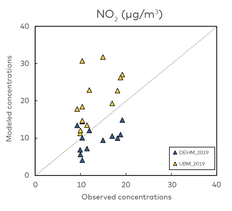
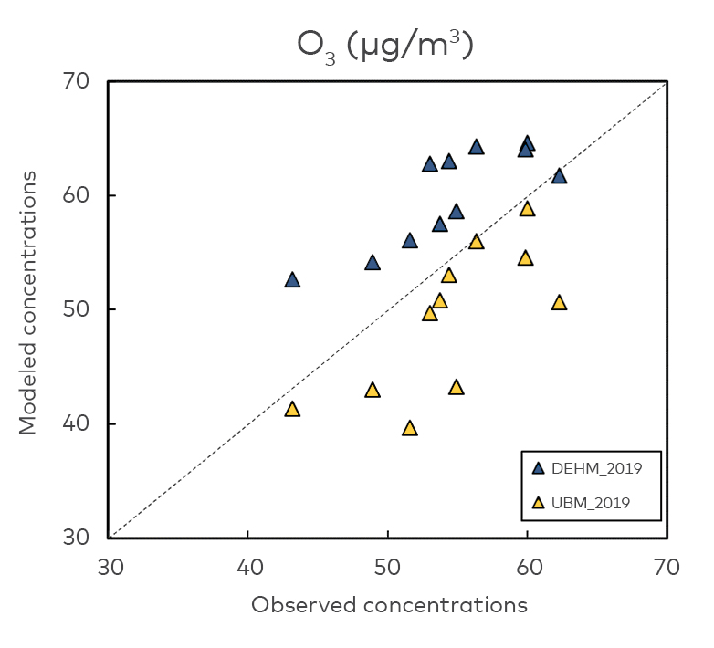
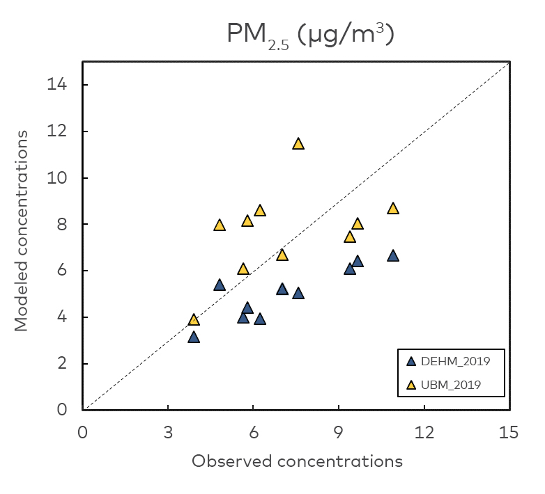
Figure 6.1. Scatter plots showing pairwise comparison of observations and UBM (yellow) and DEHM (blue) model results in 2019. Left is NO2, centre is O3 and right is PM2.5.(PM2.5 for Reykjavík not shown due to post-processing).
6.2 Modelled average concentrations over selected cities in 2019 and 2030
The average concentrations of the grid cells included in the city masks are shown in Table 6.2.
City | NO2 | O3 | PM2.5 | |||
2019 | 2030 | 2019 | 2030 | 2019 | 2030 | |
København | 21 | 17 | 52 | 54 | 8.4 | 6.8 |
Aarhus | 11 | 9 | 58 | 59 | 7.3 | 6.0 |
Odense | 11 | 9 | 59 | 60 | 7.8 | 6.3 |
Stockholm | 19 | 14 | 52 | 54 | 6.6 | 5.7 |
Malmö | 15 | 11 | 58 | 60 | 7.8 | 6.3 |
Göteborg | 13 | 10 | 58 | 59 | 6.1 | 5.1 |
Helsinki | 24 | 19 | 45 | 47 | 5.4 | 4.7 |
Tampere | 5 | 3 | 56 | 57 | 3.3 | 2.8 |
Oulu | 3 | 2 | 53 | 53 | 2.6 | 2.3 |
Reykjavík | 10 | 9 | 64 | 63 | 2.6 | 2.3 |
Oslo | 17 | n.a. | 50 | n.a. | 7.6 | n.a. |
Bergen | 10 | n.a. | 63 | n.a. | 4.9 | n.a. |
Trondheim | 6 | n.a. | 63 | n.a. | 3.7 | n.a. |
Table 6.2. Average concentrations over selected cities in 2019 and 2030 calculated with the UBM model. Units are µg/m3.
6.3 Concentration maps for selected cities in 2019 and 2030
Concentration maps for the selected cities in each of the Nordic countries for 2019 and 2030 are presented in the following for annual means of NO2, O3 and PM2.5. The dashed lines displayed in the maps are a rough indication of the extent of the city boundaries as applied in this analysis. Missing maps reflect data limitations as described previously.
General assessment
The geographic distribution of concentrations in the cities is seen to be influenced by population density and thereby associated emission density as well as large road transport corridors and ship traffic. Concentrations of NO2 and PM2.5 are decreasing for all cities from 2019 to 2030, whereas concentrations of O3 are slightly increasing.
Urban background NO2 and PM2.5 and WHO AQG
The UBM model generally overestimates NO2 concentrations and caution should be taken when comparing modelled concentrations with WHO AQG. Therefore, an estimate of compliance with the WHO AQG in 2030 also considers the present observed concentrations in 2019. In the following focus is on the capital cities that generally have the highest concentrations levels.
Based on the observed level of NO2 in 2019 at the urban background station in København (11.9 µg/m3, 9.8 µg/m3 in 2021) and the modelled decrease in concentrations towards 2030 of 19%, it is likely that concentrations will be under the WHO AQG of 10 µg/m3 in 2030 at this station. The average modelled concentration over the mask of København of 17 µg/m3 in 2030 seems overestimated.
Based on the observed level of NO2 in 2019 at the urban background station in Stockholm (10.4 µg/m3, 11.0 µg/m3 in 2021) and the modelled decrease in concentrations towards 2030 of 26%, it is likely that concentrations will be under the WHO AQG of 10 µg/m3 in 2030 at this station. The average modelled concentration over the mask of Stockholm of 24 µg/m3 in 2030 seems overestimated.
Based on the observed level of NO2 in 2019 at the urban background station in Helsinki (14.9 µg/m3, 12.4 µg/m3 in 2021) and the modelled decrease in concentrations towards 2030 of 21%, it is likely that concentrations will be slightly under the WHO AQG of 10 µg/m3 in 2030 at this station. The average modelled concentration over the mask of Helsinki of 19 µg/m3 in 2030 seems too high.
Based on the observed level of NO2 in 2019 at the urban background station in Reykjavík (9.3 µg/m3, 8.2 µg/m3 in 2021) and the modelled decrease in concentrations towards 2030 of 13%, it is likely that concentrations will remain under the WHO AQG of 10 µg/m3 in 2030 at this station. The average modelled concentration over the mask of Reykjavík is 9 µg/m3 in 2030.
The comparison of observed and modelled concentrations to PM2.5 showed some overestimation for the lowest observed values and some underestimation of the highest observed values. Based on the observed level of PM2.5 in 2019 at the urban background station in København (10.9 µg/m3, 8 µg/m3 in 2021) and the modelled decrease in concentrations towards 2030 of 20%, it is likely that concentrations will be slightly over the WHO AQG of 5 µg/m3 in 2030 at this station. The average modelled concentration over the mask of København is 7 µg/m3 in 2030.
Based on the observed level of PM2.5 in 2019 at the urban background station in Stockholm (4.9 µg/m3, 5.1 µg/m3 in 2021) and the modelled decrease in concentrations towards 2030 of 13%, it is likely that concentrations will be under the WHO AQG of 5 µg/m3 in 2030 at this station. The average modelled concentration over the mask of Stockholm is 7 µg/m3 in 2030 seems to be overestimated.
Based on the observed level of PM2.5 in 2019 at the urban background station in Helsinki (5.6 µg/m3, 5.8 µg/m3 in 2021) and the modelled decrease in concentrations towards 2030 of 15%, it is likely that concentrations will be under the WHO AQG of 5 µg/m3 in 2030 at this station. The average modelled concentration over the mask of Helsinki is 7 µg/m3 in 2030.
Based on the observed level of PM2.5 in 2019 at the urban background station in Reykjavik (7.9 µg/m3, 4.9 µg/m3 in 2021) and the modelled decrease in concentrations towards 2030 of 27%, it is likely that concentrations will be under the WHO AQG of 5 µg/m3 in 2030 at this station. The average modelled concentration over the mask of Reykjavík is 2.3 µg/m3 in 2030.
Due to data limitations no modelled concentrations for 2030 are available for Oslo.
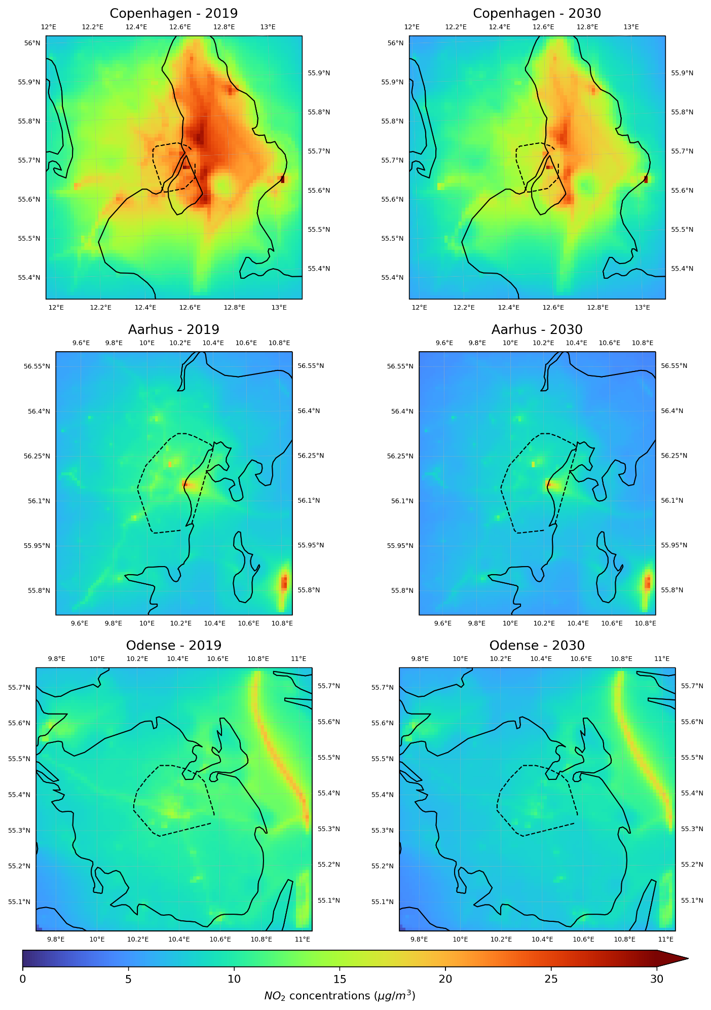
Figure 6.2. Concentration maps showing annual mean values of NO2 for the Danish cities København (top panel), Aarhus (middle panel) and Odense (bottom panel) for 2019 (left column) and 2030 (right column). Dashed line indicates the extension of the city mask.
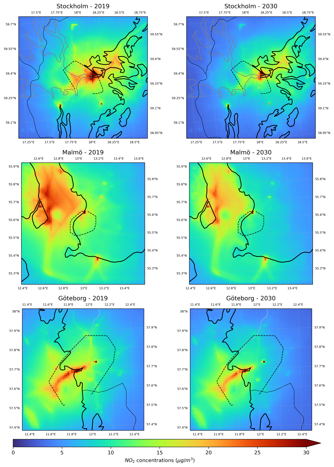
Figure 6.3. Concentration maps showing annual mean values of NO2 for the Swedish cities Stockholm (top panel), Malmö (middle pan-el), and Göteborg (bottom panel) for 2019 (left column) and 2030 (right column). Dashed line indicates the extension of the city mask.
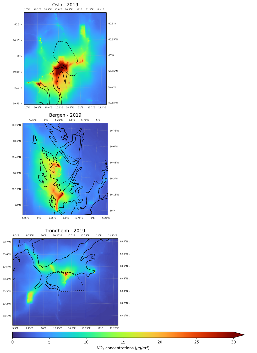
Figure 6.4. Concentration maps showing annual mean values of NO2 for the Norwegian cities Oslo (top panel), Bergen (middle panel) and Trondheim (bottom panel) for 2019. Dashed line indicates the extension of the city mask.
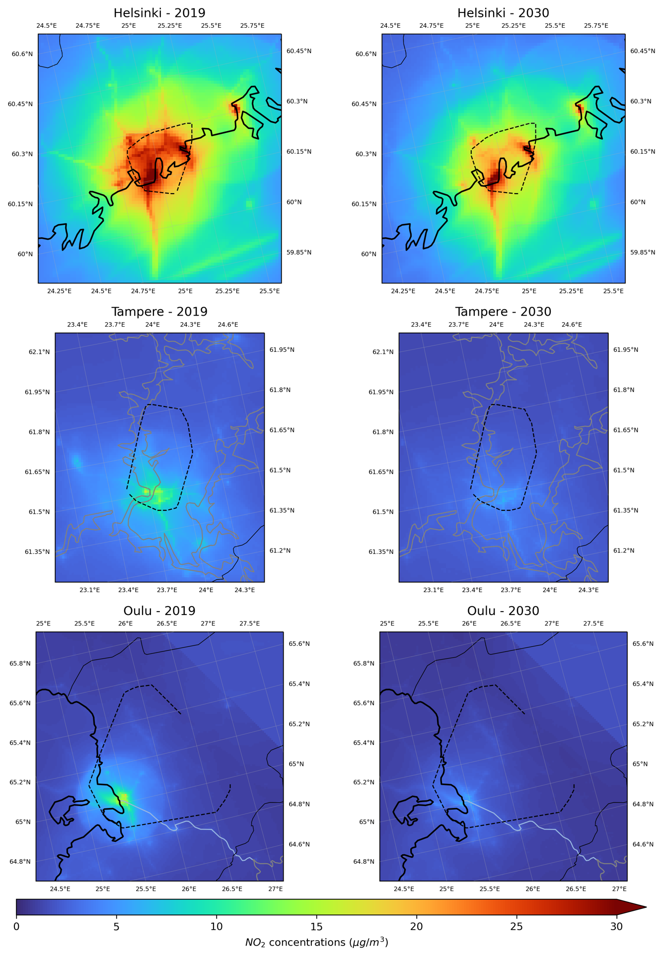
Figure 6.5. Concentration maps for annual means of NO2 for Finnish cities for 2019 and 2030. Helsinki (top panel), Tampere (middle panel), and Oulu (bottom panel).
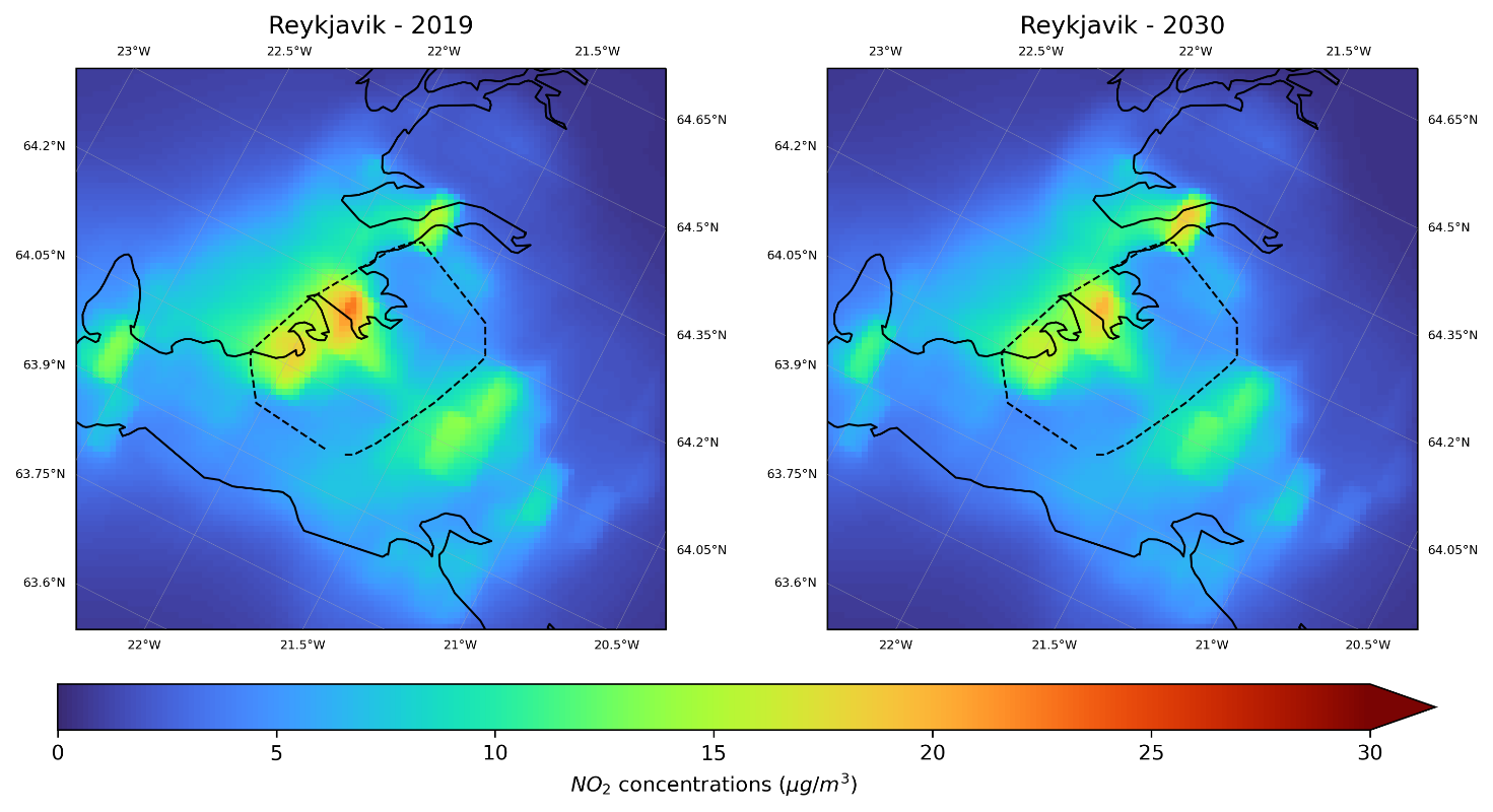
Figure 6.6. Concentration maps for annual means of NO2 for Reykjavík for 2019 and 2030.
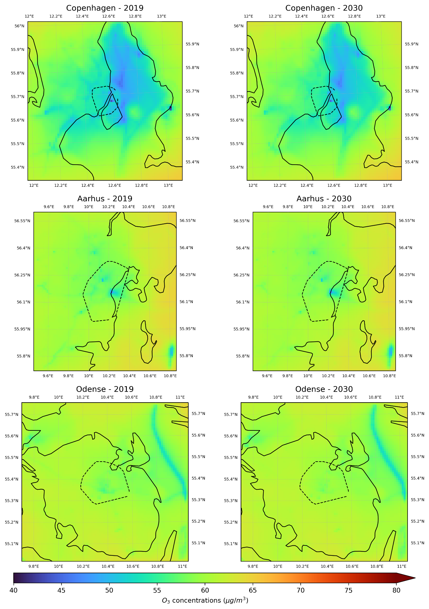
Figure 6.7. Concentration maps showing annual mean values of O3 for the Danish cities København (top panel), Aarhus (middle panel) and Odense (bottom panel) for 2019 (left column) and 2030 (right column). The dashed line indicates the extension of the city mask.
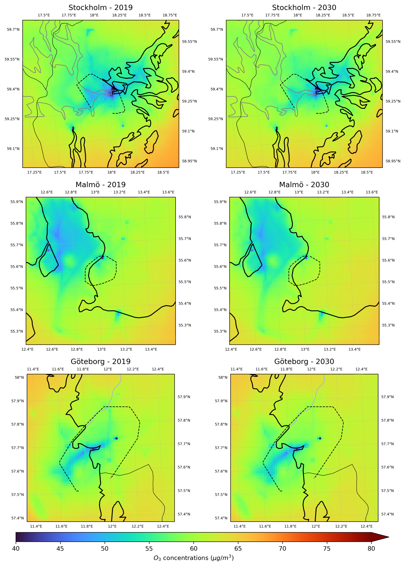
Figure 6.8. Concentration maps showing annual mean values of O3 for the Swedish cities Stockholm (top panel), Malmö (middle panel) and Göteborg (bottom panel) for 2019 (left column) and 2030 (right column). Dashed line indicates the extension of the city mask.
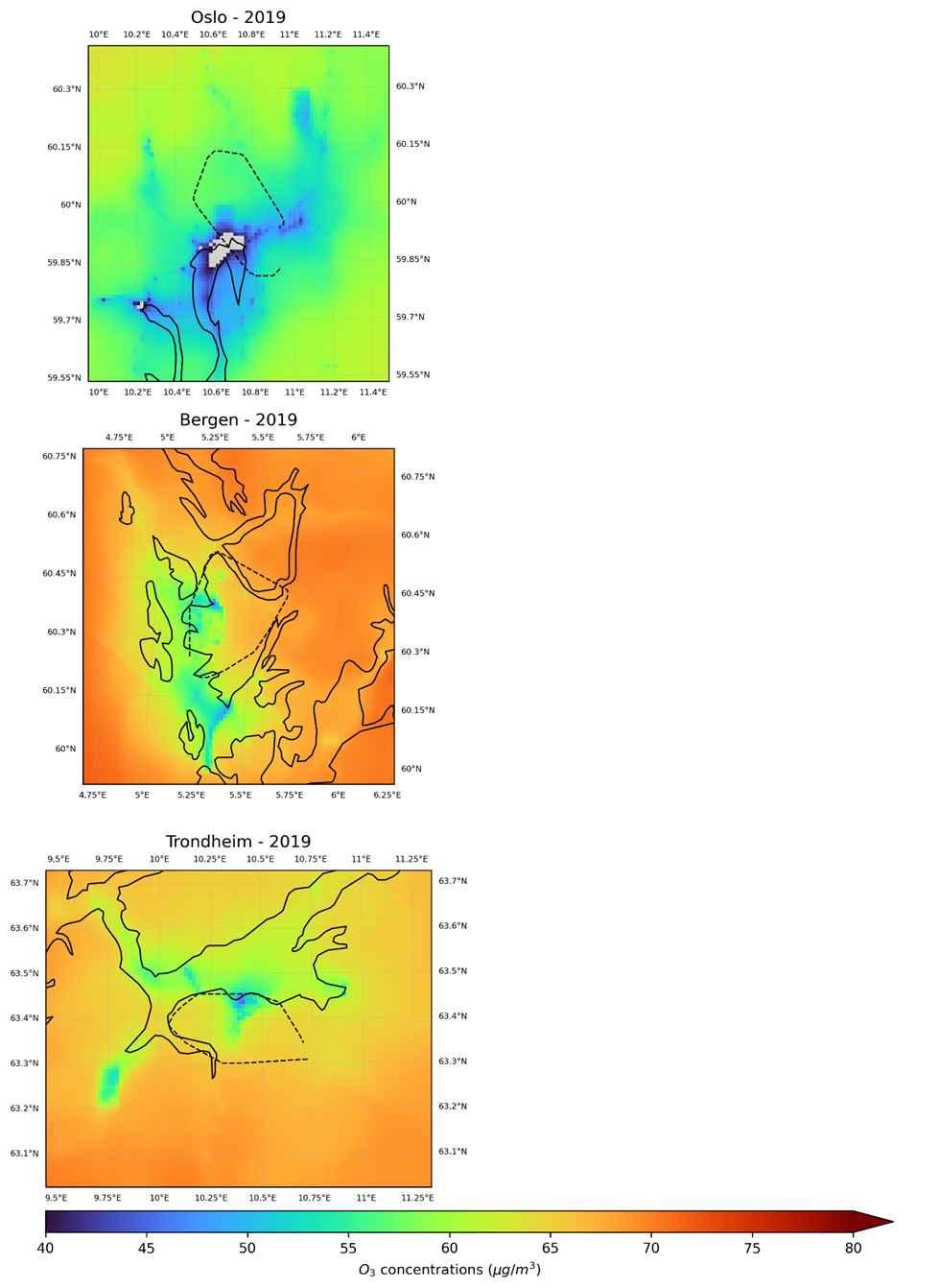
Figure 6.9. Concentration maps showing annual mean values of O3 for the Norwegian cities Oslo (top panel), Bergen (middle panel) and Trondheim (bottom panel) for 2019. Dashed line indicates the extension of the city mask.
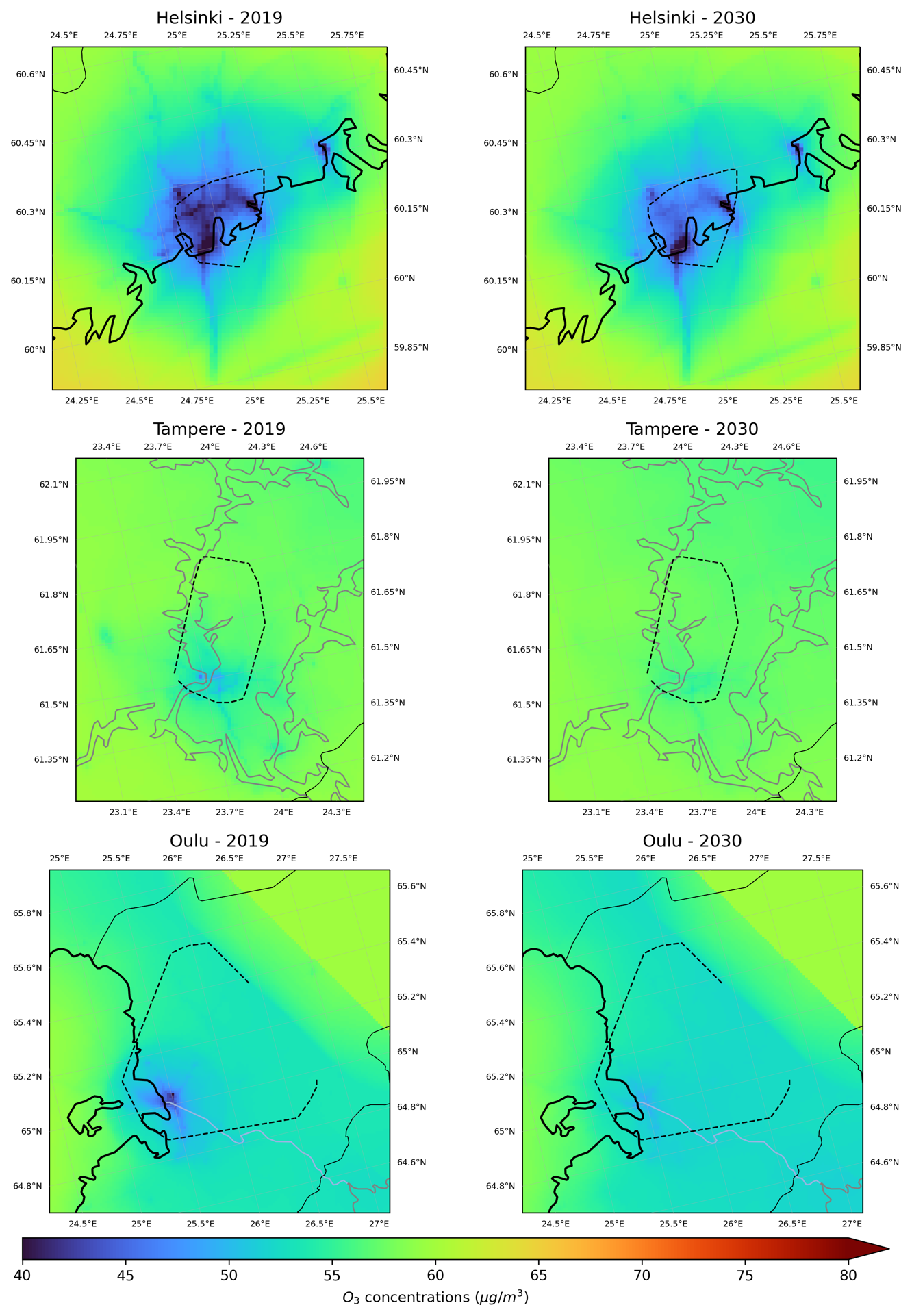
Figure 6.10. Concentration maps showing annual mean values of O3 for the Finnish cities Helsinki (top panel), Tampere (middle panel) and Oulu (bottom panel) for 2019 (left column) and 2030 (right column). Dashed line indicates the extension of the city mask.
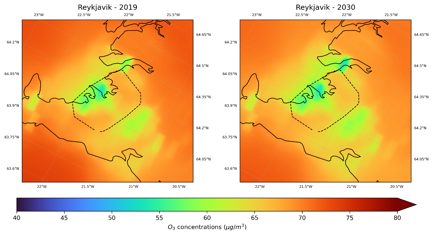
Figure 6.11. Concentration maps for annual means of O3 for Reykjavík for 2019 and 2030.
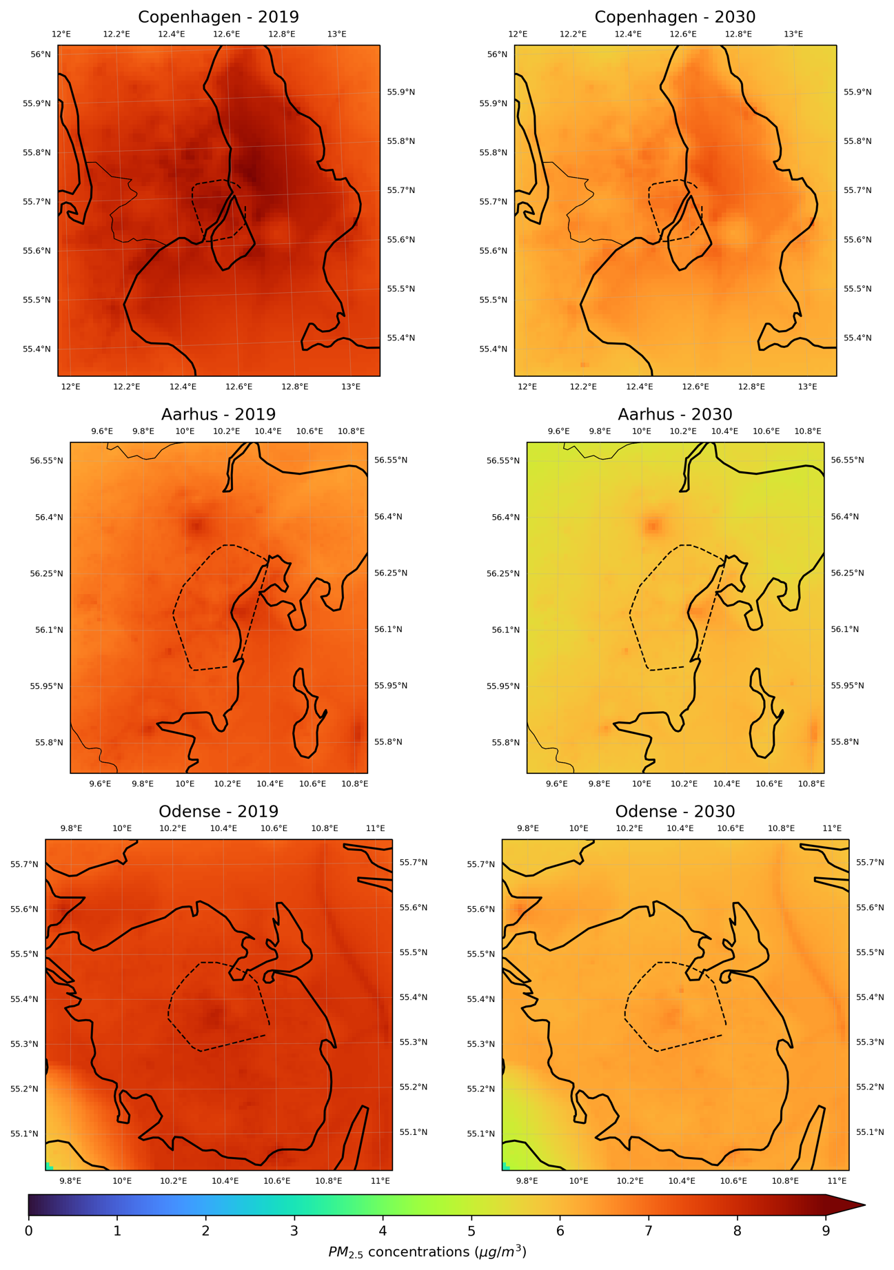
Figure 6.12. Concentration maps showing annual mean values of PM2.5 for the Danish cities København (top panel), Aarhus (middle panel) and Odense (bottom panel) for 2019 (left column) and 2030 (right column). The dashed line indicates the extension of the city mask.
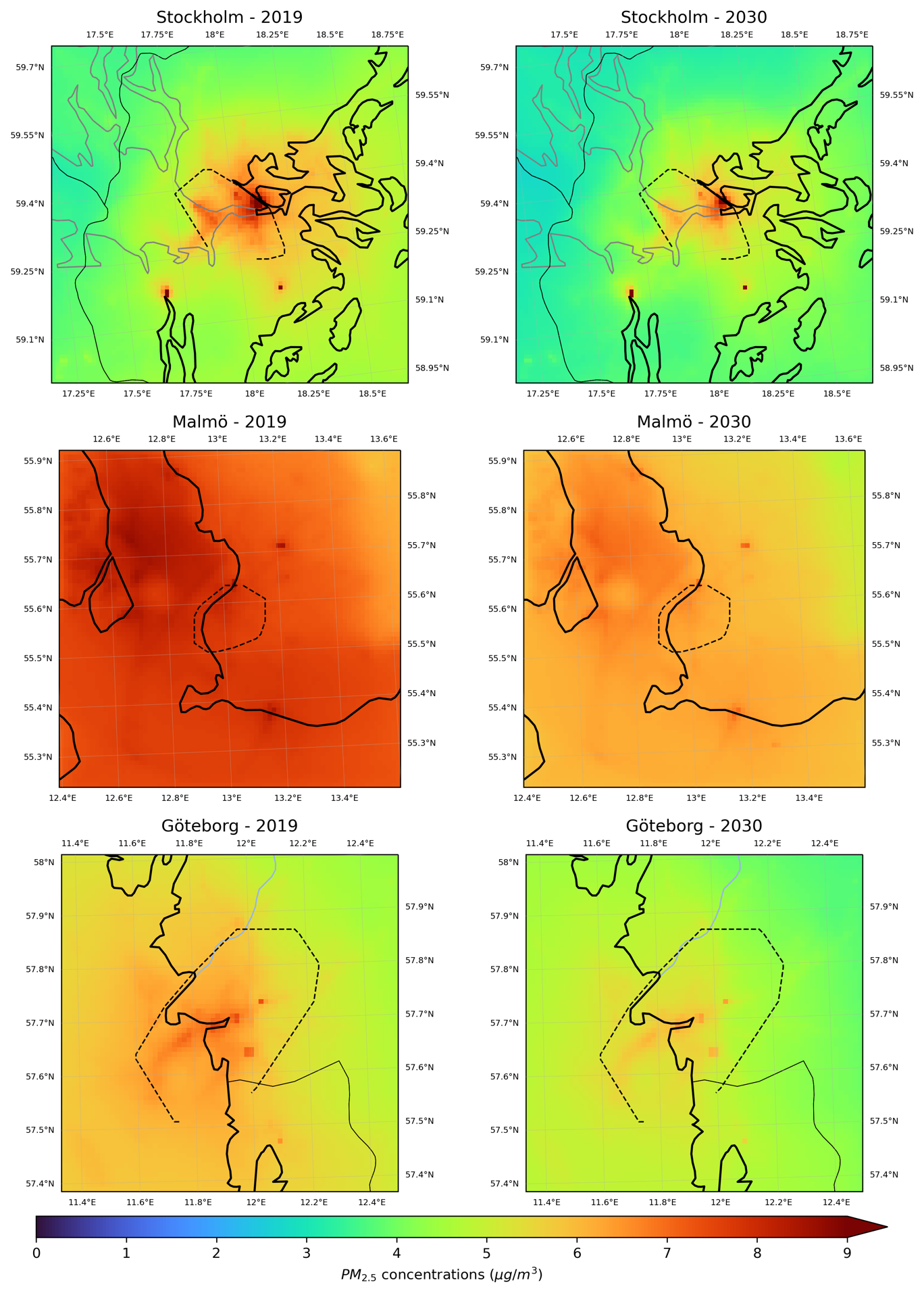
Figure 6.13. Concentration maps showing annual mean values of PM2.5 for the Swedish cities Stockholm (top panel), Malmö (middle panel), and Göteborg (bottom panel) for 2019 (left column) and 2030 (right column). Dashed line indicates the extension of the city mask.
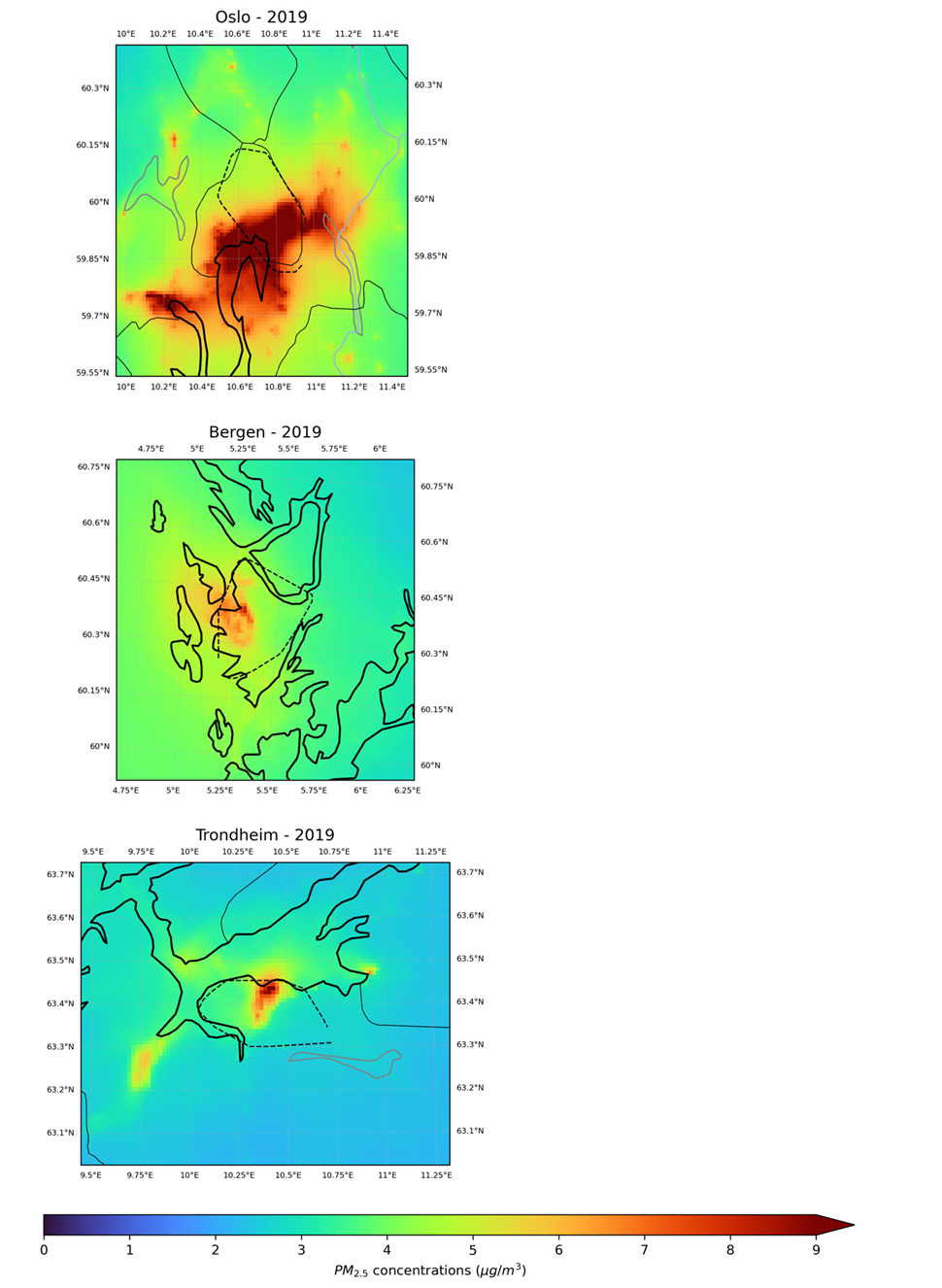
Figure 6.14. Concentration maps showing annual mean values of PM2.5 for the Norwegian cities Oslo (top panel), Bergen (middle panel) and Trondheim (bottom panel) for 2019. Dashed line indicates the extension of the city mask.
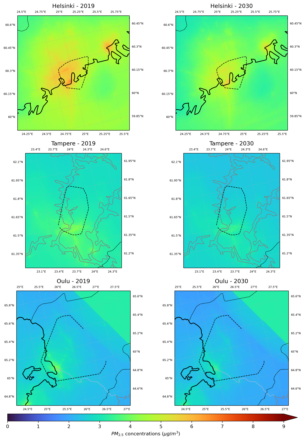
Figure 6.15. Concentration maps showing annual mean values of PM2.5 for the Finnish cities Helsinki (top panel), Tampere (middle panel) and Oulu (bottom panel) for 2019 (left column) and 2030 (right column, only Helsinki). Dashed line indicates the extension of the city mask.
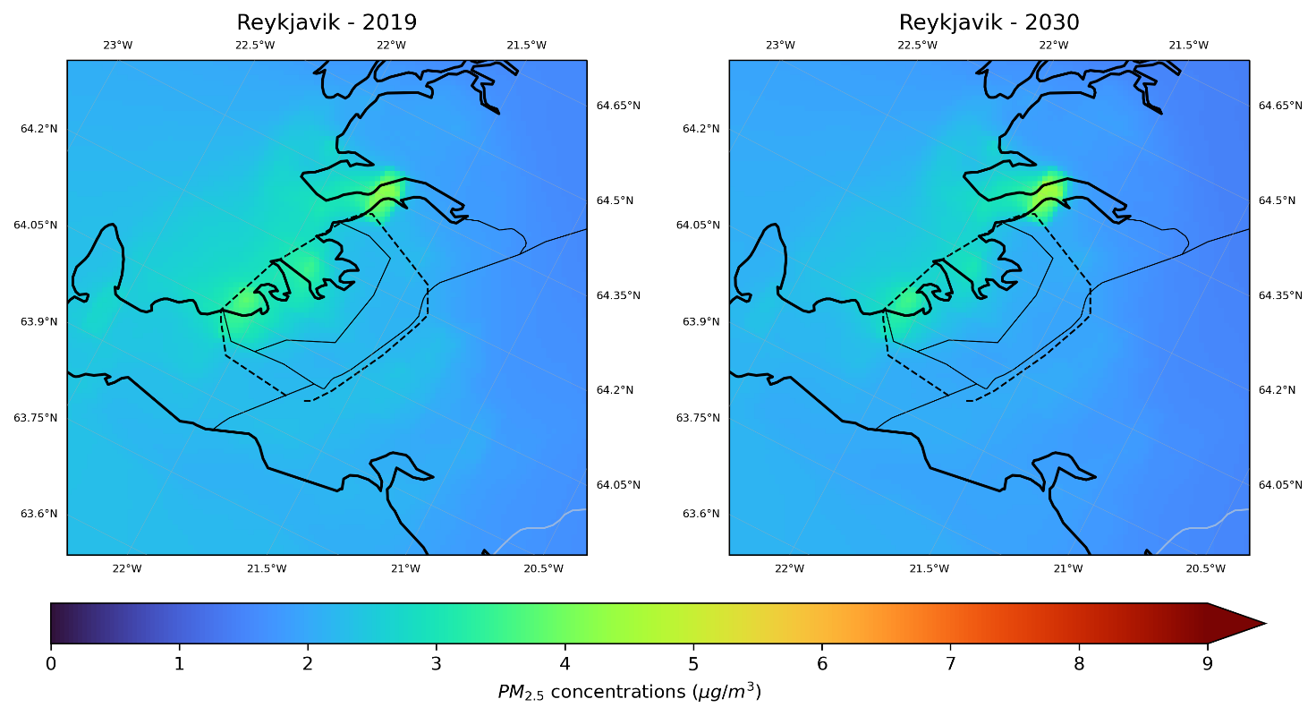
Figure 6.16. Concentration maps for annual means of PM2.5 for Reykjavík for 2019 and 2030.