5. Regional Air Quality in 2019 and 2030
5.1 DEHM model domain setups
In the project, five different model domain setups have been made i.e. for the Danish cities together with Göteborg and Malmö, for Stockholm, for the Norwegian cities, for the Finnish cities and finally for Iceland. Each model domain covers the Northern Hemisphere in a polar stereographic projection true at 60°N with a spatial resolution of 150 km x 150 km, and high resolution is obtained over the five Nordic areas using a two-way nesting technique, increasing the resolution over Europe (50 km x 50 km), Northern Europe/Nordic Countries (16.67 km x 16.67 km) and specific Nordic area (5.56 km x 5.56 km).
In the vertical direction, 29 levels resolve the lowest approx. 15 km of the atmosphere in the model. The regional air quality model, DEHM, is driven by meteorological input from the numerical weather prediction model WRF v4.1 (Skamarock et al., 2008), where the spatial setup of the WRF model system is identical to the setup of the DEHM model system both horizontally and vertically, which means that the 2D and 3D WRF data are not interpolated spatially to the similar DEHM grid points, but directly available with the correct resolution. The WRF model is driven by global data from the ERA5 reanalysis from ECMWF (Hersbach et al., 2018). The WRF data were archived with 1-hour resolution and interpolated in time inside the DEHM model. The WRF model was run for the period 30/11 2018 to 1/1 2020, and DEHM was run for 1/12 2018 to 1/1 2020, where the simulations for December 2018 were carried out to initialise the model system.
In Table 5.1 the five DEHM domains and cities involved in each domain are listed.
Domain | Cities |
Denmark–Sweden | København, Aarhus, Odense, Malmö, Göteborg |
Stockholm | Stockholm |
Norway | Oslo, Bergen, Trondheim |
Finland | Helsinki, Tampere, Oulu |
Iceland | Greater Reykjavík |
Table 5.1. Five DEHM Domains and cities involved in each domain.
In Figures 5.1–5.5 the geographical extend of the five model domain setups are shown.
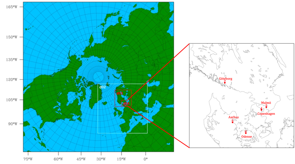
Figure 5.1. Model domain setup for the Danish cities, Göteborg and Malmö.
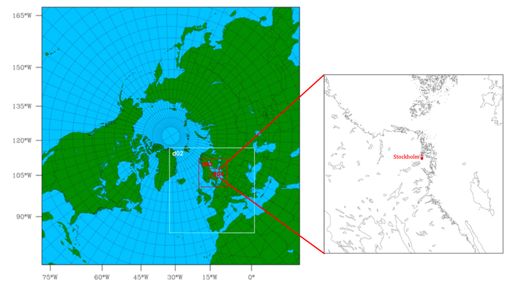
Figure 5.2. Model domain setup for Stockholm.
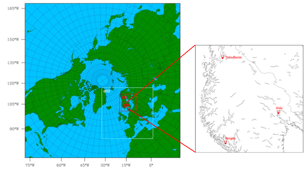
Figure 5.3. Model domain setup for the Norwegian cities.
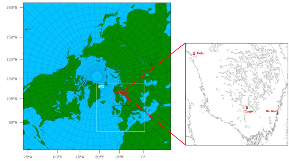
Figure 5.4. Model domain setup for the Finnish cities.
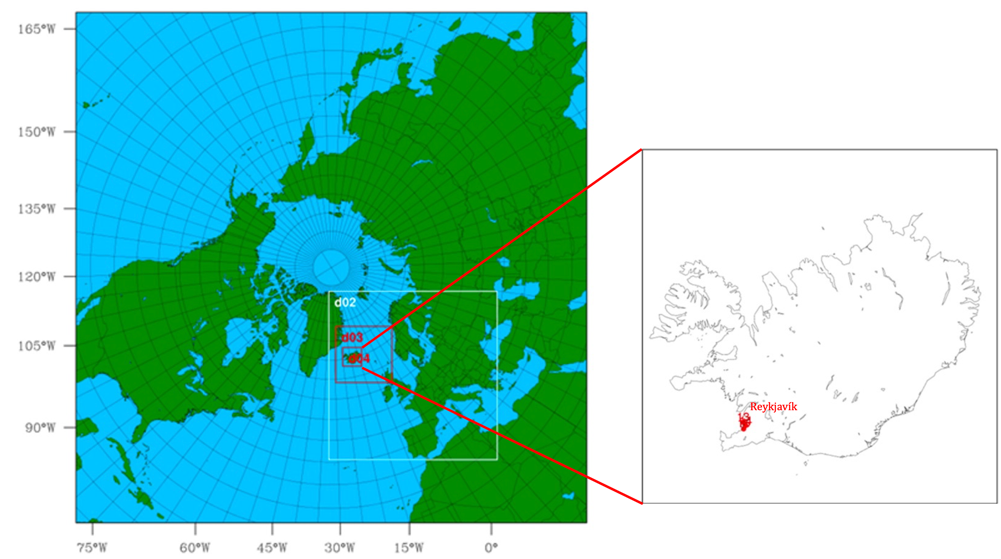
Figure 5.5. Model setup for Iceland.
5.2 High-resolution emissions in 2019 and 2030
Emissions for Europe and the rest of the Northern Hemisphere are based on emission data from the EMEP database with 0.1° x 0.1° spatial resolution and the ECLIPSE v6b database with 0.5° x 0.5° spatial resolution. Furthermore, global ships emissions based on the STEAM model with 0.1° x 0.1° resolution and monthly time resolution were used.
Projected emissions for 2030 are drawn from existing international emission databases. For EU countries, emissions reflect national projections if targets are met in the NEC directive (National Emission Ceilings), otherwise reduction targets set out in the NEC directive for 2030 for the country. For non-EU-countries, the national projections are used. Emissions of CO and PM10 are included in the national emission inventories but are not mandatory for projections, and hence there are limitations for obtaining projections of emissions of CO and PM10 for 2030 for all countries.
The countries’ projection of emissions for 2030 are given as total emissions on NFR (Nomenclature for Reporting) Code level for each component. These emissions on NFR code level are converted to the country specific GNFR (Gridded NFR) sectors given in the gridded EMEP emissions. Finally, the gridded country specific GNFR sectors for 2019 are scaled in order to establish gridded EMEP emissions. This is done by requiring that the total gridded country specific GNFR sectors are equal the countries’ projection in the same GNFR sectors for 2030 and by assuming that the spatial distribution in 2030 is similar to the spatial distribution in 2019.
Emissions for the Nordic countries (except Iceland) are based on the emission dataset from the research project NordicWelfAir (funded by NordForsk) where a high-resolution geographically distributed emission inventory of 1 km x 1 km for the Nordic countries was established for selected years from 1990 to 2014. The emission inventory for 2014 was in a similar way as for the EMEP data scaled to 2019 and 2030 based on the total country specific GNFR sectors and the national total emissions for 2019/the projection of emissions for 2030 respectively. The emission sector system applied in the NordicWelfAir emissions is based on the old SNAP (Selected Nomenclature for Air Pollution) , and since SNAP does not exactly match the GNFR sectors, these scalings to 2019 and 2030 were based on fewer, aggregated sectors, which have an exact match. See Table 5.2.
SNAP | GNFR |
1 (Energy) 3 (Industrial comb.) 4 (Industrial proc.) | A_PublicPower B_Industry |
2 (Residential combustion) | C_OtherStatComb |
5 (Extraction etc.) 6 (Solvents) 9 (Waste) | D_Fugitive E_Solvents J_Waste |
7 (Road transport) | F_RoadTransport |
8 (Off-road, without shipping) | I_Off-road H_Aviation |
10 (Agriculture) | K_AgriLivestock L_AgriOther |
Table 5.2. Matching sector correspondence between SNAP and GNFR.
The calculations for Iceland are different from the other countries because the high-resolution (1kmx1km) NordicWelfAir emissions was the first high-resolution emission inventory made and it has not been evaluated in detail yet. Therefore, only EMEP emissions (0.1° x 0.1° approx. 11 km x 6 km) are used in both DEHM and UBM for Iceland. The differences between the approach for handling emissions in DEHM and UBM include the distribution in the vertical, where DEHM has a vertical distribution profile depending on SNAP/GNFR category, whereas UBM does not. For the other Nordic countries, where NordicWelfAir emissions were available, the emissions from high stacks were given in separate point-source files, including the stack height, and this has been treated in a special way in UBM (plume-in-grid approach) to account for the vertical distribution. However, for Iceland these data are not available, and all emissions are gridded and emitted at surface level in the model.
Another issue with the Icelandic emissions is that the emissions from SNAP8 (national fishing fleet) has been reported (by Iceland) to EMEP with a geographic distribution, where all emissions occur in the harbours, not on the ocean. This is a choice made by the Icelandic emission authorities, but it means that the sources of SNAP8 emissions are placed very close to the population, as most of the Icelandic population lives close to the harbours and leading to an overestimation of concentration levels in these areas. It is not possible to adjust for this as it would require a redistribution of emissions based on the location of the fishing vessels that is beyond the scope of the present project.
Furthermore, Icelandic emissions of SOx are almost entirely dominated by hydrogen sulphite (H2S) emissions from geothermal power plants allocated to SNAP5. In these plants, hydrogen sulfide (H2S) is released during geothermal processing. In the atmosphere it is oxidized to SO2 and further to sulphate. The chemical lifetime for the chemical reactions that convert H2S to SO2 by OH radical is approx. two days and probably longer at Iceland due to the cold climate, so this H2S will not contribute to SO2, and definitely not to sulphate over Iceland. All H2S emissions are included in the SOx emission inventory as SO2 by assuming that one molecule H2S is equal one molecule SO2. In the first version of the air quality and health modelling it was assumed that SOx was 95% SO2 and 5% sulphate as is standard for combustion related SOx emissions. However, this led to very high modelled SO2 concentrations and also influenced estimates of PM2.5. After becoming aware of the hydrogen sulphide issue the air quality and health estimates were adjusted by post-processing. From the model runs for SNAP 5, 6 and 9 combined with the basic model run an estimate was made of the incorrect contribution from H2S emissions, which was reported as SO2 in the official emission inventory for Iceland and therefore treated as SO2 in the models system, to the concentrations of SO2, sulphate and nitrate by assuming that 100% of the contributions from SNAP5, 6 and 9 to these three compounds are coming from H2S emissions and with this assumption it is possible to adjust all model results.
The NordicWelfAir emissions available for Norway for this project, was not complete for the SNAP sectors 1, 3, 4, 5, 8 and 9. Therefore, it was decided to use EMEP GNFR sectors for Norway instead for these specific emission sectors. It should be noted, that the EMEP data are similar, but with a more coarse spatial resolution, compared with the NordicWelfAir data.
In Figure 5.6–5.8 the total emissions of selected pollutants (SOx, NOx and PM2.5) are shown for the Nordic countries for the aggregated SNAP sectors for 2019 and 2030.
The combined sectors of SNAP1 (Energy), SNAP3 (Industrial combustion) and SNAP4 (Industrial processes) are the emission sectors that contribute the most to SOx except for Iceland, where the combined sector of SNAP5 (Extraction etc,), 6 (Solvents) and 9 (Waste) show the largest contributions to SOx emissions due to geothermal energy production allocated to SNAP5. The largest source of SOx is from geothermal power plants, and SOx emissions are therefore dominated by hydrogen sulphide emissions.
SNAP7 (Road transport) contributes the most to NOx in 2019 but decreases towards 2030 where other sectors also contribute significantly. SNAP8 (off-road) also contributes significantly to NOx. For Iceland these emissions are dominated by fishing vessels. They are not geographically correct distributed in the EMEP emission inventory as all emission are allocated to harbour areas and not where most of the emissions take place at sea.
SNAP2 (Residential combustion) represents almost entirely emissions from wood burning in wood stoves in Nordic countries and contributes the most to PM2.5 emissions except for Iceland since woodstoves are not commonly used in Iceland.
There is a reduction for all countries and pollutants from 2019 to 2030.
Figure 5.6. Emissions of SOx in the Nordic countries for the aggregated SNAP sectors for 2019 and 2030.
Figure 5.7. Emissions of NOx in the Nordic countries for the aggregated SNAP sectors for 2019 and 2030.
Figure 5.8. Emissions of PM2.5 in the Nordic countries for the aggregated SNAP sectors for 2019 and 2030.
In Appendix 2 the numbers behind the figures 5.6–5.8 are given.
An example of the final geographical variation of NOx emissions is given in Figure 5.9.
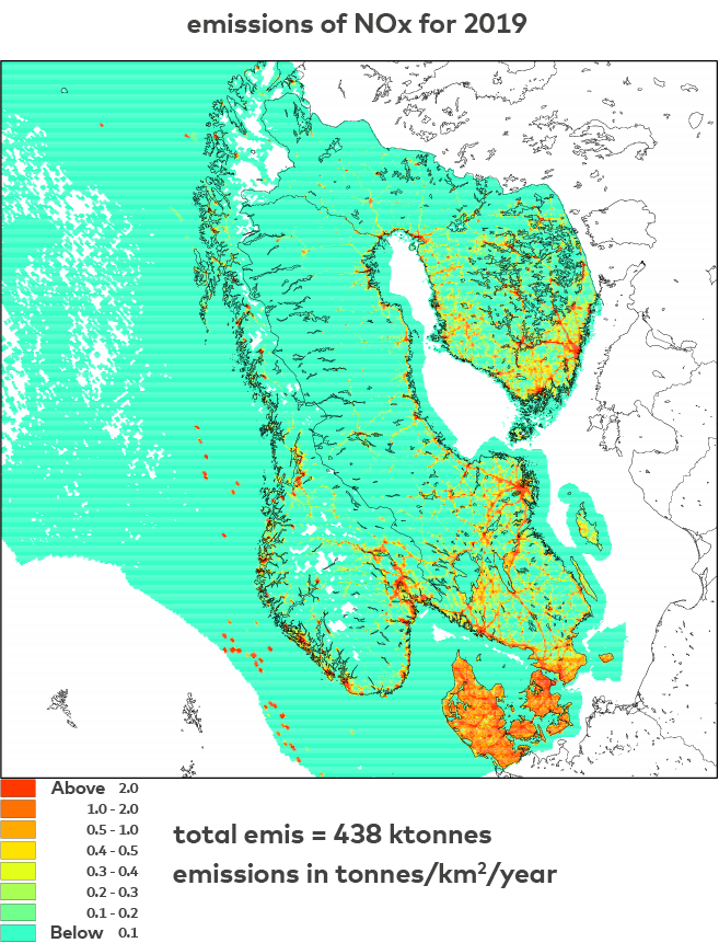
Figure 5.9. An example of the geographical variation of NOx emissions in Denmark, Norway, Sweden and Finland.
5.3 Regional concentrations compared with WHO AQG
To limit the presentation of pollutants and statistical parameters, the following focuses on pollutants and parameters that pose the largest risk for impacts on human health from air pollution. These pollutants and parameters are annual mean concentrations of PM2.5 and NO2 together with peak season concentrations of ozone, the latter defined as the average of daily maximum 8-hour mean O3 concentrations in the six consecutive months with the highest six-month running-average O3 concentration. The new WHO guidelines for annual mean of PM2.5 is 5 µg/m3, for annual mean of NO2 it is 10 µg/m3, and for peak ozone it is 60 µg/m3. In the following figures, concentrations for 2019 and 2030 are visualised side-by-side for each pollutant to present the development in concentrations from 2019 to 2030.
The selected cities are labelled with magenta colour if the concentration at the grid cell of the city is exceeding the WHO guideline, otherwise, labelled with black colour. It is the DEHM interpolated values to the observational site, which can be thought of as the nearest grid cell to the measurement location that represent the city. Further, the WHO guideline values are marked as a black line in the colour bar of the legend.
Note that the results presented in these figures are regional concentrations which represent the background condition of the selected cities. The actual urban background concentrations over the cities will be slightly higher for PM2.5 and NO2 (lower for O3), and for hotspots like busy streets, concentrations will be even higher for PM2.5 and NO2 (lower for O3).
Annual mean of NO2
In figure 5.10, the annual mean concentrations of NO2 in the model domain are visualised for the model simulation of 2019 and 2030. The WHO guideline for the annual mean concentration of NO2 is 10 mg/m3.
There is a general gradient from south to north with higher concentrations in Denmark and southern Sweden. It is obvious that the concentration in most areas of the model domain are below the WHO guideline, and the exception is the few big cities. Ship emissions can also be seen to cause elevated concentrations along ship routes, especially in the inner Danish waters, and at the biggest harbors. There is a general decrease in concentrations from 2019 to 2030.
Five of the selected cities are exceeding the WHO guideline in 2019: København, Trondheim, Stockholm, Oslo and Reykjavík, and only Reykjavík in 2030.
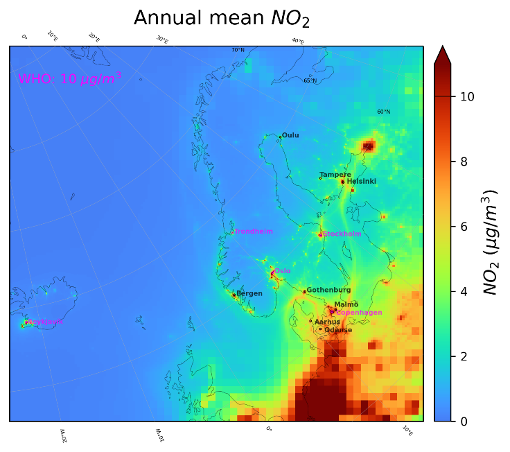
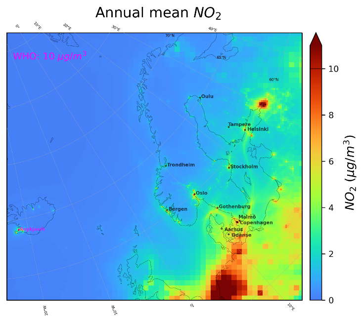
Figure 5.10. Annual mean concentrations of NO2 for 2019 (left) and 2030 (right). The WHO 2021 guideline value is 10 mg/m3 and it is exceeded in the selected cities labelled in magenta.
Annual mean of PM2.5
In Figure 5.11, the annual mean concentrations of PM2.5 in the model domain are visualised for the model simulation of 2019 and 2030. The WHO guideline for the annual mean concentration of PM2.5 is 5 mg/m3. The general concentration gradient also shows a decrease from south to north in the domain, and as for NO2, there is a decrease in concentrations from 2019 to 2030.
There are significant exceedances of the WHO guidelines in 2019 for Denmark and southern Sweden. There are still exceedances in 2030, but they are much smaller.
In four of the selected cities, the concentrations exceed the WHO guideline in 2019 located in Denmark (København, Aarhus, Odense) and southern Sweden (Malmö). This is reduced to three in 2030 in the same countries as Aarhus no longer exceeds the guideline in 2030 based on the model simulations.
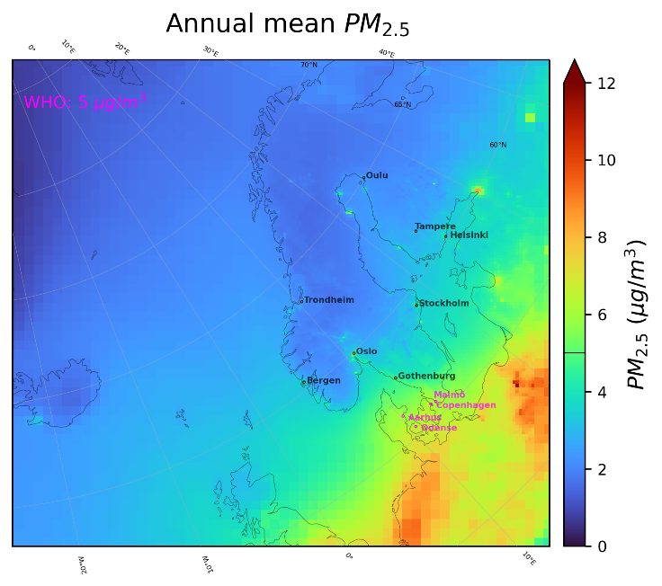
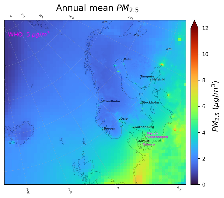
Figure 5.11. Annual mean concentrations of PM2.5 for 2019 (left) and 2030 (right). The WHO 2021 guideline value is 5 mg/m3 and it is exceeded in the selected cities labelled in magenta.
Peak ozone
Figure 5.12 shows the peak seasonal concentrations of O3. The WHO guideline concentration is 60 mg/m3, and this is exceeded in the model simulation in most parts of the domain both in 2019 and 2030. Peak ozone concentrations show a very slight decrease towards 2030, especially for Iceland and Finland.
Concentrations of O3 are not higher in big cities, but actually lower compared with rural areas, due to the titration effects of NOx where NOx emissions from e.g. traffic converts ozone to NO2.
The concentrations in all the selected cities are exceeding the WHO guideline for peak season mean ozone in both 2019 and 2030.
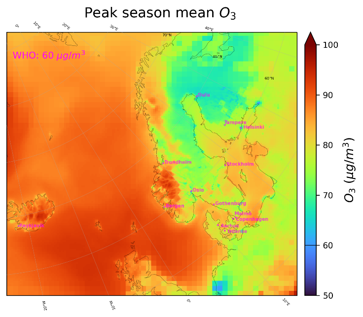
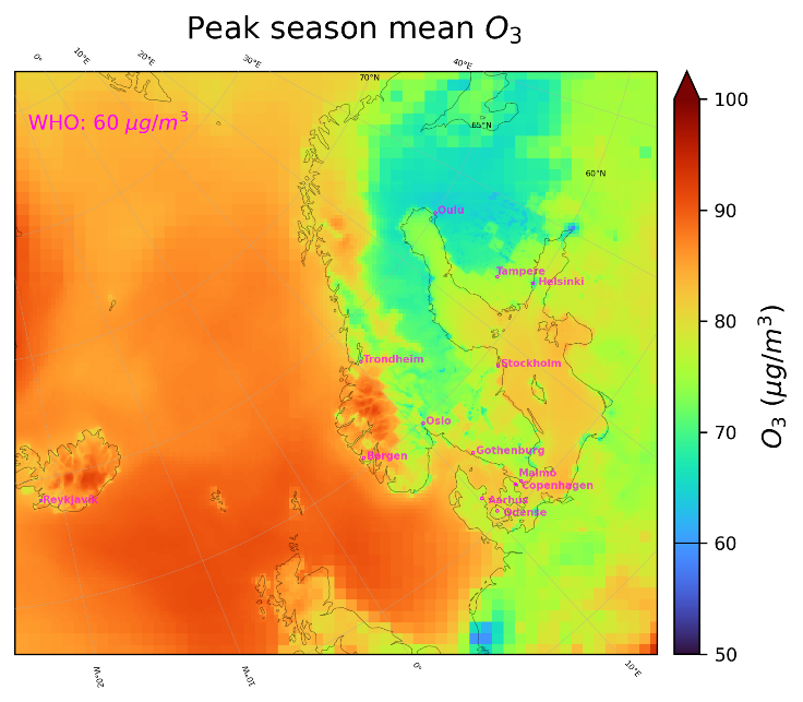
Figure 5.12. Peak season concentrations of O3 for 2019 (left) and 2030 (right). The WHO 2021 guideline value is 60 mg/m3 and it is exceeded in the selected cities labelled in magenta.
Other pollutants
A similar analysis as presented above has been carried out for the pollutants PM10, CO and SO2.
All selected cities have concentration levels that are below the WHO guideline in 2019 and 2030 for annual PM10 (15 µg/m3) and peak PM10 (45 µg/m3 as annual 99th percentile of 24h-mean).
All selected cities have concentration levels that are below the WHO guideline for CO in 2019 and 2030 (4 mg/m3 as annual 99th percentile of 24h-mean).
All selected cities were below the WHO guideline for peak concentration of SO2 in both 2019 and 2030 (40 µg/m3 as annual 99th percentile of 24h-mean).
Modelled annual mean concentrations versus observations in 2019 and modelled annual mean concentrations in 2030
In Table 5.3 the modelled annual mean concentrations of NO2, O3 and PM2.5 for the selected cities are compared with observations in 2019 at urban background stations. The modelled annual means for 2030 are also shown. The modelled concentrations represent the grid cells (5.6 km x 5.6 km) where the urban background measurement stations are located.
Table 5.3. Annual mean observed (2019) and modelled concentrations of urban background NO2, O3, and PM2.5 (2019 and 2030). Unit µg/m3, all model results from the DEHM model.
City | NO2 | O3 | PM2.5 | ||||||
Observation (2019) | DEHM (2019) | DEHM (2030) | Observation (2019) | DEHM (2019) | DEHM (2030) | Observation (2019) | DEHM (2019) | DEHM (2030) | |
København | 11.9 | 12.0 | 8.6 | 62.3 | 61.8 | 63.4 | 10.9 | 6.7 | 5.3 |
Aarhus | 11.4 | 7.2 | 5.4 | 56.3 | 64.3 | 64.6 | 9.4 | 6.1 | 4.9 |
Odense | 9.9 | 6.9 | 5.3 | 60.0 | 64.6 | 64.6 | - | 6.5 | 5.3 |
Stockholm | 10.4 | 14.4 | 7.2 | 54.9 | 58.7 | 63.6 | 4.8 | 5.4 | 4.7 |
Malmö | 10.3 | 10.0 | 6.5 | 59.8 | 64.0 | 65.8 | 9.7 | 6.4 | 5.2 |
Göteborg | 17.0 | 10.5 | 6.1 | 54.4 | 63.1 | 65.5 | 7.0 | 5.2 | 4.4 |
Helsinki | 14.9 | 9.4 | 5.6 | 51.6 | 56.1 | 58.1 | 5.6 | 4.0 | 3.4 |
Tampere | 9.9 | 5.6 | 3.2 | 53.7 | 57.6 | 58.3 | 3.9 | 3.2 | 2.7 |
Oulu | 10.4 | 4.0 | 2.3 | 48.9 | 54.2 | 54.4 | - | 2.8 | 2.4 |
Reykjavík | 9.3 | 13.4 | 12.9 | - | 60.5 | 59.3 | 7.9 | 4.3 | 2.9 |
Oslo* | 19.2 | 14.9 | 7.3 | 43.2 | 52.6 | 57.6 | 7.6 | 5.0 | 4.4 |
Bergen* | 18.8 | 11.0 | 5.7 | 53.0 | 62.8 | 65.7 | 5.8 | 4.4 | 3.9 |
Trondheim* | 18.2 | 10.0 | 4.7 | - | 57.8 | 61.0 | 6.2 | 3.9 | 3.5 |
* See note in text. | |||||||||
As expected, the DEHM model in general underestimates the NO2 concentrations when compared with observations obtained at urban background stations as the DEHM model has a coarser resolution compared with UBM. The DEHM model predicts a considerable decrease in concentrations from 2019 to 2030 as a result of emission reductions.
As expected, the DEHM model overestimates the O3 concentrations when compared with observations obtained at urban background stations. Furthermore, the DEHM model predicts a slight increase in concentrations from 2019 to 2030, which can be understood by the decrease in NOx emissions leading to less NOx available for depletion of O3 over the cities.
Finally, also as expected, the regional scale DEHM model underestimates the PM2.5 concentrations when compared with observations obtained at urban background stations. Also for PM2.5, it is seen that the DEHM model predicts a small decrease in concentrations from 2019 to 2030 as a result of emissions reductions. Note that observed PM2.5 level of 7.9 µg/m3 in 2019 in Reykjavik is relatively high compared with observed levels in 2021 of approx. 5 µg/m3 probably due to influence of volcanic emissions in 2019.
In general air pollution models tend to underestimate the concentration of PM2.5 when comparing with measurements. In international literature, this is referred to as "the mass closure problem" or "the missing mass problem". As the field of air pollution research evolves, more relevant processes are included in the models and natural and anthropogenic emissions are described in higher detail, this mass gap is slowly reduced. It is likely that part of the "missing mass" is water in the particles which is typically not described by the models. Processes that are not fully described in the models, such as the formation of secondary organic particles (SOA) can also contribute to the problem, as can missing sources such as e.g. mineral dust and more importantly for urban areas, re-suspended dust.
Various attempts have been made in recent years to adjust for the lack of mass in the Danish National Air Quality Monitoring Programme, as this has an impact on the estimation of health effects and external costs. Results of analyses of measurements and model results for PM2.5 have shown that the gap between the concentrations predicted by the models and obtained with measurements corresponds to a missing mass of approx. 33% of the modelled concentration (Ellermann et al., 2022). This means that based on the available Danish measurements – and assuming that these are representative for the country as a whole - PM2.5 concentrations are underestimated by approx. 33% in Denmark on average in space and time. It has not been analysed in this project, whether this is also the difference in the other Nordic countries.
It is important to keep this in mind when comparing model calculated concentrations of PM2.5 with the WHO guidelines. In connection with the calculation of future air quality in 2030, it is not known what the underestimation is, as there are no measurements for 2030. However, it is very likely that the modelled concentrations of PM2.5 in 2030 are also underestimated.
In the subsequent modelling of urban background concentrations and health effects for Oslo, it became evident that something was wrong with the aggregation of projected emissions for 2030 as well as with the geographic distribution of emissions leading to a large unexpected increase in concentrations and health effects from 2019 to 2030. The official projection of the energy sector includes both public power and emissions from oil and gas production in the Norwegian Sea/North Sea, and it was not possible to split the official projection up into these two subsectors. The latter sector constitutes a very large part in Norway as opposed to all other European countries, and these emissions were allocated with the same geographic distribution as power plants leading to high emissions in Oslo from the public power plant sector. The way DEHM handles elevated point sources (like e.g. power plants) in the energy sector compared with the simpler model UBM, results in less influence on the surface concentrations due to this erroneous distribution of the emissions from oil and gas production, and therefore the regional background concentrations are predicted to decrease from 2019 to 2030 as seen in Table 5.3, even though the energy sector emissions are too high on land. As this introduces an uncertainty on results for 2030 for the Norwegian cities, we have marked the DEHM model results in italic in Table 5.3.