Typography
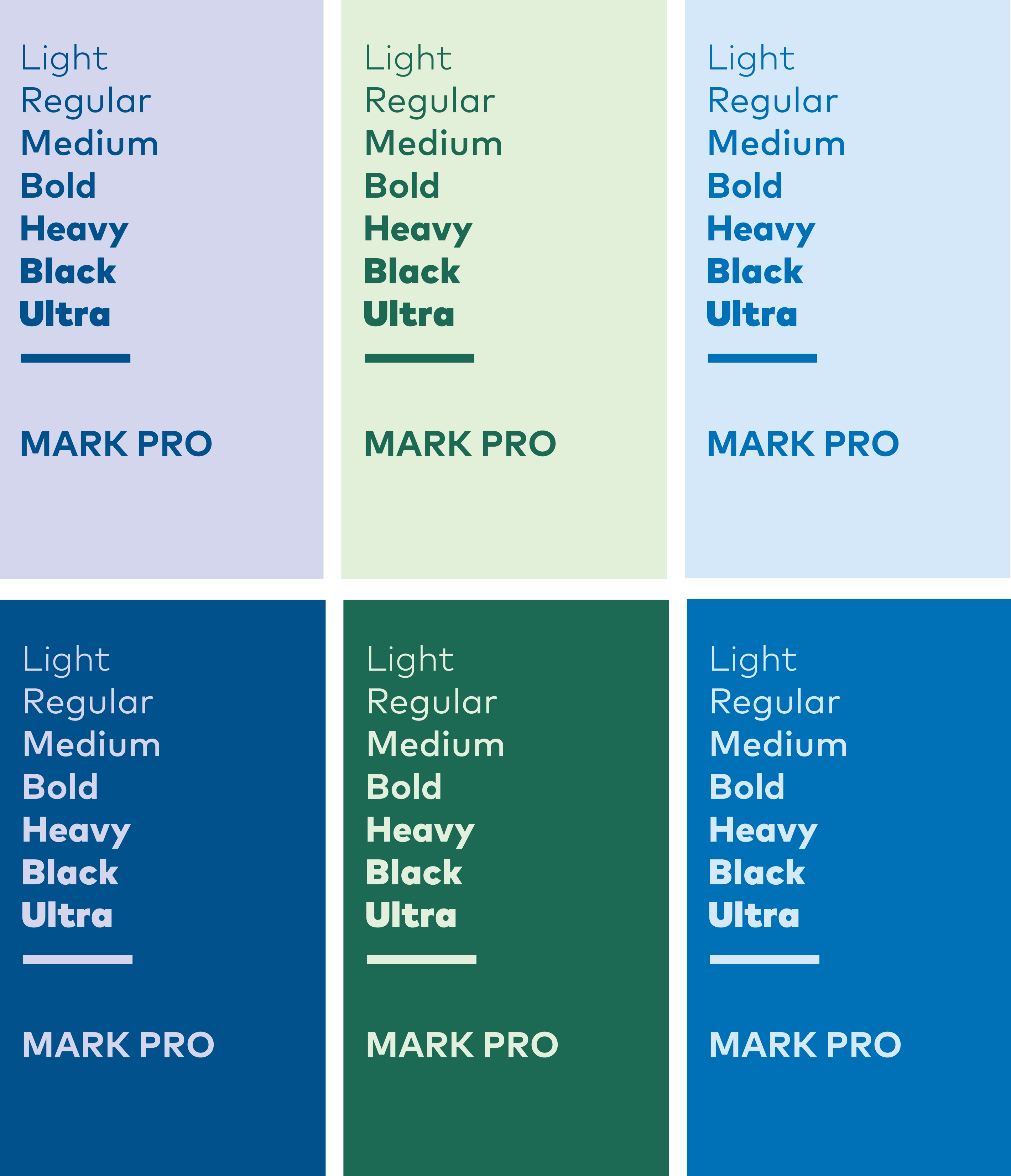
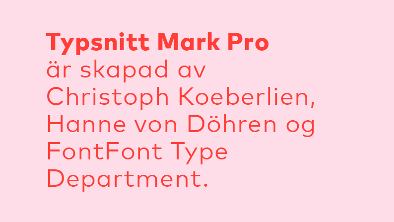
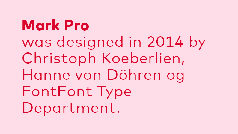
Mark Pro
Mark Pro is Nordic co-operation’s primary typeface. It is a geometric typeface, which conveys a straightforward, open and accessible idiom that reflects the values of Nordic co-operation. Mark Pro är det nordiska samarbetets primära typsnitt.
Mark Pro is available in many different styles: from thin to bold. This allows the typography to vary according to content and target audience.
The Mark Pro package covers all of the Nordic languages, and also the Cyrillic alphabet.
Mark Pro can be used online.
Mark Pro should not be used in Word, Excel or PowerPoint – read more under System typeface.
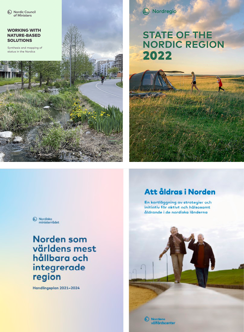
EXAMPLES
The visual identity includes certain recurring typographical conventions.
Headings
All styles may be used, as long as the result is easily legible. In other words, colour, size and, where applicable, photo background should be taken into account.
For shorter headings, it is acceptable to use upper-case letters only. For longer headings, both upper and lower case should be used to make them more easily legible.
The title may be aligned either to the right or to the left. It is also permissible to align individual words and lines without justifying the text at the margin. Centre-aligning of headings should be avoided.
Licence
Licences are purchased from Myfonts.
The desktop version is called Mark Pro, the web font is called Mark.
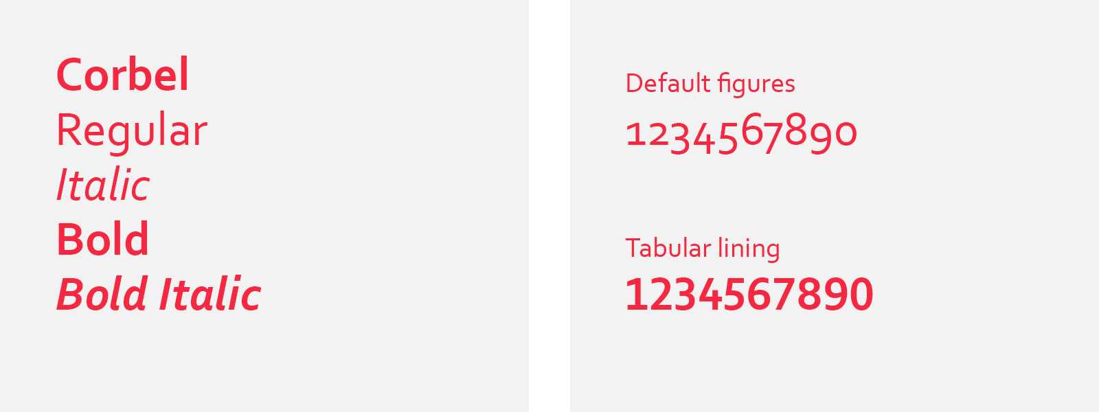
System typeface
For Word documents, Excel and PowerPoint use the system typeface – Corbel. Corbel comes with the Microsoft Office package. If you use a different operating system that does not include Corbel, it is available as a free download from www.wfonts.com.
Corbel can in some cases be used on social media.
By default, Corbel has lower case numbers (default figure). They work well for continuous text. The font also includes another set of numbers (tabular lining), which is more suitable for tables, headings and page numbering.