Sub identites
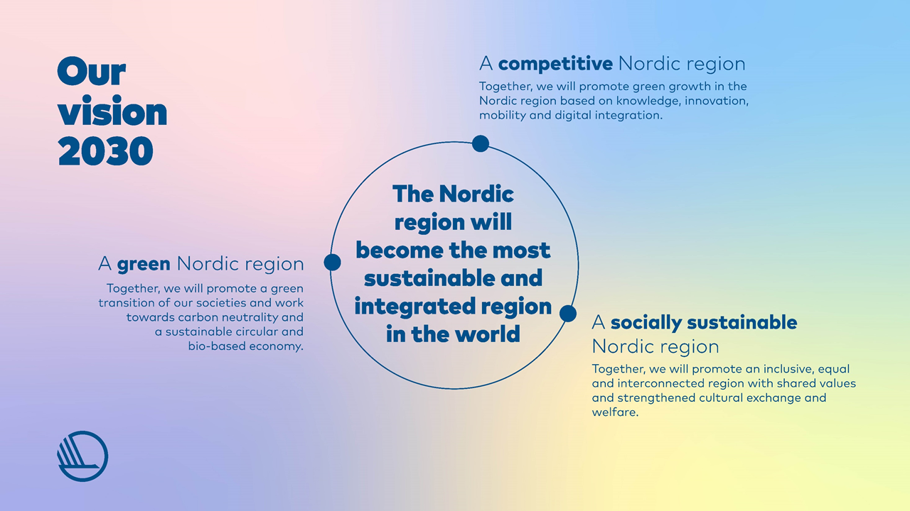
Our vision 2030
Concept
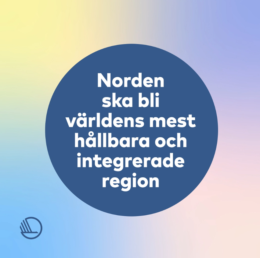
The Nordic region must become the world’s most sustainable and integrated region by the year 2030: In August 2019, the Nordic prime ministers agreed that this would be the headline for Nordic co-operation in the coming years. In order to achieve this vision, we must focus on three strategic priorities in the years leading up to 2024:
- A green Nordic region
- A competitive Nordic region
- A socially sustainable Nordic region
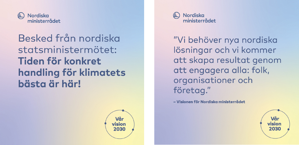
A sub identity has been developed for communicating our vision. “Our vision 2030” is written in a circle with three points – one point for each priority – on a multi coloured background. A brief explanation may be associated with the points, which are always located at the same place in the circle. The priorities are always placed in this order. The typography and graphics are always dark blue.
If further or new points are added after 2024, the model can be expanded. The coloured background is used only when communicating about the vision.
Digital
PowerPoint slides presenting the vision in all the Nordic languages and English are available in Templafy at the Nordic Council of Ministers’ secretariat. The slides can also be downloaded here:
→ Download PowerPoint slides with vision graphics (6 languages)
Shareables for the social media adhere to the same guidelines as other materials (examples at the bottom right).
Publications
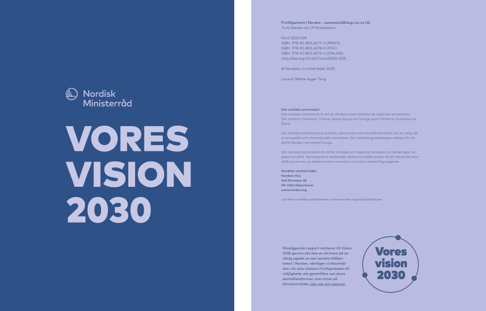
If a publication deals exclusively with the vision, you can use the multi-coloured background with all the secondary colours in selected places – though not on the front page, which must have either a photograph or a dark blue background.
In other publications that have a connection with the vision, you can place the circle with the three dots and “Our vision 2030” in the colophon or in the section “About this publication”. The graphic element is accompanied by an optional text which explains the connection. This applies to both digital and printed publications.
The graphic may be primary blue, dark blue or dark red, to accord with the colours in the publication.
→ Download the vision graphic in three colours (PNG, 6 languages)
Internal communication
The internal communication strategy covers the entire Nordic cooperation and includes the Secretariat of the Nordic Council of Ministers, its institutions and offices in the Nordic and Baltic countries and the Secretariat of the Nordic Council.
Nordic cooperation works with many different areas of society. We are united by common values and an awareness that we are stronger together. Here, strong and well-functioning internal communication is absolutely crucial.
Graphic profile
The graphic profile for the internal communication looks like this:
Colors: Primary blue background and white text, alternatively the colors can be reversed.
Typography: Mark Pro is our primary font, but Corbel can also be used as a system font. CAPITAL LETTERS can be used for meaningful words. Important words can be marked in bold, e.g. by quotation. Centered text may exceptionally be used.
Graphic element: A thick line is included as a design element.
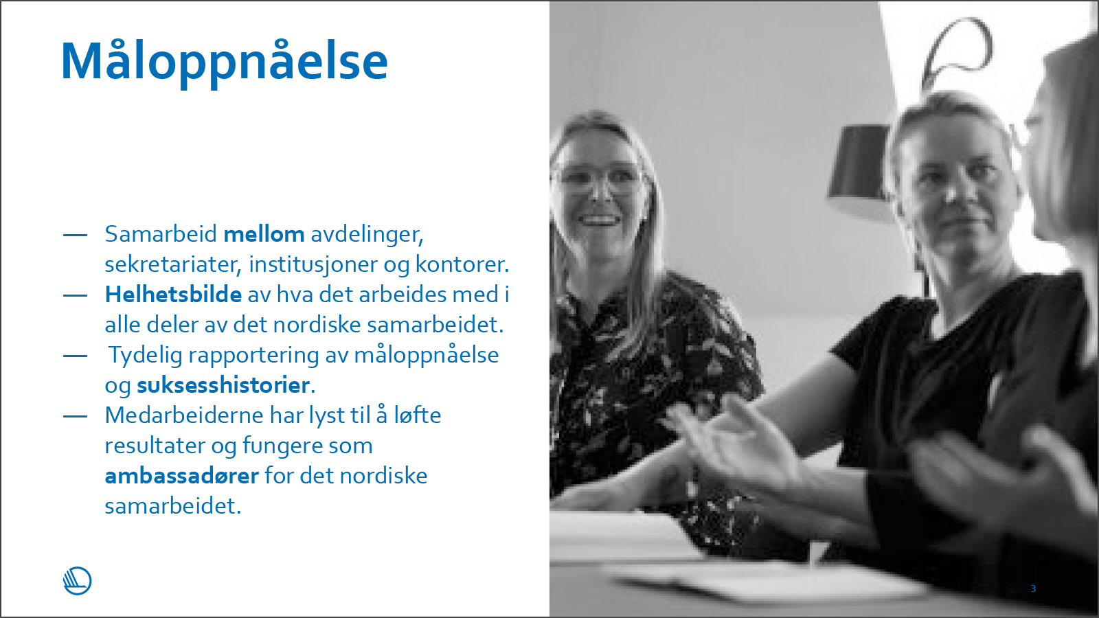
Photo: We use black/white photos.
Illustration: Icons and illustrations can be used and possibly adapted to animations.
Publications: The front page of publications always have box design with a primary blue box and white text.
See examples of design of pdf front pages below.
Sustainable Lifestyle
Introduction
Sustainable Lifestyle is a programme initiated and funded by the Nordic Council of Ministers. It runs from 2021 to 2024. This document outlines a sub-section of the Nordic Council of Ministers’ graphic identity and may only be used by the programme’s six projects.
The overall aim of the programme is to make it easier to live sustainably in the Nordic Region, make sustainable lifestyle choices and accelerate the normalisation of sustainable lifestyles.
Contact: INGER SMÆRUP SØRENSEN,
Programme Coordinator
+298 22 46 73 / inger@nlh.fo
Programme Coordinator
+298 22 46 73 / inger@nlh.fo
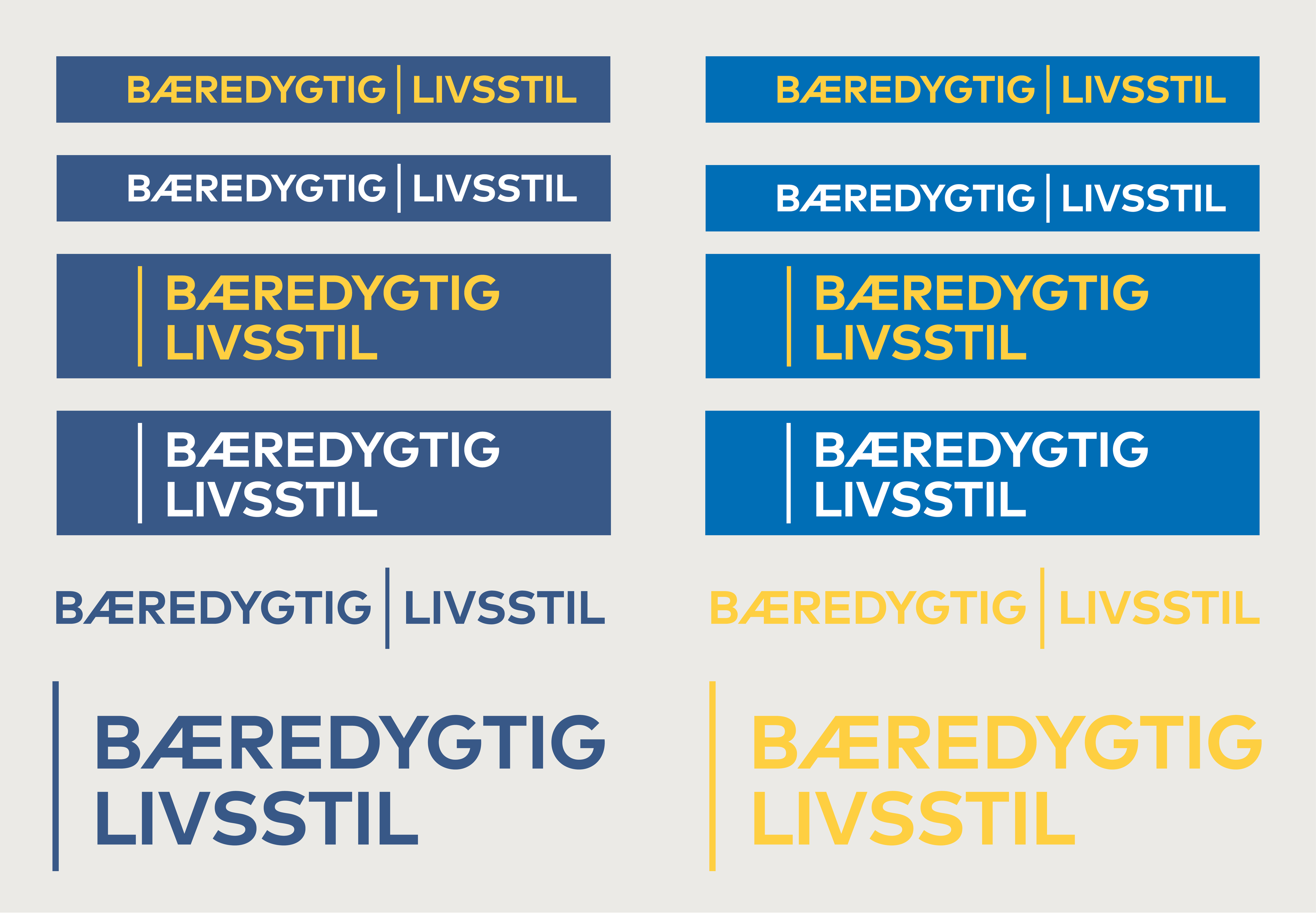
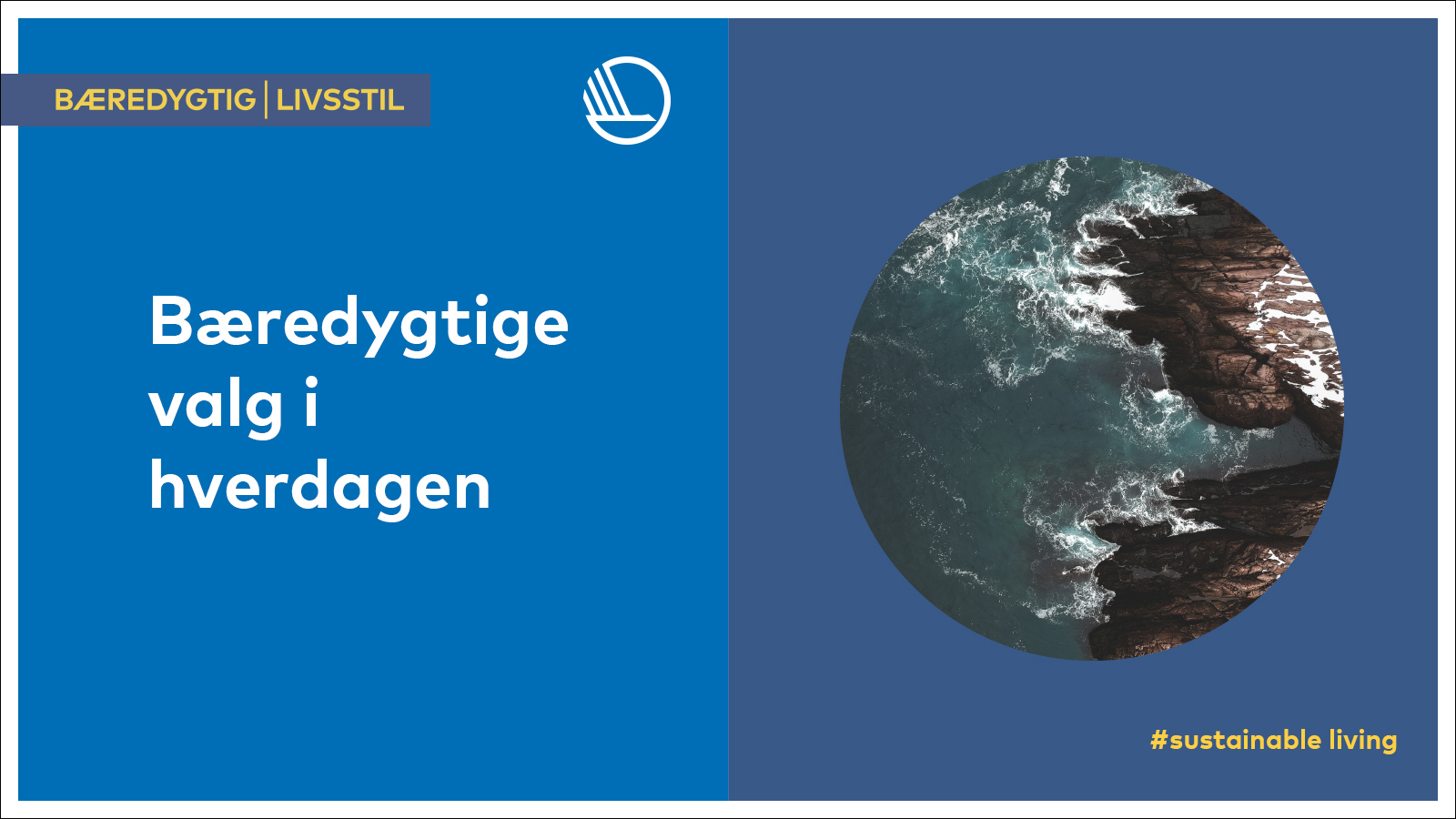
Logo
SUSTAINABLE LIFESTYLE is used as a sub-logo, and always in combination with the Swan. It is available in several variants and colours, as well as seven languages. Examples of how the sub-logo is used are shown below.
If you need access to the logos, please write to pub@norden.org.
Colours
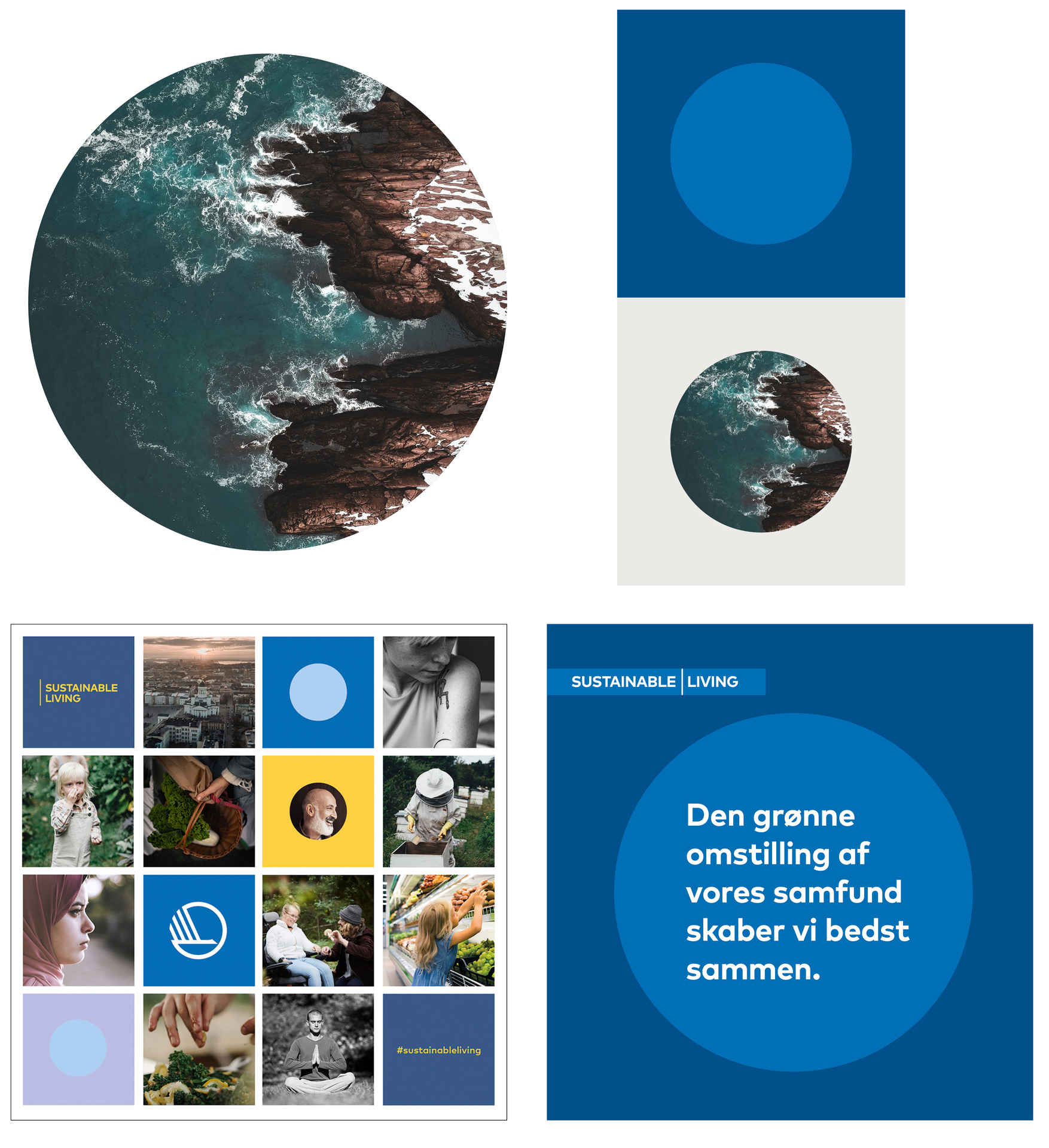
Sustainable Lifestyle uses four of the primary colours and four of the secondary colours from the Nordic Council of Ministers’ visual identity. There are slight deviations from the general rules in the design manual regarding the use of yellow. In this case, yellow may be used in combination with primary blue and dark blue. Yellow may also be used along with pale red and pale violet.
Dark blue

HEX: #385988
RGB: 56-89-136
CMYK: 100–55–3–25
Primary blue

HEX: #006eb6
RGB: 0-110-182
CMYK: 100–40–0–6
Yellow

HEX: #fdcf41
RGB: 253-207-65
CMYK: 0–13–100–0
Dark grey

HEX: #454547
RGB: 70-69-71
CMYK: 0–0–0–88
Pale violet

HEX: #d3d5ed
RGB: 211-213-237
CMYK: 20–15–0–0
Light blue

HEX: #d4e9f9
RGB: 212-233-249
CMYK: 20–3–0–0
Light yellow

HEX: #fff0be
RGB: 255-240-190
CMYK: 0–2–35–0
Light grey

HEX: #d4e9f9
RGB: 237-237-238
CMYK: 4–3–6–7
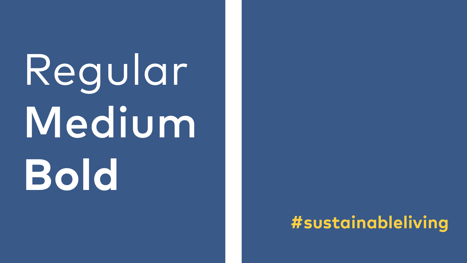
Typography
The typeface is Mark Pro, which is a licensed font. The Mark Pro package covers all of the Nordic languages. Licences may be purchased from www.fontshop.com. The typeface for desktop is called Mark Pro. The web typeface is called Mark.
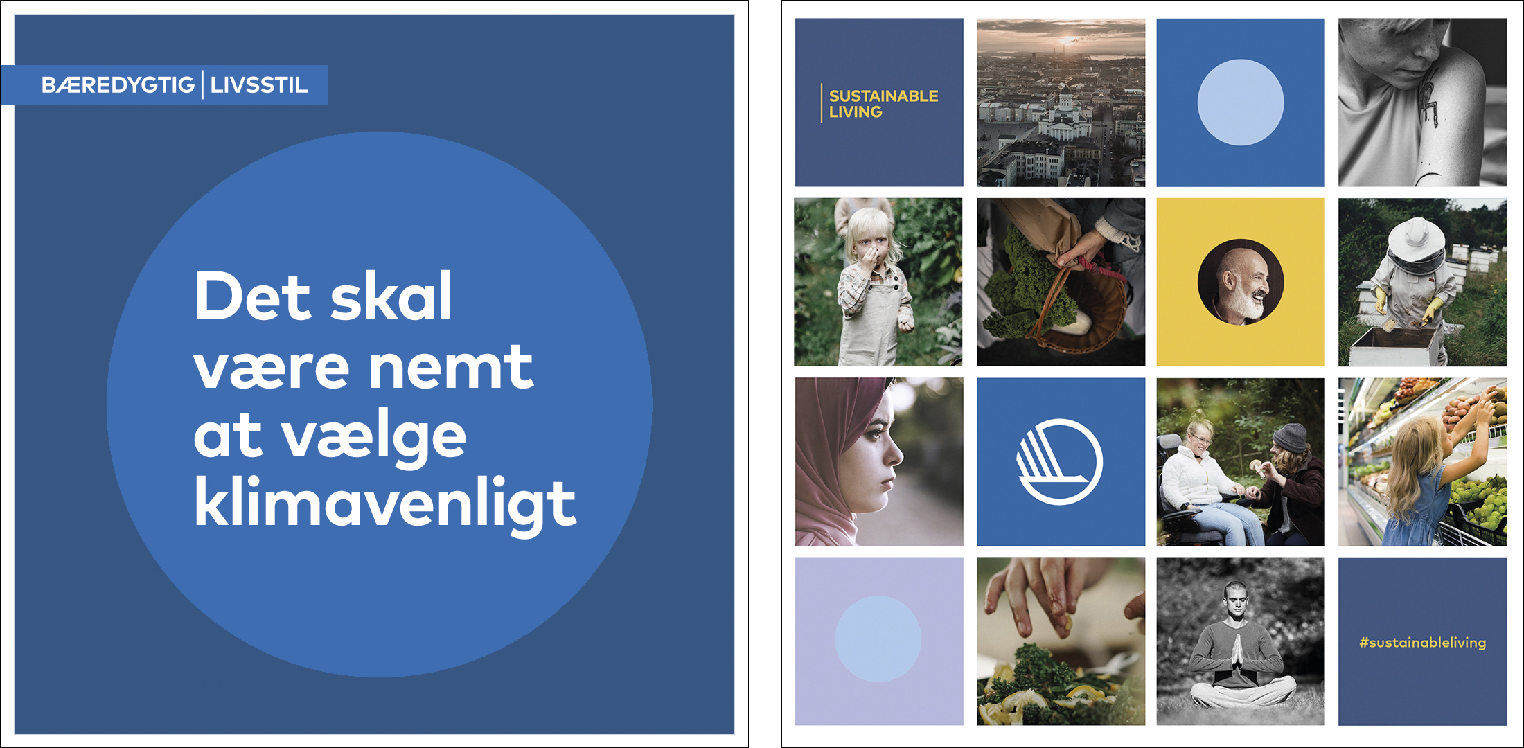
The three primary fonts are regular, medium and bold. The hashtag #sustainableliving is used throughout as a graphic and communicative element, and is always in English.
For Word, Excel and PowerPoint files, use the system typeface Corbel, which comes with Microsoft Office.
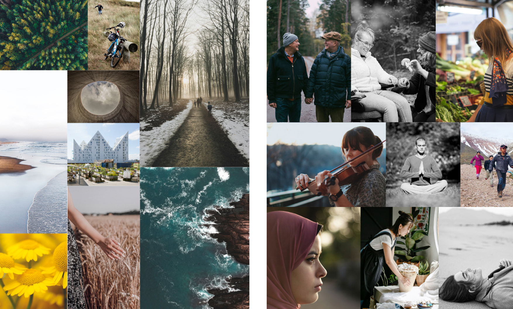
Images
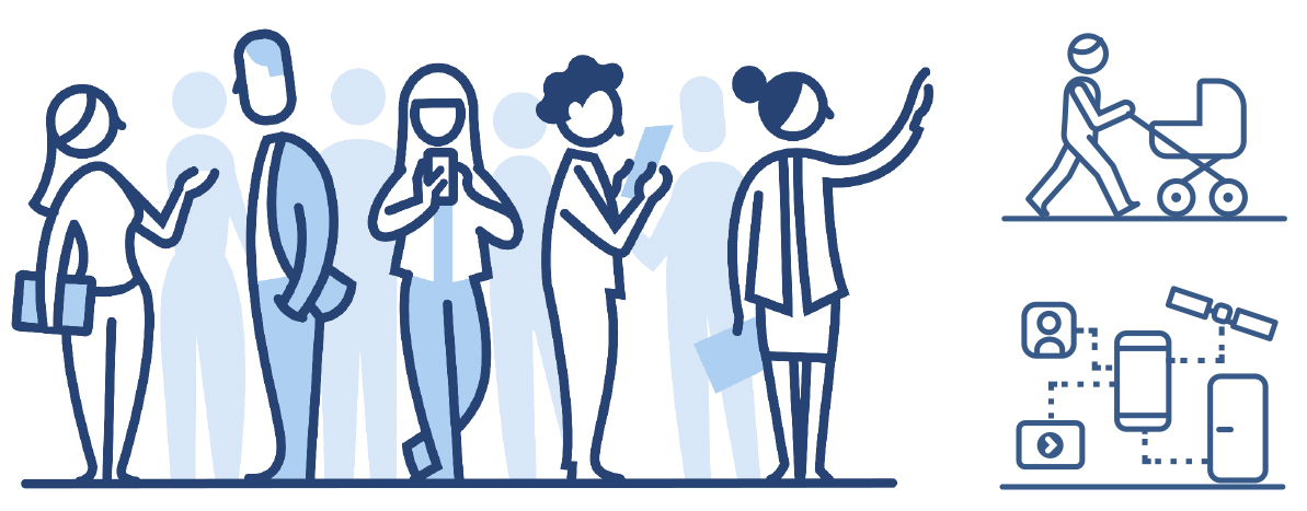
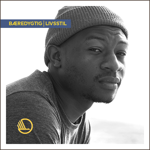
The visual identity primarily uses archive images that support the overall theme. The overall aesthetic is natural and relaxed, but also characterised by seriousness and reflection:
- Environmental photos depicting nature, the climate and everyday life, where the changes will take place. These are mainly in colour.
- A representative selection of portraits of people from the Nordic Region, in both B/W and colour.
A white frame around the images emphasises a lighter and more uncluttered look. The frame thickness remains relatively the same, as shown in the example to the right.
You can find suitable images in Skyfish. Use the search term “sustainable living” to see the project’s photos. The vast majority of images there can be used free of charge, as long as you credit the source.
Additional photos can be found in various image databases:
To get access to the restricted areas of our image archives on Skyfish and Templafy, please contact pub@norden.org.
Shapes
The circle is a consistent shape throughout. It symbolises sustainability and fact that the project covers all of the Nordic countries. The circle can be placed within a rectangle or square, and may be used in several ways and different formats. It can consist of a simple, single-colour element or be used to frame a photograph or text. The visual identity also includes mosaics made up of squares containing different content.
Digital
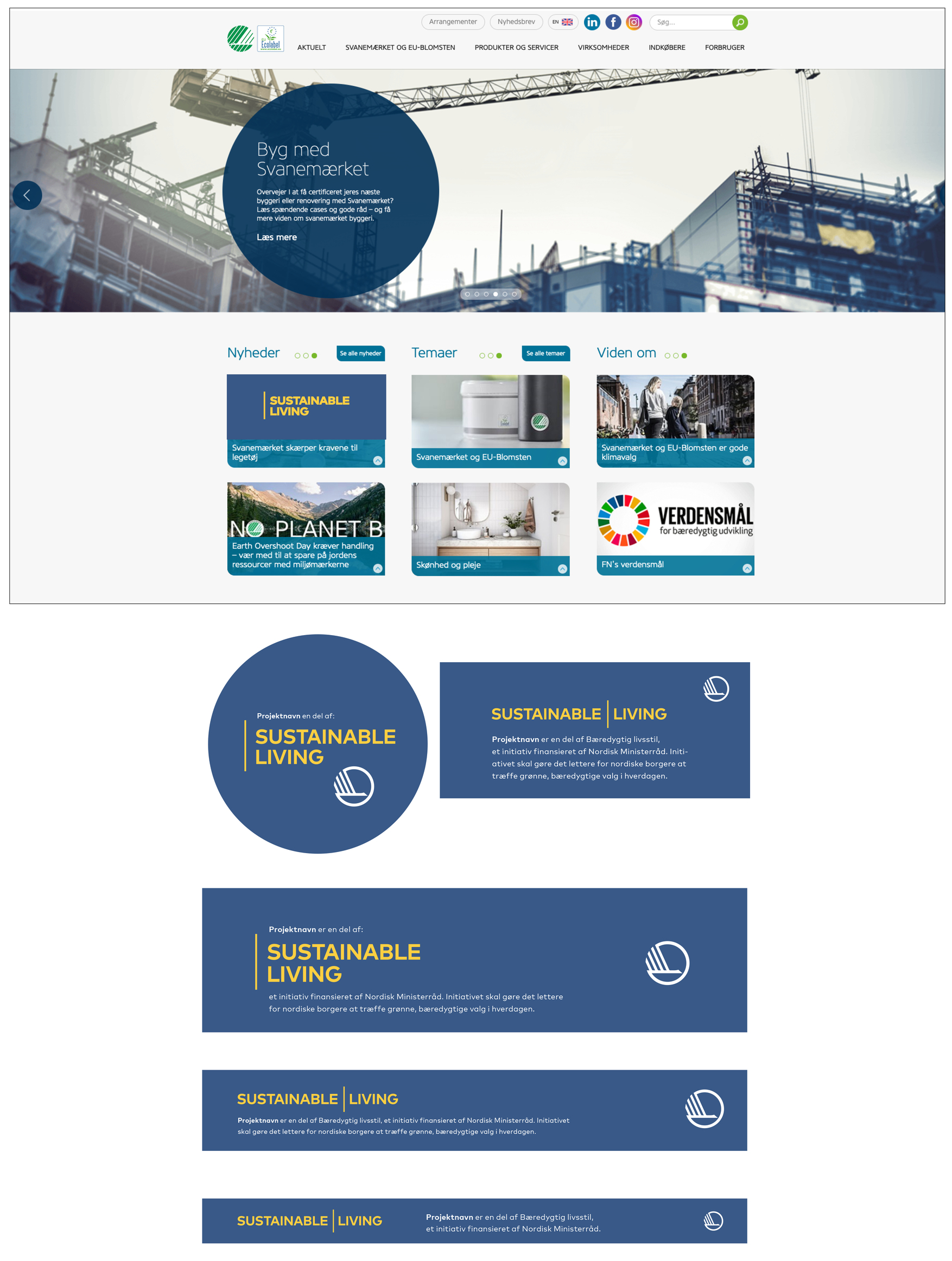
Inserts, partner banners and focus sections can be used to highlight that a given project is part of the overall initiative. Each project’s individual platform determines the shape and size of these elements. See the example from www.ecolabel.dk.
Social media
To the right are examples of material for social media.
1:1 for Instagram and Facebook (1080 x 1080 px), 16:9 for LinkedIn, Facebook and Twitter (with different dimensions).
For Instagram Stories, we recommend the font San Francisco Bold for iOS or Roboto for Android. For breaking stories, the safest font colour is white. For pre-prepared stories, which afford greater control over the colours, there is a little more room to play (e.g. with yellow or dark blue).
Office
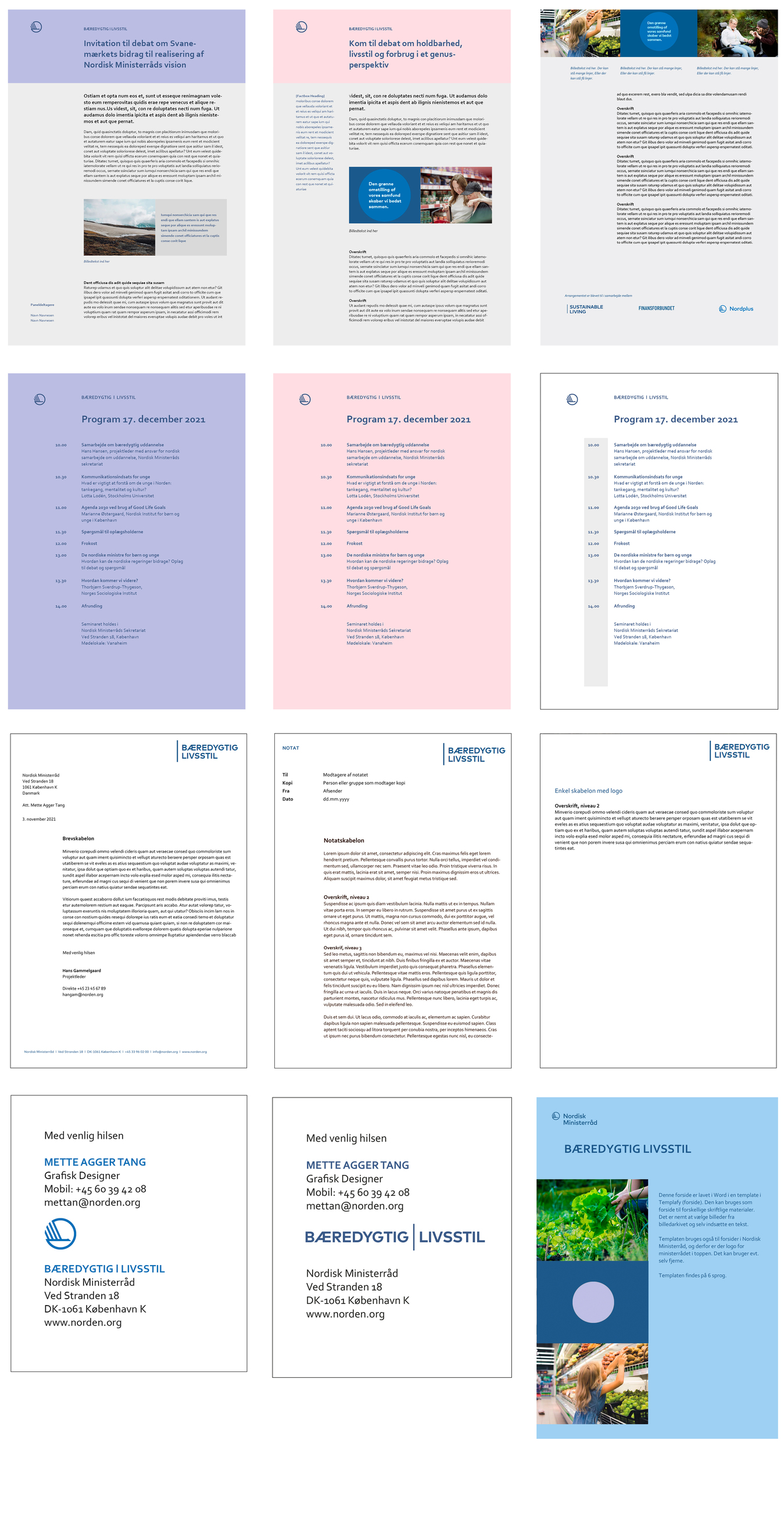
Templafy
Templates for PowerPoint and Word are available in the Templafy add-in. Project members can request access to Templafy by contacting pub@norden.org.
Powerpoint
In Templafy, select “Template dark blue”.
Word
Row 1: Example of template in Templafy for invitations.
Row 2: Example of template in Templafy for programs.
Row 3: There are no templates for paper lines (letters, notes, etc.), but it is relatively simple to adapt the existing ones, see examples.
Row 4: Example of mail signature and template in Templafy for front pages in word.
Row 2: Example of template in Templafy for programs.
Row 3: There are no templates for paper lines (letters, notes, etc.), but it is relatively simple to adapt the existing ones, see examples.
Row 4: Example of mail signature and template in Templafy for front pages in word.
Outlook
Mail signatures are in Corbel (11 pt). Sender and Sustainable Lifestyle are in upper case bold in blue. The rest of the text is black. We recommend that the only graphic element in the signature is the Swan icon. This clearly identifies the sender, even if the recipient’s mail does not display image files. If you decide to use the logo, please follow the example provided here (bottom right).
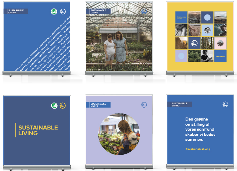
Large formats
Here are some examples of large-format motifs. They are shown as rollup banners, but the medium can also be used for digital backdrops, visual outdoor materials, posters, etc.
The first example uses the “sustainability background”. The text can also be typed from left to right across the format. Here, the text is negative, but you can also use a positive version with dark text on a light background. This works best on large surfaces and can be used in a variety of contexts.
Please note that in the two examples on the far left, the green Swan label is located next to the Nordic Council of Ministers’ Swan icon.