Colours
Colours as signifiers of identity
The colours used to signify identity are based on the eight Nordic flags and consist of: dark blue, blue, red, and yellow. These clear and obvious colours make up the primary palette. Blue and white are consistently used as main colours in formal contexts, e.g. on letters, flags and podiums.
The accent palette is inspired by Nordic light. These are subtle colours that provide a contrast to the bold flag colours.
These primary and accent colours, combined with a scale of neutral grey tones, make up the colour universe for official Nordic co-operation.

Primary colours
The primary colours are combined with the accent colours.
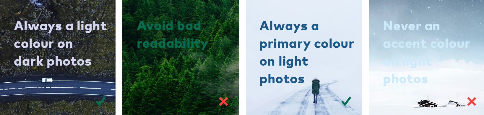
White can also be combined with the primary colours (except with dark yellow and dark grey). According to the Web Accessibility Guidelines the contrast between two colour that are combined should be high, white comes in very handy together with the primary colours an photographs.
Dark blue

HEX: #385988
RGB: 56-89-136
CMYK: 100–55–3–25
Green

HEX: #266d51
RGB: 38-109-81
CMYK: 85–35–70–25
Primary blue

HEX: #006eb6
RGB: 0-110-182
CMYK: 100–40–0–6
Red

HEX: #ba0c2f
RGB: 186-12-47
CMYK: 0–100–75–20
Yellow

HEX: #fdcf41
RGB: 253-207-65
CMYK: 0–13–100–0
Dark grey

HEX: #454547
RGB: 69-69-71
CMYK: 0–0–0–88
Accent colors for digital media
The accent colors are specially adapted to digital use and online publications. The accent colors should always be combined with the primary colors.
According to EU requirements for web design and accessibility, the contrast between colors should be high. The accent colors should therefore be used on a background of a primary color.
Light violet

HEX: #d3d5ed
RGB: 211-213-237
CMYK: 20–15–0–0
Light green

HEX: #e2fae1
RGB: 226-250-225
CMYK: 15–0–20–0
Light blue

HEX: #d4e9f9
RGB: 212-233-249
CMYK: 20–3–0–0
Light red

HEX: #fbdce7
RGB: 251-220-231
CMYK: 0–20–3–0
Light yellow

HEX: #fff0be
RGB: 255-240-190
CMYK: 0–2–35–0
Light grey

HEX: #ecedee
RGB: 236-237-238
CMYK: 4–3–6–7
Alternative accent colors for printing and graphs
The alternative accent colors can be used for printing of for example backdrops for events and fot the usage of colors in graphs (like curve diagrams in online publications).
The accent colors, which are lighter in shade than the alternative ones, are specially adapted to digital use and online publications, as the contrast between dark and light color must be high, for example in text. The accent colors becomes too light for print and graphs - and therefore we have the alternative colors.
Alt. light violet

HEX: #bcbde2
RGB: 188-189-226
CMYK: 30–25–0–0
Alt. light green

HEX: #cde4c4
RGB: 205-228-196
CMYK: 25–0–30–0
Alt. light blue

HEX: #afdbf6
RGB: 175-219-246
CMYK: 35–3–0–0
Alt. light red

HEX: #f8c9db
RGB: 248-201-219
CMYK: 0–30–3–0
Alt. light yellow

HEX: #ffed99
RGB: 255-237-153
CMYK: 0–3–50–0
Alt. light grey

HEX: #c8cacc
RGB: 201-202-204
CMYK: 0–0–0–24
Grey tones
You can use among these grey tones when making info graphics and graphs.
Grey tones can also be used in typography, if you wish a softer expression. The dark grey and the light grey can also be used on front pages for publications.
White

HEX: #ffffff
RGB: 255-255-255
CMYK: 0–0–0–0
Light grey

HEX: #ecedee
RGB: 236-237-238
CMYK: 4–3–6–7
Alt. light grey

HEX: #c8cacc
RGB: 201-202-204
CMYK: 0–0–0–24
40%

HEX: #a7a9ab
RGB: 167-169-171
CMYK: 0–0–0–40
56%

HEX: #87898c
RGB: 135-137-140
CMYK: 0–0–0–56
72%

HEX: #696a6c
RGB: 105-106-108
CMYK: 0–0–0–72
Dark grey

HEX: #454547
RGB: 69-69-71
CMYK: 0–0–0–88
Black

HEX: #000000
RGB: 0-0-0
CMYK: 0–0–0–100
Use of colour
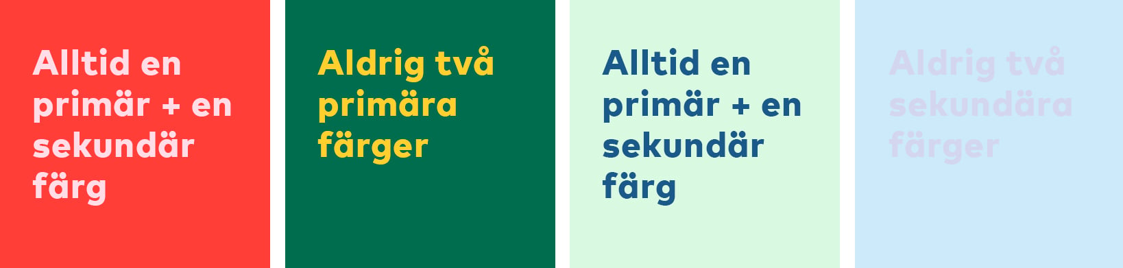
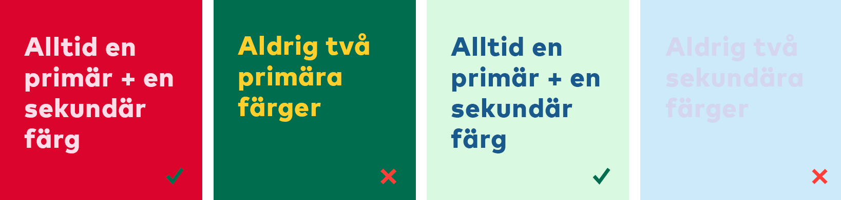
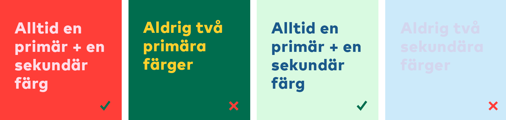
Always use a combination of a primary colour and an accent colour on background, title and logo, on all of the main forms of communication (covers on publications, websites, posters, etc.). See examples below.

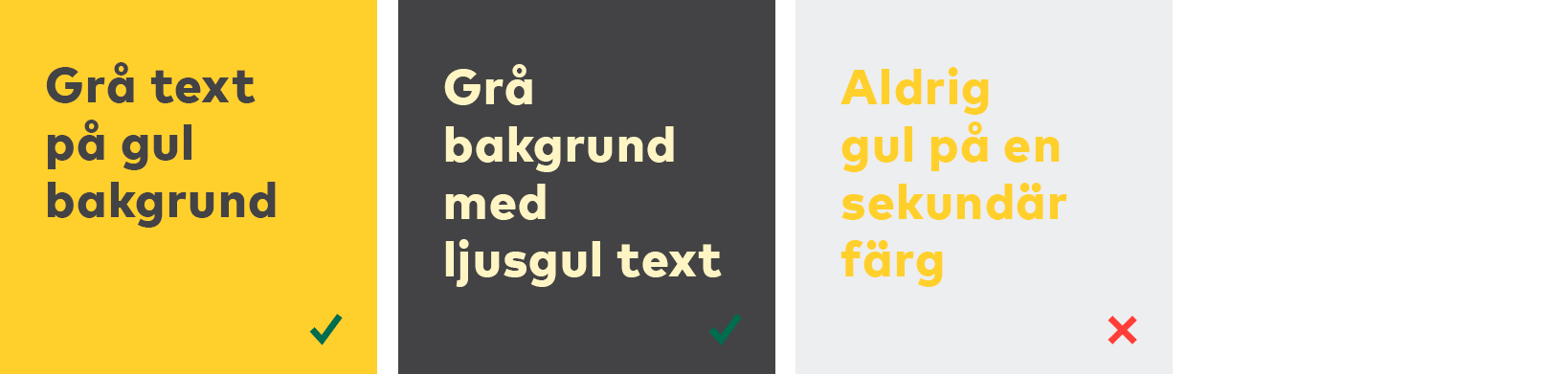
Yellow and grey
For reasons of legibility, the primary yellow should only be used for text on photos, or as a background colour overlaid with text in a dark shade of grey.