Digital media
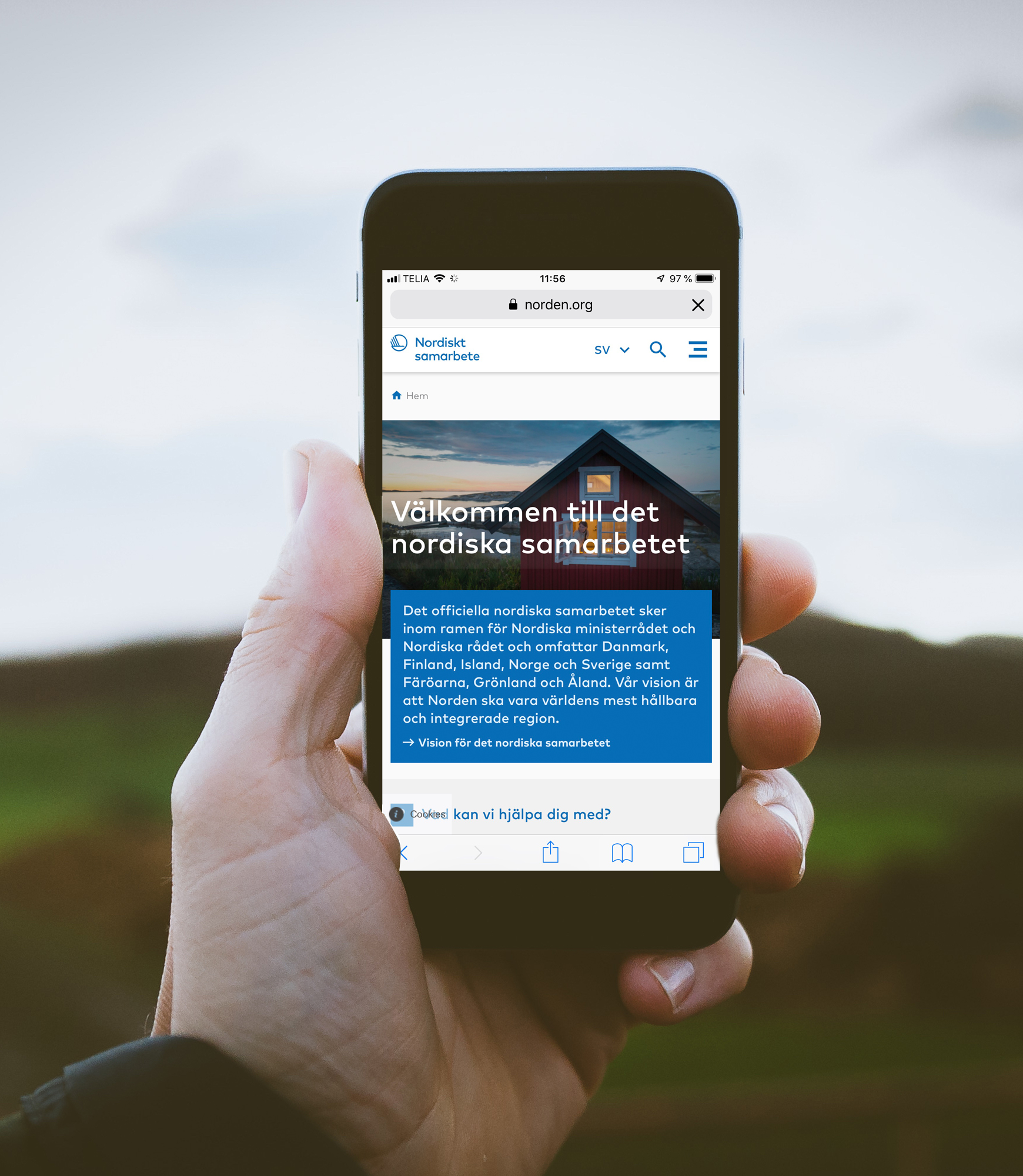
Websites
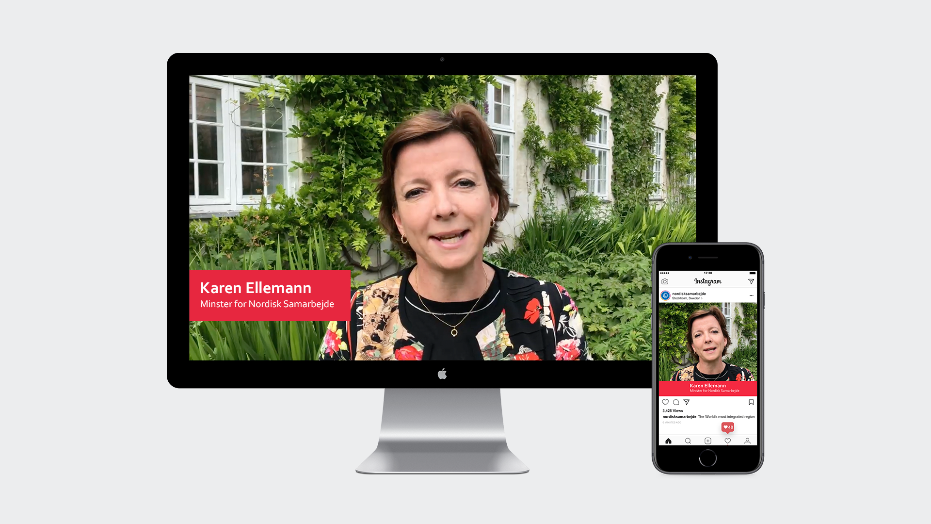
The visual identity on a website can be implemented in a number of ways. See exemples here:
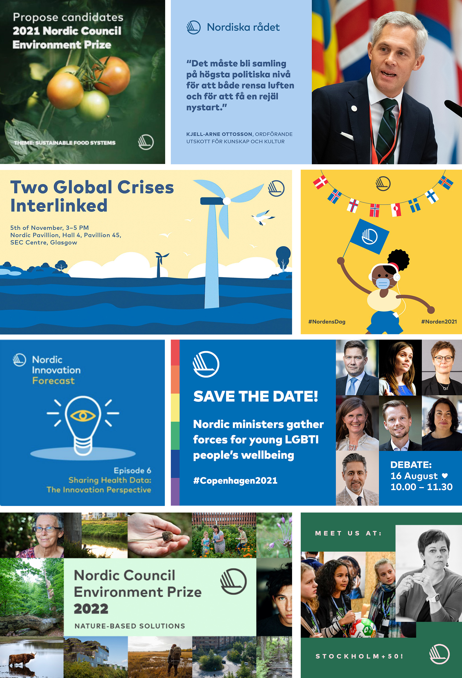
Social media
Written communication on online banners must be short and to the point.
Social media uses standard formats, e.g. Facebook banners are 1200 x 628 px or for Instagram, 1080 x 1080 px.
Please, remember to keep up-to-date with the latest social media formats, as they are constantly changing.
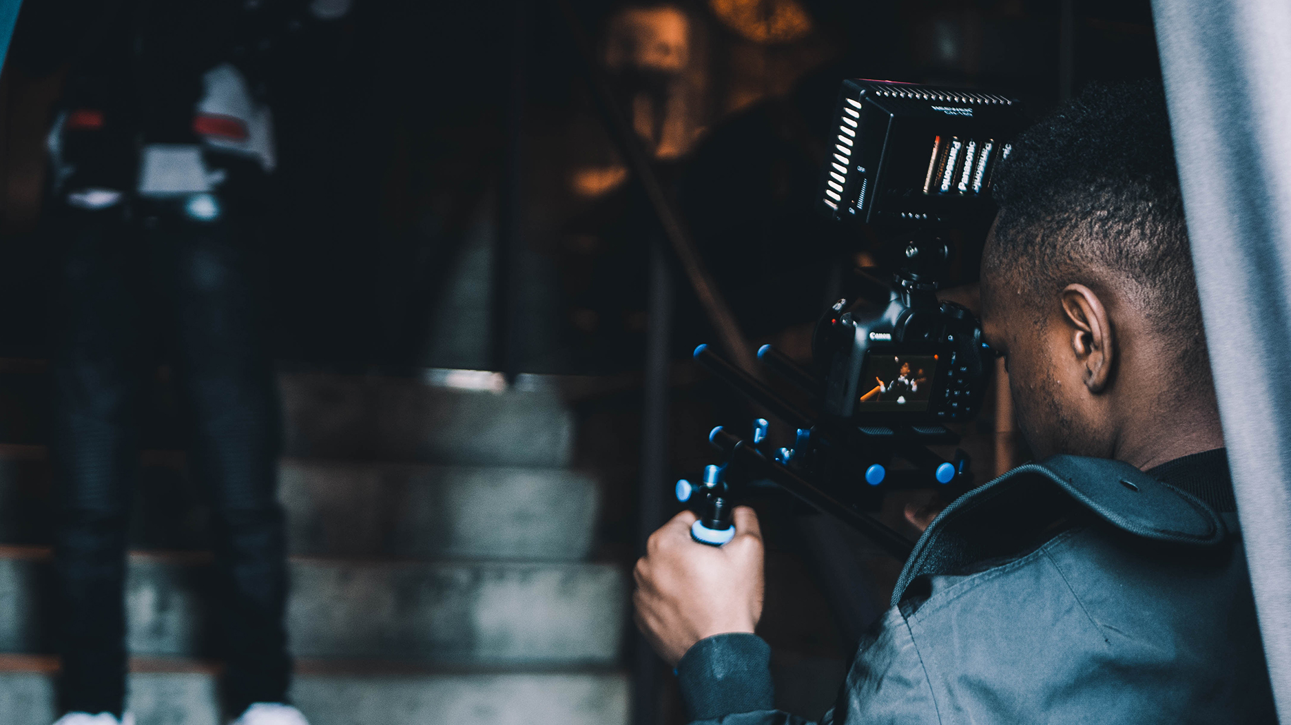
Video production
Three types of production
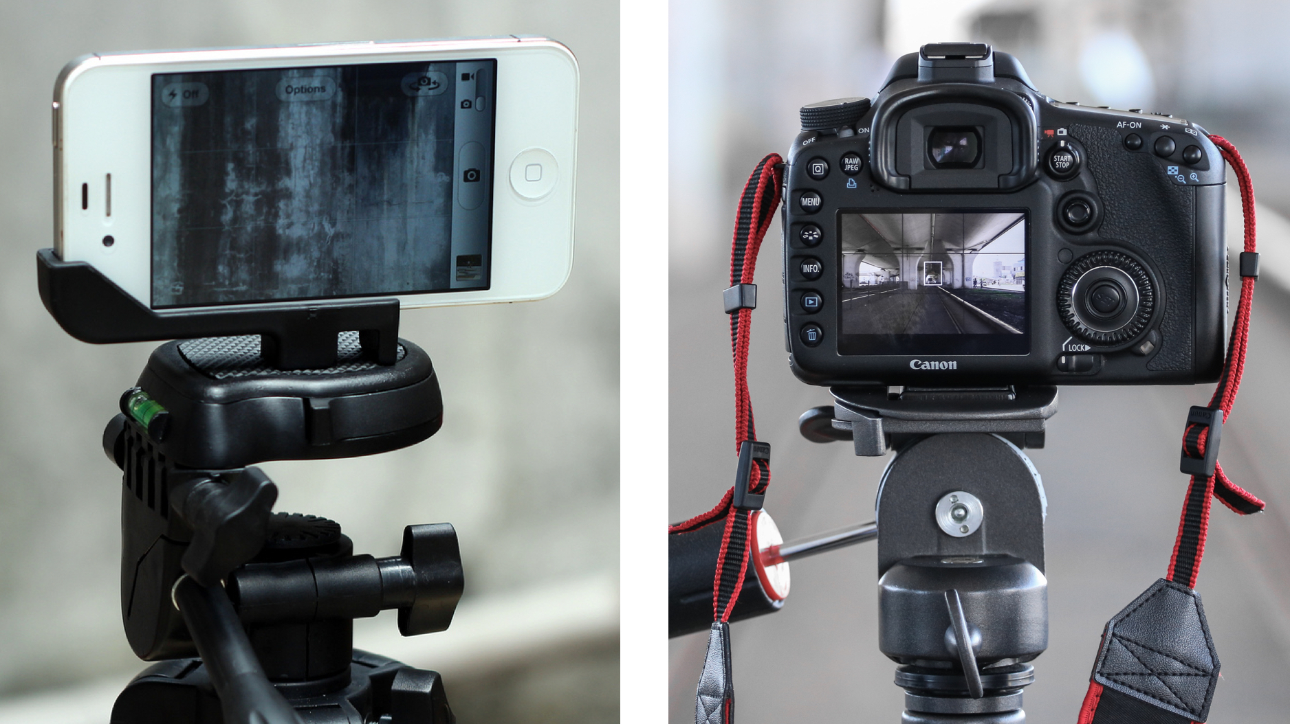
SMALL (with smartphone or tablet)
- User-generated content for distribution on social media.
- Short interviews filmed in-house with smartphone or tablet.
Post-editing with smartphone or tablet in, for example, Luma Fusion.
MEDIUM (in-house)
- Interviews for news and social media.
Internal or external camera operator with video camera or smartphone/tablet. Internal pre-production, script writing and post-processing in, for example, Adobe Premiere Pro.
LARGE (external producer)
- Video/interview with video camera, assisted by external producer.
The consultant is involved in the pre-production, subtitling and post-processing, plus any animations. Mainly for prioritised projects and campaigns.
The good production
There are a number of elements that can have a major influence on whether or not you end up with a successful production, including pace, preparation, location, lighting, editing, choice of background music, etc.
A video production process may be divided into three stages:
- Preparation
- Recording
- Post-processing
These elements are described in more detail below.
Preparation and recording
MEDIUM AND FORMAT
Format 16:9 (1920 x 1080 pixels) is typically used for TV, YouTube, Vimeo and Facebook.
Format 1:1 (1024 x 1024 pixels) is typically used for Instagram.
Format 9:16 (1920 x 1080 pixels) is typically used for Snapchat, Instagram stories and Facebook stories.
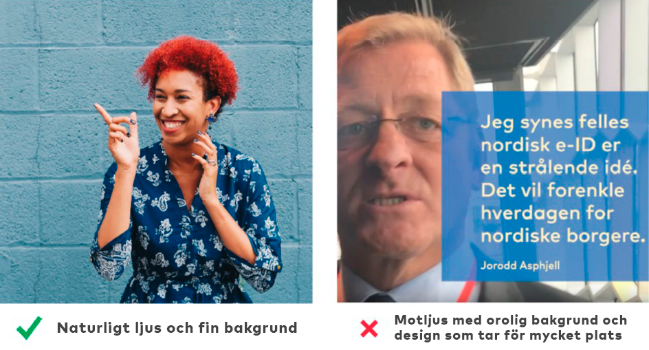
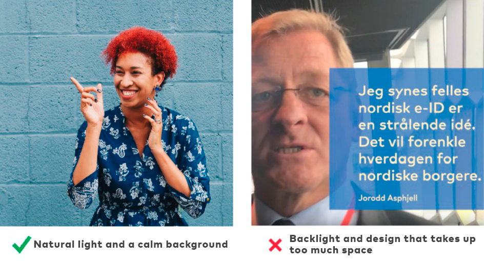
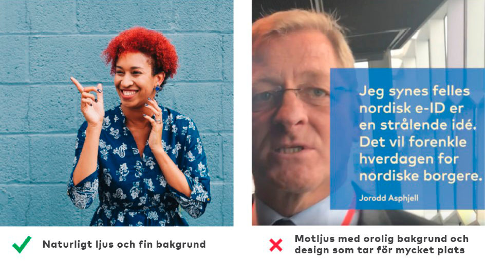
LOCATION AND LIGHTNING
Lighting can affect the atmosphere of a recording. Light can have different colour temperatures, which influence whether we experience the light as warm or cold, soft or hard.
Warm light can be advantageous if the atmosphere is to be pleasant and comfortable, as it gives a sense of trust and security. Natural light typically changes in the course of the day and is warmest in the morning and evening.
Soft light produces less contrast between dark and light areas. Soft light is ‘scattered’ light that is emitted by a large light source. This is the kind of light you get on a slightly cloudy day, in a softly lit room, or with the help of a reflector screen that spreads the light from a light source.
Hard light creates a harsh atmosphere in the picture. Hard light is typically produced by small light sources. The further a person is from a light source, the harder the light appears. For this reason, sunlight is a hard light source.
Cold light creates a sad or grim atmosphere. Fluorescent lamps are typically a source of cold light.
SOUND
To record sound, it is best to use an external microphone. Remember also to use a long microphone cable, so that the interviewer does not need to stand too close to the camera. If you at a conference or the like where there is a lot of background noise, see if you can find a room or corner where it is quieter. If it is windy outside, record indoors, as wind noise will greatly reduce the sound.
PICTURE
A picture should be composed in such a way that it appears harmonious and pleasant to look at. A picture with depth and perspective is usually more interesting to look at than a flat image.
Positioning people: If possible, place people at a distance from a calm background, so that there is depth in the picture and the focus of the content is not disturbed. A green plant and a neutral wall, a beautiful staircase, or a neutral lithography can provide excellent backgrounds. Depth can be achieved by positioning the person at a distance to the background, possibly with part of a visible element in the foreground.
Framing: The person can be shown to advantage from chest or navel level to just above the head, so that some of the person’s body is included, and not too much wall or ceiling. In this way we are close enough to see details, but we can still see some of the surroundings, which helps to create depth and atmosphere.
The lines of the picture: Horizontal lines create calm and harmony. Examples of horizontal lines are the edge of a table, a window sill or the horizon. Oblique lines can create dynamics, but avoid using too many of them, as this can produce turmoil.
Camera angle: As far as possible, keep the camera still, at a normal angle, with the person right in front of the camera. If the camera is lower than the person, looking up, he or she may appear intimidating, while if it is raised above the person, he or she may appear less significant.
Post-processing
When the recording process is finished, it is important to consider the following:
- Logo and colours
- Intro and outro
- Typography and subtitles
- Editing and pace
- Animations
- Music
LOGO AND COLOURS
The templates in the manual use white and primary blue. Other colour combinations of ours can also be used. We always work with a full colour palette. You can see the definition in the section of this manual on using colours. If you are using yellow, read in particular the rules for the use of yellow in the design manual.
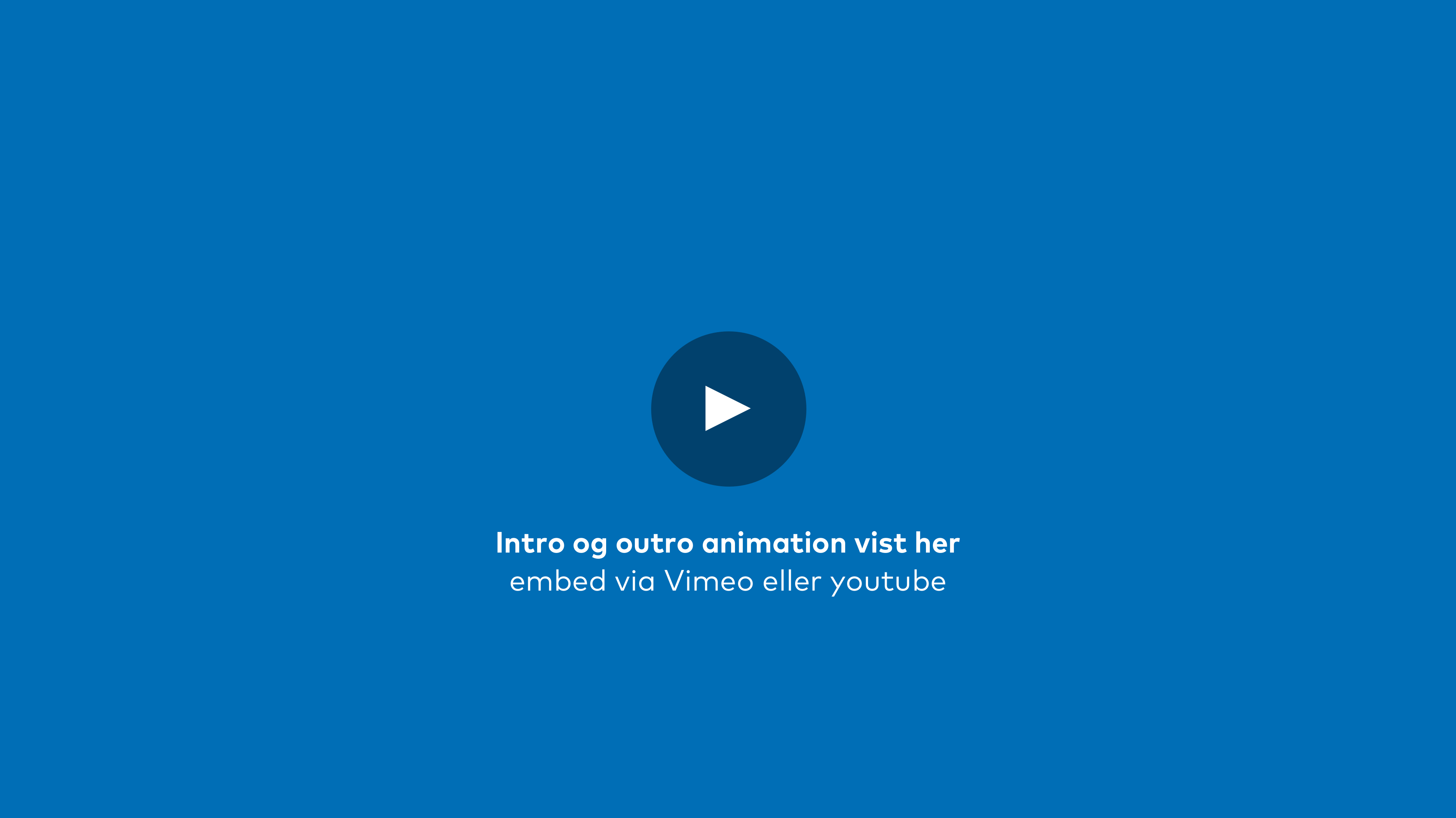
INTRO AND OUTRO
Intro: Must be film, and preferably something that will engage the viewer’s attention. Avoid using graphics at the beginning.
Outro: The video must have a clear sender. We use the large swan with either “Nordic Council of Ministers”, “Nordic Council” or “Nordic Co-operation”.
TYPOGRAPHY AND SUBTITLES
We use Mark Pro as our typographical font. Where possible, we use Corbel for subtitles. We recommend that subtitles are used in all film productions, as many people do not watch videos with the sound on, and this may help to remedy language barriers and sound distractions. Films quite simply become more accessible with subtitles.
EDITING AND PACE
Cuts between people and illustrative images can produce good dynamics – however, there should not be too many short clips that do not allow the eye to rest. Keep in mind that your video should have an appropriate pace. If the video is very short, you can often use a faster pace than in a longer video.
If there are no illustrative pictures, or if it is a long interview, varying angles or distances can be used with the same subject. In order to create a link between the pictures when editing, a sound bridge can be created. In a sound bridge, the sound continues across a cut between pictures; the sound binds the pictures together and gives an impression of coherence and wholeness.
When switching to a new subject, such as a new person, the cut between the two should be as undisruptive as possible. This can for example be done by using approximately the same point of focus (typically the eyes).
ANIMATIONS
Exercise care when animating the various elements. Animation with text should be used in moderation.
MUSIC
Music is a supportive element which can add atmosphere and pace. Consider what story the music should tell, and make sure it doesn’t become too dominant. There are often rights attaching to music, so make sure these are clarified before you use it. You can advantageously use music from one of these sites (note that there are various different payment models and usage rights):
- Premiumbeat
- Inkompetech
- Freesound
- Artlist
- Youtubes ljudbibliotek
If you use Luma Fusion, you can use the ‘Storyblocks’ feature.


Graphics and infographics
If graphics or infographics are used, these should add something to the video. If there is a person speaking, the infographic should support what is said, whether or not the graphics are animated.
Animation with text should be used in moderation.
Web accessibility
Norden.org conforms with Level AA of the Web Content Accessibility Guidelines (WCAG) 2.0. The WCAG guidelines, as detailed on w3.org, are designed to make web content more accessible to people with disabilities. The guidelines also make web content more user-friendly in general.
The following links are useful web-design resources:
→ w3.org – information on WCAG 2.0 (Danish)
→ contrastchecker.com – for checking colours and contrasts
→ webbriktlinjer.se – web-design guidelines (Swedish)
With the browser add-on WAVE Accessibility Extension you can analyse web accessibility in different browsers. The WAVE extension places indicators on the website that provide feedback on accessibility.
Alternative texts (Alt Text) on images and infographics helps people with visual impairments understand images and other graphical contents. When someone uses a screen reader to view documents, the alternative texts will be read out loud. If the visuals are purely decorative, and not informative - you can mark them as such without needing to write an alternative text.
Keep it (relatively) short. The most popular screen readers cut off alternative texts at around 125 characters, so it's advisable to keep it to that character count or less. Focus on writing descriptive alternative texts that provides context to the image and if possible, includes your target keyword.
Contrasts and web colours
When we design front pages for online publications, shareables and other digital material, we use text on a coloured background. A high contrast ratio assists readers who are visually impaired or colour blind.
According to the EU accessibility guidelines, web text must have a contrast ratio of at least 4.5:1 – except for larger fonts, which must have a contrast ratio of at least 3:1.
Large fonts: Standard style of more than 24 pixels (18 pt.). Bold style of more than 18.66 pixels (14 pt.).
The colours from the design manual can be tested using, for example, → contrastchecker.com. Enter the HEX codes of the colours in the foreground and background, and you will be informed of whether the contrast is good enough.