Publications
Digital publications
Due to our policy of printing as little as possible, most of our publications are digital only – usually responsive online publications accompanied by an automatically generated PDF (format 210 x 280 mm). The publications comply with the EU Accessibility Directive.
We use software from the company First Edition to generate our publications. This section is about digital publications created using the First Edition software.
RESPONSIVE DESIGN
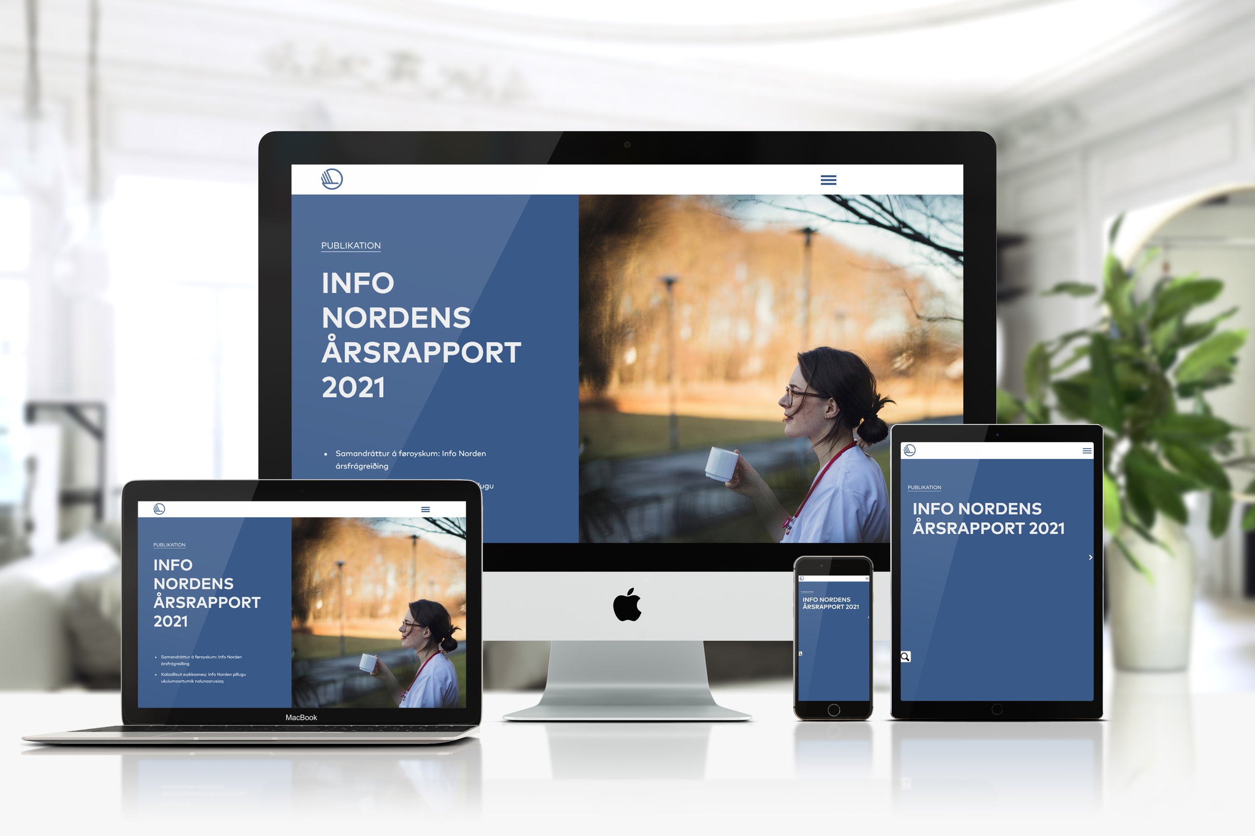
Our digital publications are responsive, which means they adjust to match all screen sizes. On a small screen (smartphone), the elements are stacked on top of each other. Bear this in mind when designing layouts. You also need to think about sizes when choosing text, designing graphs, etc. Always remember to test the result on a range of screen sizes.
Colours
The body text in the digital publications are on white background with dark grey text (88% black).
A combination of primary and accent colours, for example boxes with text on colored background, is also used.
For graphs primary and alternative accent colours are being used, since these colors distinguish better on white background than the normal accent colours.
Typography
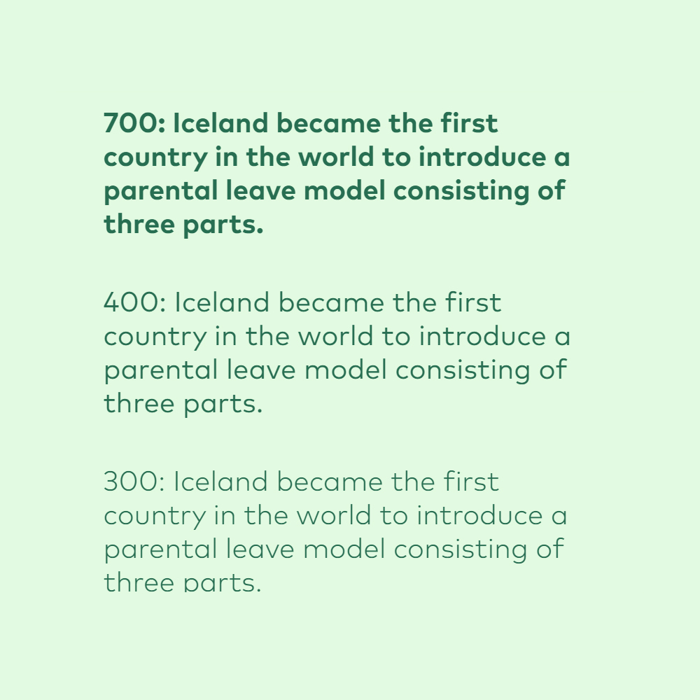
Mark OT is the default typeface in our online-publications. You may use it in four different weights (700, 500, 400 and 300). You can set the size of the font yourself, under settings.
It is important to use the system with H1, H2, H3, etc. This creates a hierarchy in the text that a screen reader can read aloud for people with a visual impairment.
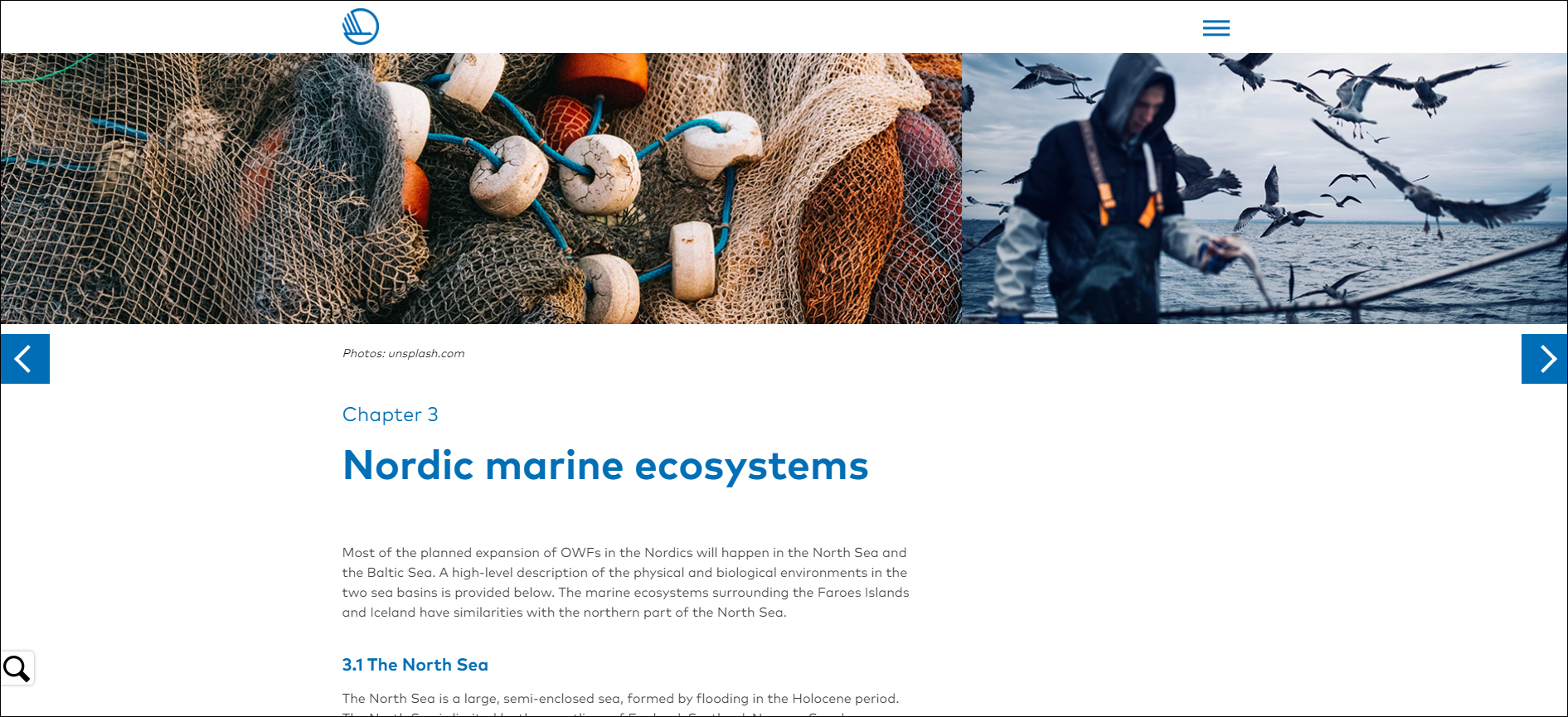
Images
You can insert images in the format of your choice into our publications.If you place a large images at the top of a page, please make sure that the image size allows the reader to see at least some of the headline and text without scrolling.
Wherever there is an image field, you are free to replace it with a video if you prefer.
Click on the links below for examples:
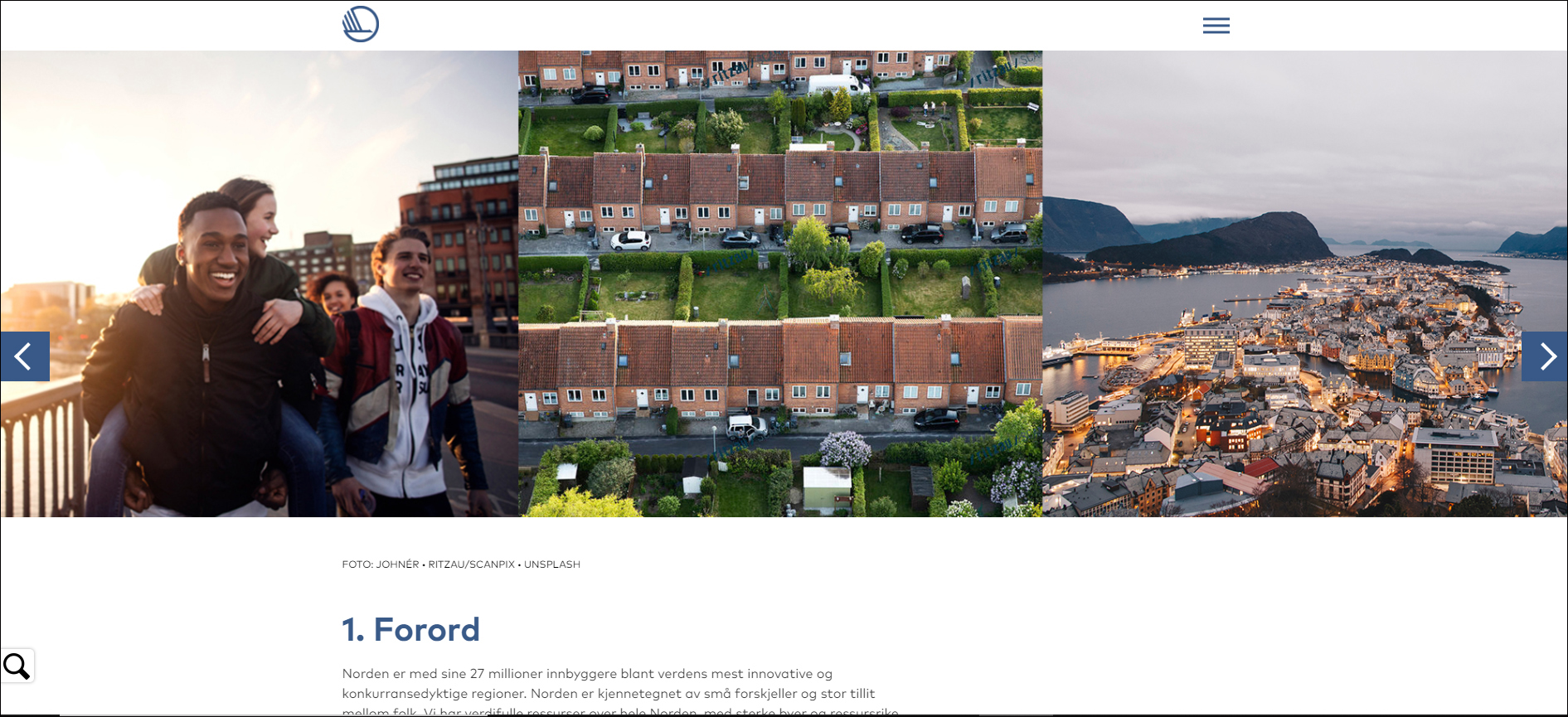
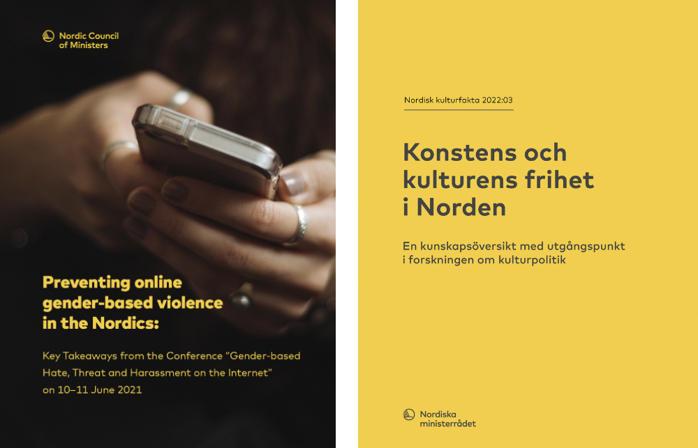
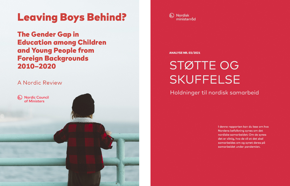
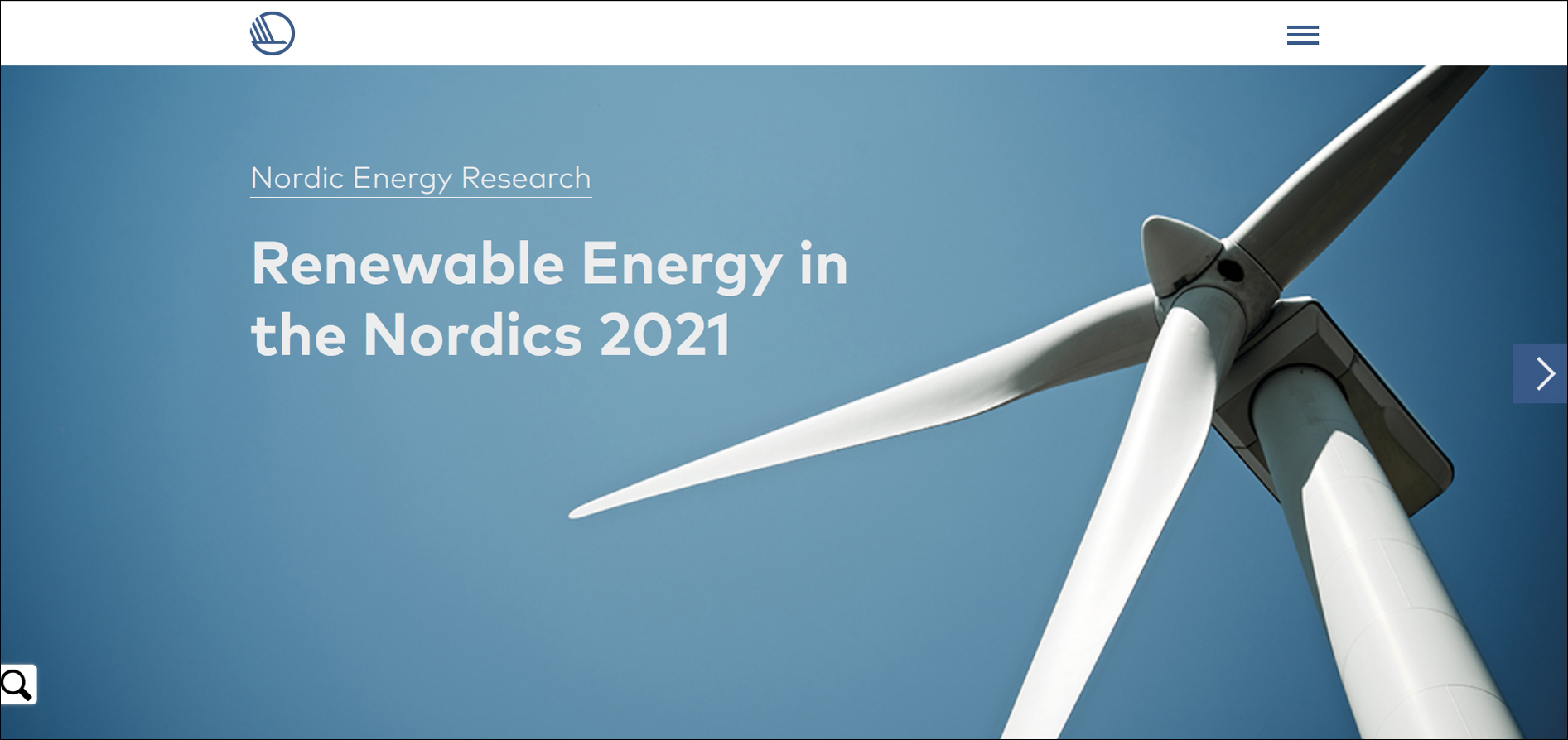
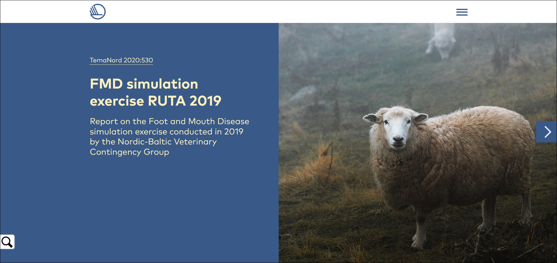
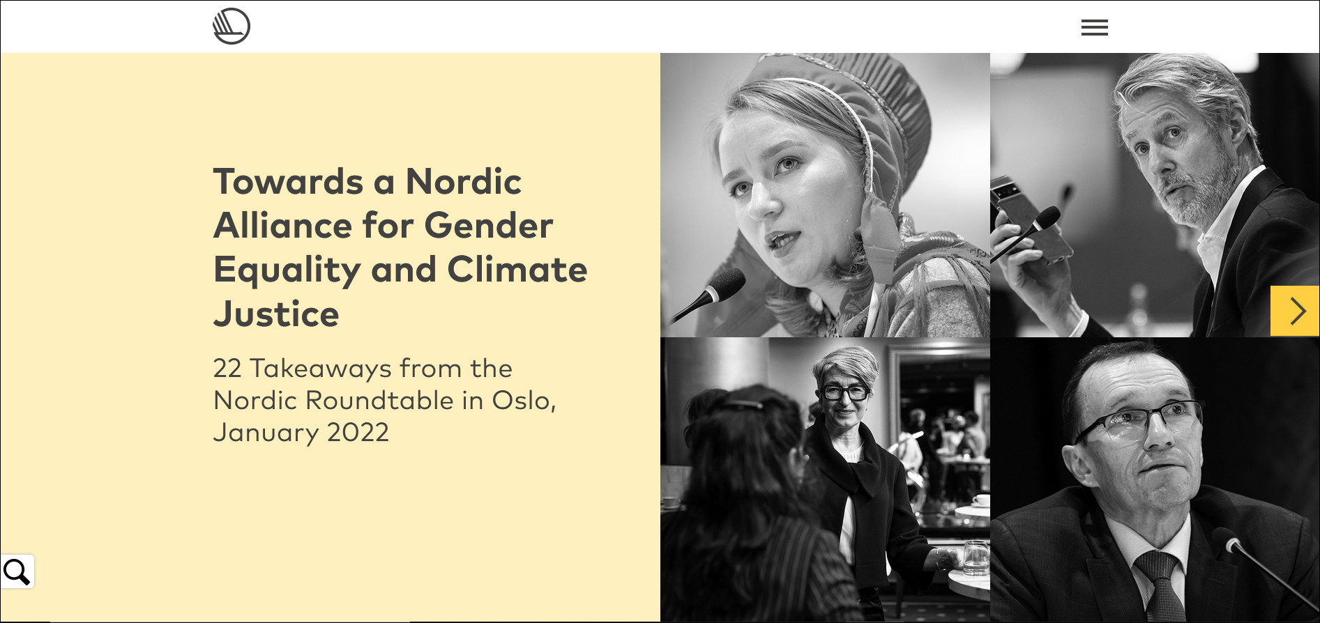
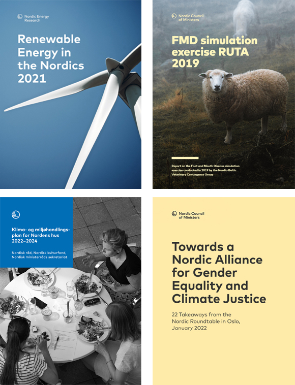
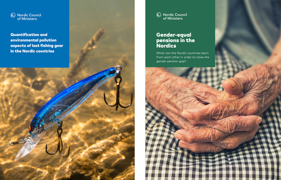
Front pages
If the publication is published by the masterbrand, a swan logo (repeated on all pages) features at the top left. Institutions usually use their full logo. The logo must not be placed anywhere else on the front page.
The masterbrand and the institutions have different templates for front pages. Most of them use the following standard front pages, supplemented with their own solutions:
- Full page content area
- Medium content area
- Small content area
- 4 cases
Full-page content area is difficult to use and should be tested on all screen sizes.
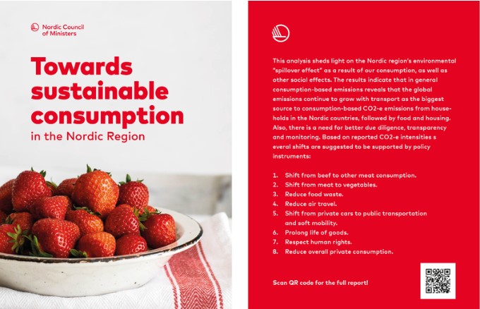
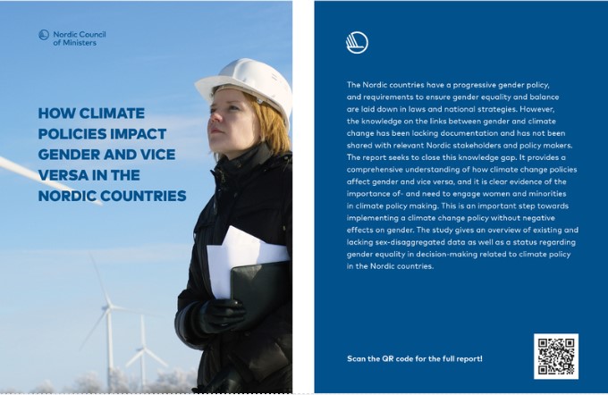
You can place texts, links and other elements on top of images.
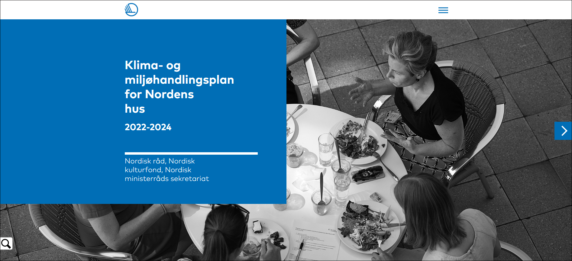
NEW!
A box on the front page is our latest design element. The box should always be placed in the top left corner.
The main product is the online version of the publication, but PDF versions are also made available for download. Although First Edition automatically generates a PDF from the online version, you can adapt it slightly. The formatet of the autogenerated PDF is 210 x 280 mm.
For example, the front page of the PDF can be created using InDesign and uploaded as an image file. The same grid is used as in printed publications. It is a good idea to use the same colours, images and typography on the front page of both the PDF and online versions.
Specific alterations to the PDF file can be designed in InDesign. Although it is possible to replace the automatically generated PDF, please remember that you must still choose a design suitable for digital display.
Here are some examples front pages. You can download the complete PDF through these links:
FRONT PAGE WITH BOX DESIGN
A box on the front page is our latest design element. The box should always be placed in the top left corner.
The logo should be placed at the top with title below. The size of the box is 10.5 x 10.5 cm on a 21 x 28 cm page. The logo symbol should be 72 mm wide.
Graphs
In our online publications the graphs are interactive.
In graphs we use primary colours combined with alternative accent colours in order to create a higher contrast between the colours, thus meeting the requirement of web accessibility.
Here are some examples of graphs with primary colours.
Example of a bar chart
Exemple of a donut chart
Example of a line chart
Example of a horizontal bar chart
Examples of a pie chart
Example of a surface diagram
Cards – advertisment for online publications
For events and meetings, we can print postcard-sized cards that refer to the publication's URL.
The layout can, for example, consist of the publication's front page together with a short presentations text and a QR code that leads directly to the publication.

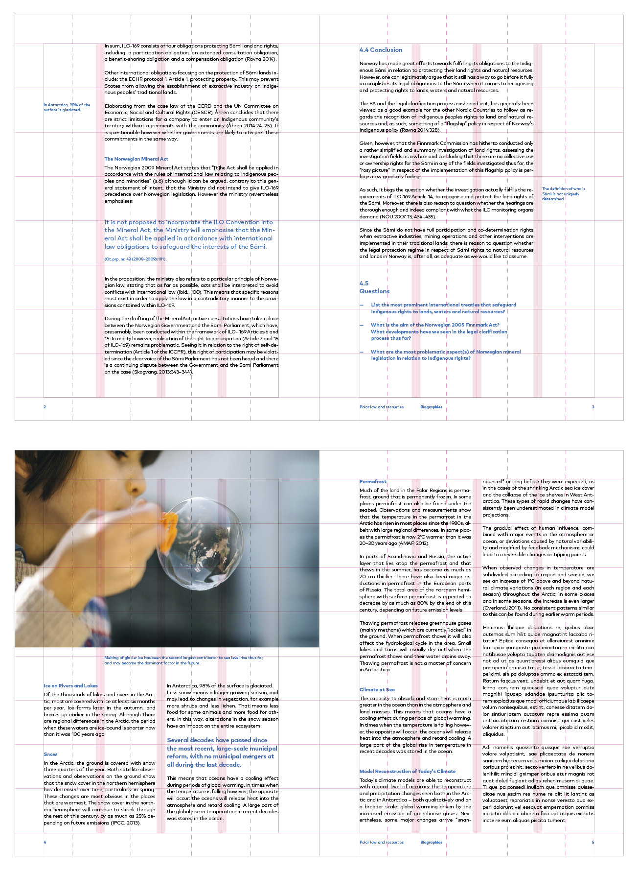
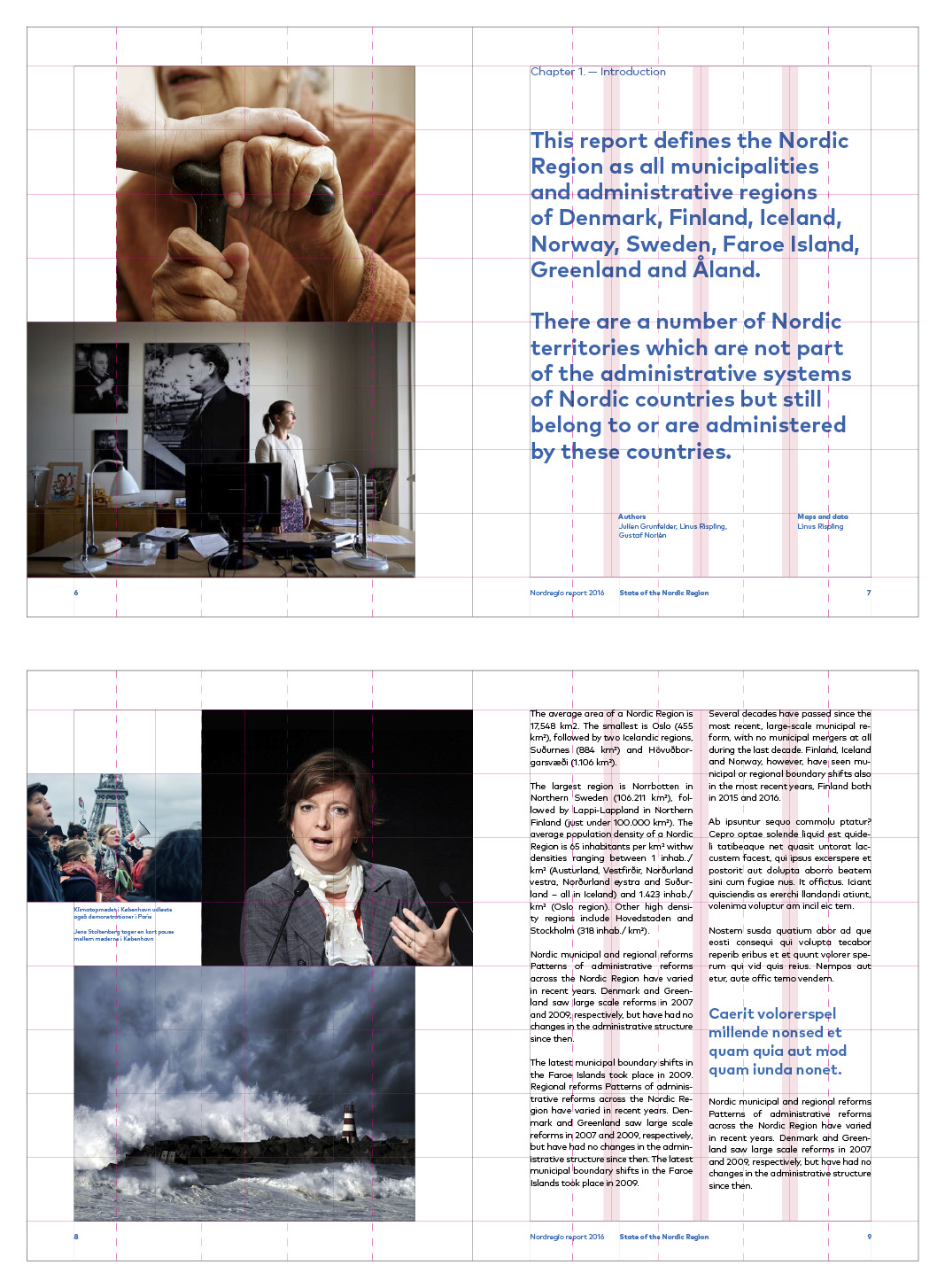
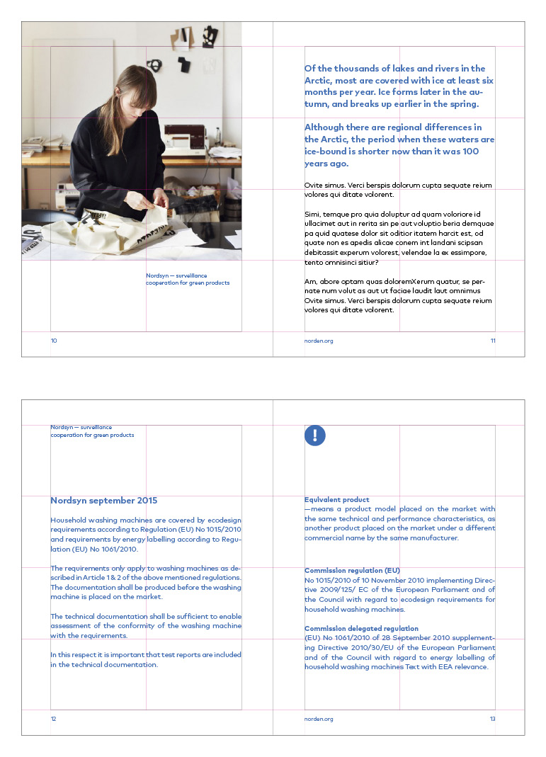
Printed publications
In the Nordic Council of Ministers and the Nordic Council, we have a policy to do as little printing as possible. Therefore, most of our publications are published exclusively digitally, usually as responsive online publications with an automatically generated pdf (see the section on digital publications).
This section is for those who are going to produce a printed publication, or a pdf file with an advanced layout.
Paper and printing
Uncoated paper should be used for both content pages and covers. Suitable examples are Multi Design White.
Publications must be glue-bound or stapled, and always in one of the formats described.
We only use Ecolabelled printing houses.
Formats and grid
Publications come in three formats: small, medium and large. The proportions are based on the flags of the Nordic countries.
The template for each format has a grid, which is also based on the proportions of the flags.
The dotted lines are there to indicate the vertical mid-point of each field in the grid, and are only for cropping images,
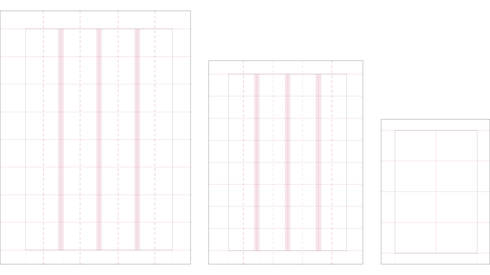
LARGE
Format: 210 x 280 mm
Margins: T 20 – B 16 – L 28 – R 20 mm
Columns: 4
Column spacing: 6–8 mm
Margins: T 20 – B 16 – L 28 – R 20 mm
Columns: 4
Column spacing: 6–8 mm
NOTE: The margins shift according to whether the page is to the right or left of the spine. The wide margin is the middle of the spread.
MEDIUM
Format: 170 x 225 mm
Margins: T 15 – B 15 – L 22 – R 18
Columns: 4
Column spacing: 6–8 mm
Margins: T 15 – B 15 – L 22 – R 18
Columns: 4
Column spacing: 6–8 mm
NOTE: The margins shift according to whether the page is to the right or left of the spine. The wide margin is the middle of the spread.
SMALL
Format: 120 x 160 mm
Margins: T 12 – B 12 – L 15 – R 14
Columns: 1
Margins: T 12 – B 12 – L 15 – R 14
Columns: 1
NOTE: The margins shift according to whether the page is to the right or left of the spine. The wide margin is the middle of the spread.
Front pages in printed publication
Front pages are laid out using the same grid as the content pages, but without the column spacing. Backgrounds should always extend over the whole page. The title, info text and logo can be placed anywhere on the grid, and should always be the same colour.
For all formats, the minimum size of the logo is:
Symbol: 72 mm wide
See more examples of our front pages on → norden.org/publications
REMEMBER!
- Never use two or more primary colours together for the background and title.
- Never use two or more secondary colours together for the background and title.
- The logo and title must not be in different colours.
- Yellow and pale yellow should not be used together.