Basic elements
Logo
The Nordic Swan
The Swan represents trust, integrity and freedom. It has served as a symbol of Nordic co-operation for over three decades. The new Swan is a simple, strong and open image of a swan in flight.
Open-ness to new thoughts, ideas and partnerships is one of the fundamental principles of Nordic co-operation.
The Swan alone
The Swan is used by itself on flags, podiums and other places where it needs to be recognised at a distance. In this context, the Swan signifies formal Nordic co-operation, and so is white on a primary blue background.
The Swan can also be used as a more subtle signifier of identity, e.g. as an imprint on folders, notebooks or other merchandise.
→ Download the Swan icon in all colours (SVG-format). If you need the Swan in other formats please write to pub@norden.org.

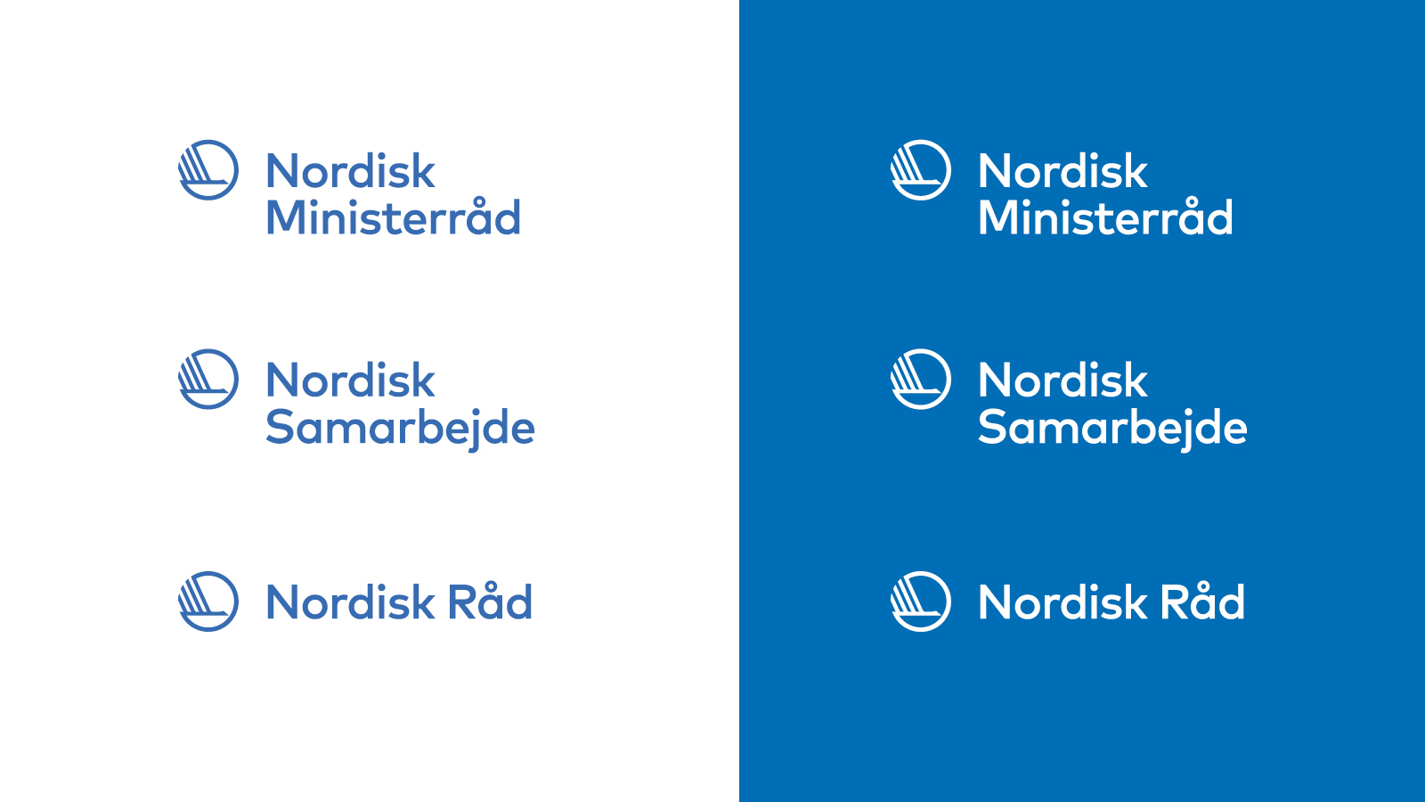
Primary logo
The primary logo consists of the Swan and a logotype. The logo is a single graphic entity and the ratio of image to logotype is always the same.
The typeface used for the logotype is Mark Pro Medium.
The primary logo uses the primary blue colour on a white background and white on a primary blue background.
It is the formal logo of Nordic co-operation, the Nordic Council of Ministers and the Nordic Council.
The logo in other colours from the Design manual can be used in presentations, publications and other materials. The same colour is used in text and other design elements so that there is a clear connection between the visual elements and the logo.
Download logo files in SVG-fomrat in different colours (RGB) and languages. If you need other formats of the logo, please write to pub@norden.org.
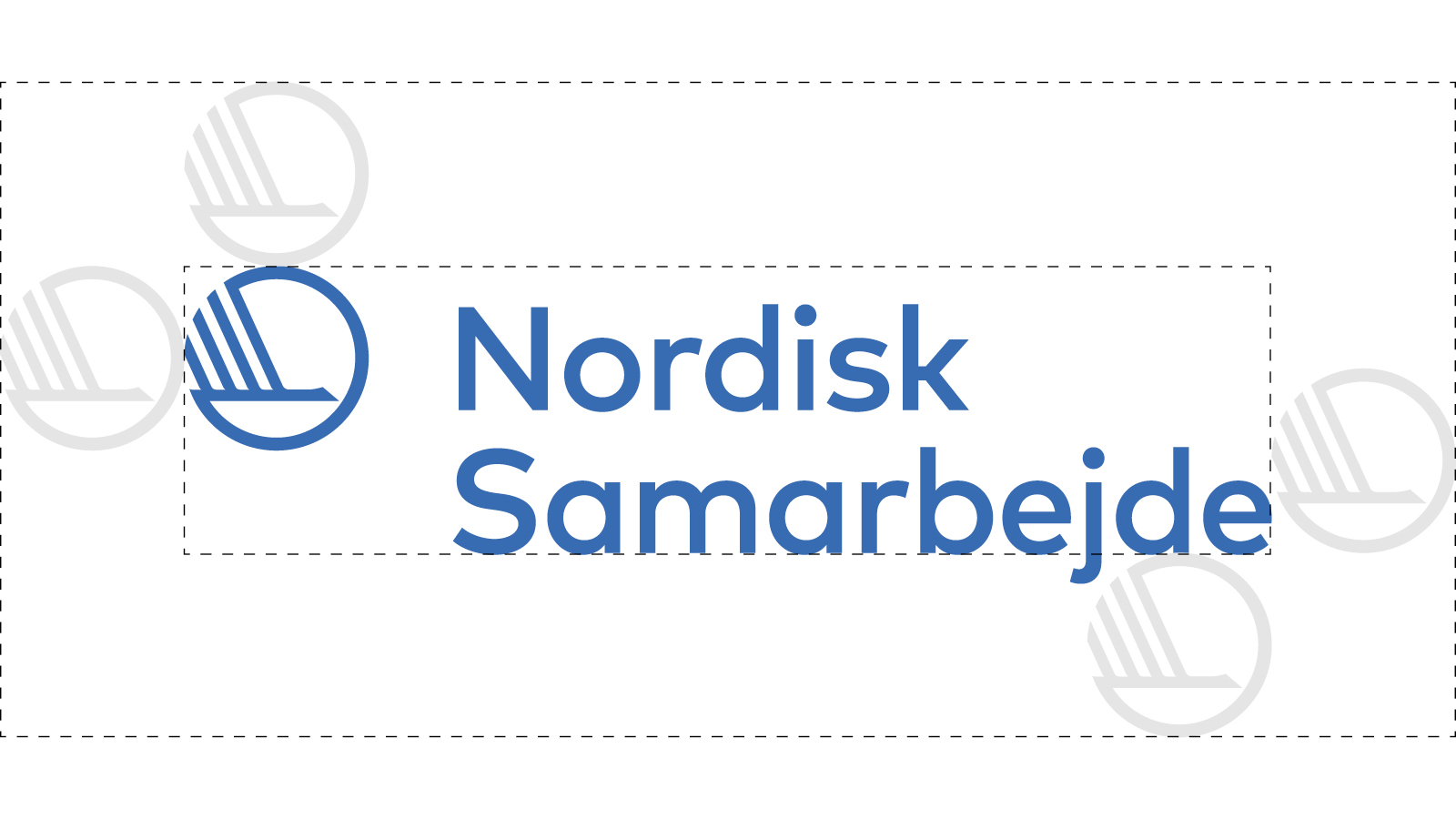
Respect distance
The distance between the logo and other communication and design elements is defined in relation to the Swan.
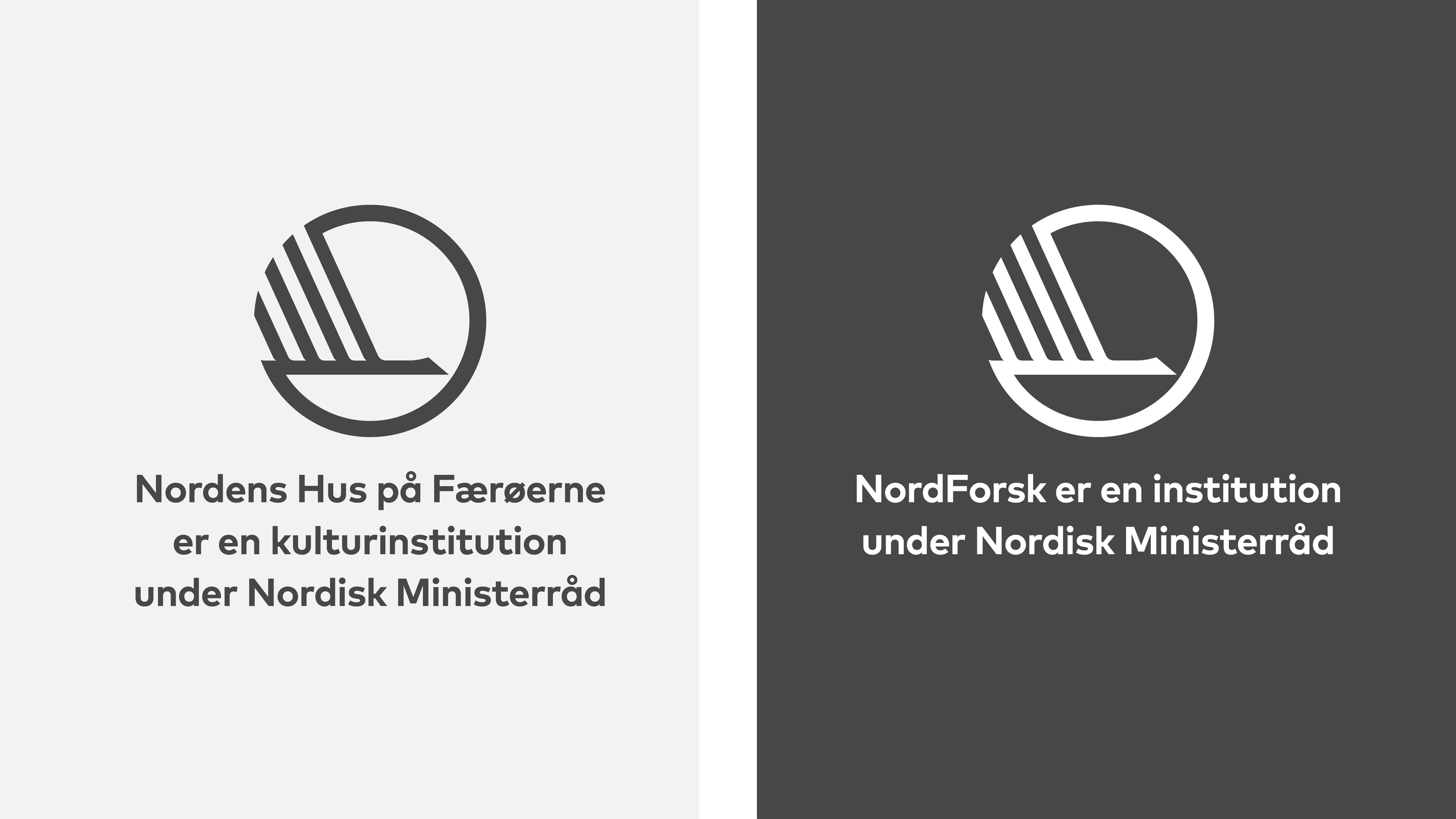
Endorsement logo
The endorsement logo can be used in multiple contexts, e.g. by co-branded partnerships and as a sponsorship logo. The alternative to using the endorsement logo is to place the logo with the transparent background directly on the communication interface, e.g. website, publication or invitation. In these cases, the partner selects the background colour. The partner may opt to use either the blue logo or the dark or light-grey version, whichever is more appropriate. The text is in Mark Pro Bold and is placed below or to the right of the Swan logo should be adapted depending on the use and situation.
The endorsement logo is available also with dark grey on a light background, or light grey on a dark background. If the endorsement logo is not used, the publisher must include text explaining its relationship with the Nordic Council of Ministers.
If you need the endorsement logo, please write to pub@norden.org. Inform us which text you wish to have and the language needed.
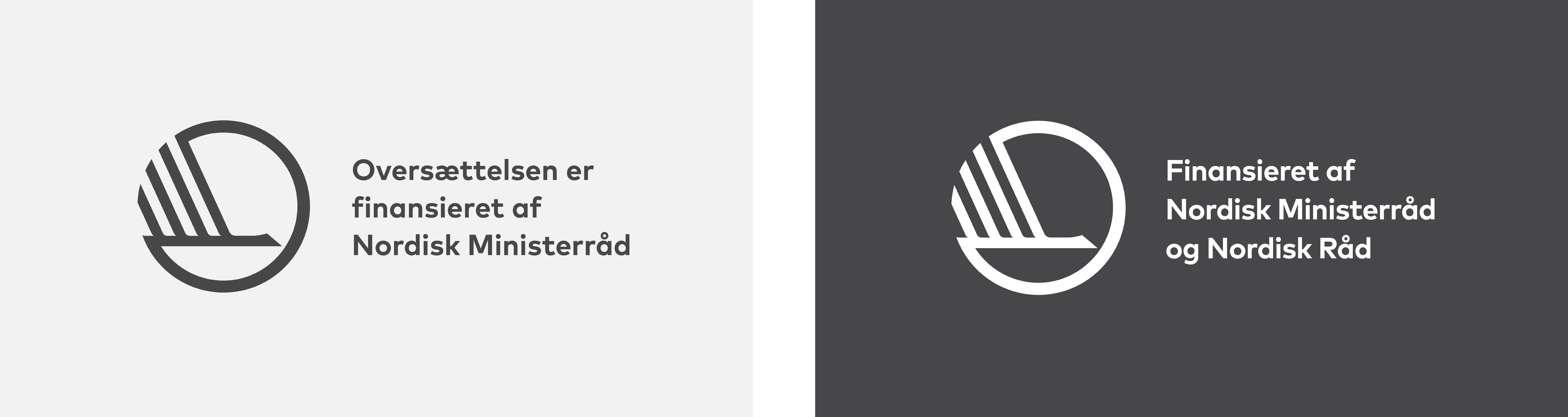
Logo for translations
In work that have received a grant for the translation from the Nordic Council of Ministers, a small swan logo with associated text is placed in the colophon or in another appropriate place.
If you need the logo for translations, please write to pub@norden.org. Inform us which text you wish to have and the language needed.
Colours
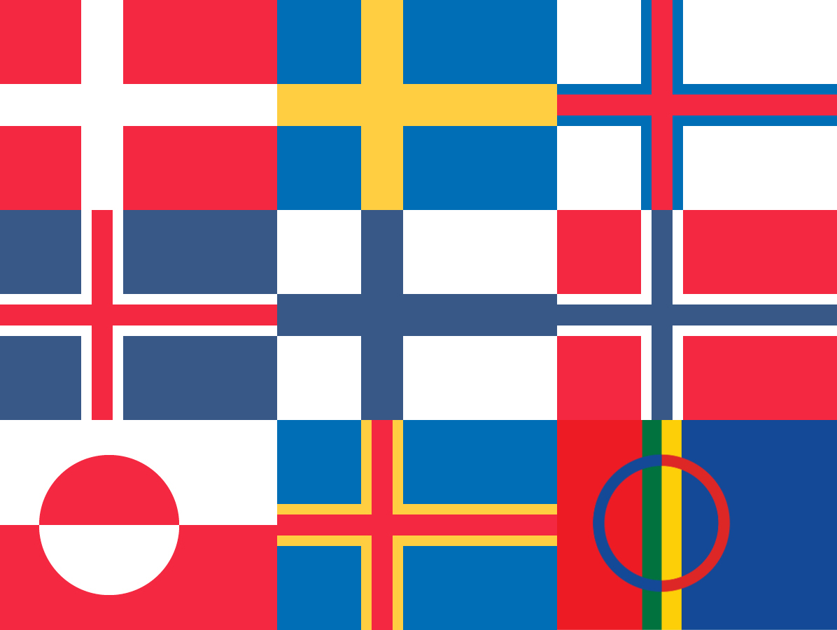
Colours as signifiers of identity
The colours used to signify identity are based on the eight Nordic flags and consist of: dark blue, blue, red, and yellow. These clear and obvious colours make up the primary palette. Blue and white are consistently used as main colours in formal contexts, e.g. on letters, flags and podiums.
The accent palette is inspired by Nordic light. These are subtle colours that provide a contrast to the bold flag colours.
These primary and accent colours, combined with a scale of neutral grey tones, make up the colour universe for official Nordic co-operation.
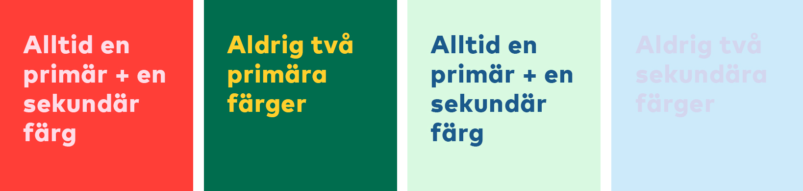
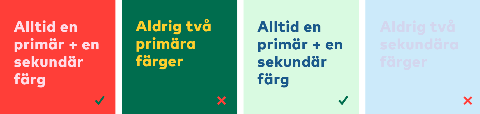
Primary colours
The primary colours are combined with the accent colours.
White can also be combined with the primary colours (except with dark yellow and dark grey). According to the Web Accessibility Guidelines the contrast between two colour that are combined should be high, white comes in very handy together with the primary colours an photographs.
Dark blue

HEX: #385988
RGB: 56-89-136
CMYK: 100–55–3–25
Green

HEX: #266d51
RGB: 38-109-81
CMYK: 85–35–70–25
Primary blue

HEX: #006eb6
RGB: 0-110-182
CMYK: 100–40–0–6
Red

HEX: #ef403b
RGB: 244-41-65
CMYK: 0–100–90–0
Yellow

HEX: #fdcf41
RGB: 253-207-65
CMYK: 0–13–100–0
Dark grey

HEX: #454547
RGB: 70-69-71
CMYK: 0–0–0–88
Accent colors for digital media
The accent colors are specially adapted to digital use and online publications. The accent colors should always be combined with the primary colors.
According to EU requirements for web design and accessibility, the contrast between colors should be high. The accent colors should therefore be used on a background of a primary color.
Light violet

HEX: #d3d5ed
RGB: 211-213-237
CMYK: 20–15–0–0
Light green

HEX: #e2fae1
RGB: 226-250-225
CMYK: 15–0–20–0
Light blue

HEX: #d4e9f9
RGB: 212-233-249
CMYK: 20–3–0–0
Light red

HEX: #fbdce7
RGB: 255-221-226
CMYK: 0–20–3–0
Light yellow

HEX: #fff0be
RGB: 255-240-190
CMYK: 0–2–35–0
Light grey

HEX: #d4e9f9
RGB: 237-237-238
CMYK: 4–3–6–7
Alternative accent colors for printing and graphs
The alternative accent colors can be used for printing of for example backdrops for events and fot the usage of colors in graphs (like curve diagrams in online publications).
The accent colors, which are lighter in shade than the alternative ones, are specially adapted to digital use and online publications, as the contrast between dark and light color must be high, for example in text. The accent colors becomes too light for print and graphs - and therefore we have the alternative colors.
Alt. light violet

HEX: #bcbde2
RGB: 188-189-226
CMYK: 30–25–0–0
Alt. light green

HEX: #cde4c4
RGB: 205-228-196
CMYK: 25–0–30–0
Alt. light blue

HEX: #afdbf6
RGB: 174-219-245
CMYK: 35–3–0–0
Alt. light red

HEX: #f8c9db
RGB: 248-201-219
CMYK: 0–30–3–0
Alt. light yellow

HEX: #ffed99
RGB: 255-237-153
CMYK: 0–3–50–0
Alt. light grey

HEX: #c8cacc
RGB: 201-202-204
CMYK: 0–0–0–24
Grey tones
You can use among these grey tones when making info graphics and graphs.
Grey tones can also be used in typography, if you wish a softer expression. The dark grey and the light grey can also be used on front pages for publications.
White

HEX: #ffffff
RGB: 255-255-255
CMYK: 0–0–0–0
Light grey

HEX: #d4e9f9
RGB: 237-237-238
CMYK: 4–3–6–7
Alt. light grey

HEX: #c8cacc
RGB: 201-202-204
CMYK: 0–0–0–24
40%

HEX: #a7a9ab
RGB: 167-169-172
CMYK: 0–0–0–40
56%

HEX: #87898c
RGB: 136-138-140
CMYK: 0–0–0–56
72%

HEX: #696a6c
RGB: 105-106-109
CMYK: 0–0–0–72
Dark grey

HEX: #454547
RGB: 70-69-71
CMYK: 0–0–0–88
Black

HEX: #000000
RGB: 0-0-0
CMYK: 0–0–0–100
Use of colour
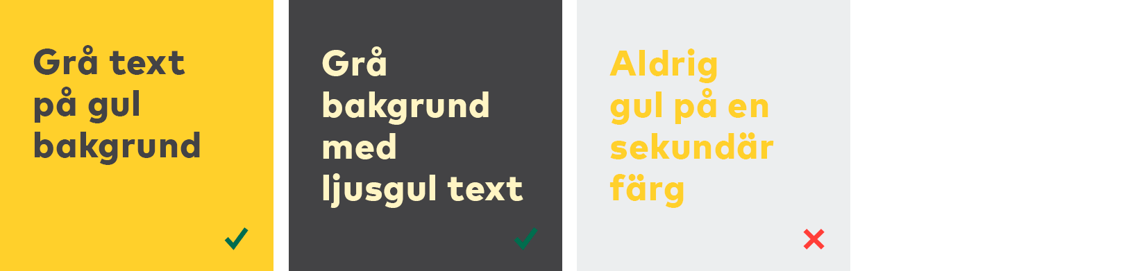
Always use a combination of a primary colour and an accent colour on background, title and logo, on all of the main forms of communication (covers on publications, websites, posters, etc.). See examples below.

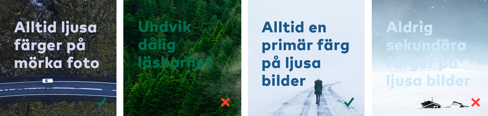


Yellow and grey
For reasons of legibility, the primary yellow should only be used for text on photos, or as a background colour overlaid with text in a dark shade of grey.

Typography
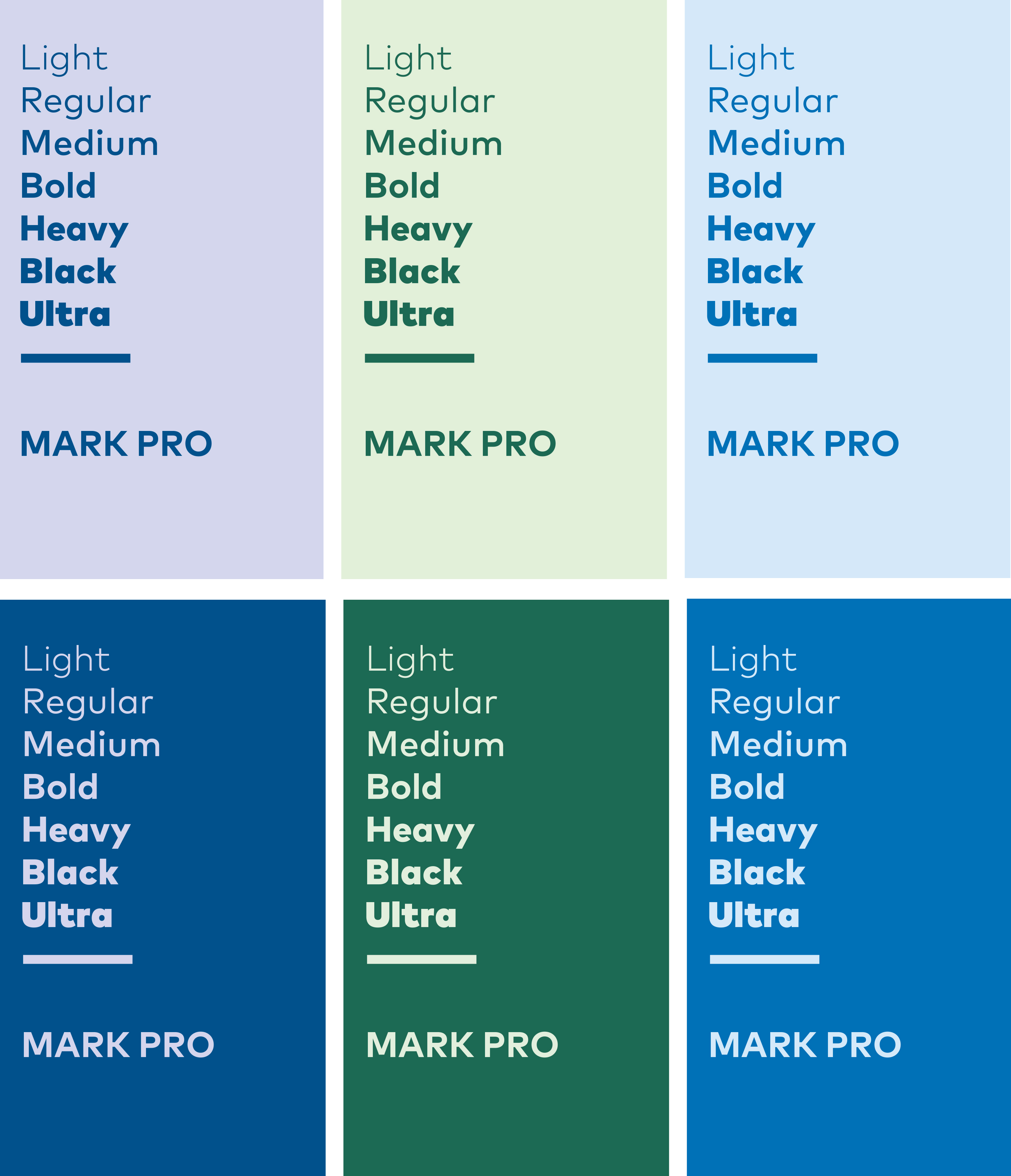
Mark Pro
Mark Pro is Nordic co-operation’s primary typeface. It is a geometric typeface, which conveys a straightforward, open and accessible idiom that reflects the values of Nordic co-operation. Mark Pro är det nordiska samarbetets primära typsnitt.
Mark Pro is available in many different styles: from thin to bold. This allows the typography to vary according to content and target audience.
The Mark Pro package covers all of the Nordic languages, and also the Cyrillic alphabet.
Mark Pro can be used online.
Mark Pro should not be used in Word, Excel or PowerPoint – read more under System typeface.
EXAMPLES
The visual identity includes certain recurring typographical conventions.
Headings
All styles may be used, as long as the result is easily legible. In other words, colour, size and, where applicable, photo background should be taken into account.
For shorter headings, it is acceptable to use upper-case letters only. For longer headings, both upper and lower case should be used to make them more easily legible.
The title may be aligned either to the right or to the left. It is also permissible to align individual words and lines without justifying the text at the margin. Centre-aligning of headings should be avoided.
Licence
Licences are purchased from Myfonts.
The desktop version is called Mark Pro, the web font is called Mark.

System typeface
For Word documents, Excel and PowerPoint use the system typeface – Corbel. Corbel comes with the Microsoft Office package. If you use a different operating system that does not include Corbel, it is available as a free download from www.wfonts.com.
Corbel can in some cases be used on social media.
By default, Corbel has lower case numbers (default figure). They work well for continuous text. The font also includes another set of numbers (tabular lining), which is more suitable for tables, headings and page numbering.
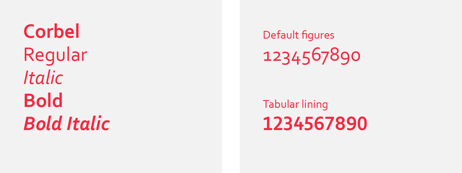
Image policy
Purpose
Images play a key role in our visual identity.
They are used to highlight the strength of Nordic co-operation, emphasise its achievements and ambitions, and showcase an innovative, outward-looking and visible region without borders.
Overall style
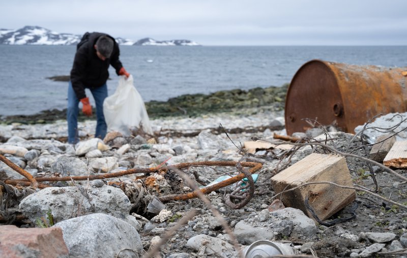
Images should convey immediacy, authenticity and life. Also make sure that they are gender balanced and normcritical to avoid stereotyping. Their composition should be straightforward and the focus clear.
The photographies should have a natural light. Indirect natural light with soft shadows is preferable to bright sunlight with harsh shadows. Backlight helps make backgrounds bright, simple and harmonious.
Skin tones should be soft and natural, i.e. as they would appear in indirect and naturally soft light.
Any photo editing should be subtle and result in a clean, natural image, as in the examples shown.


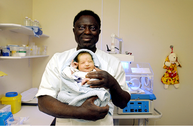
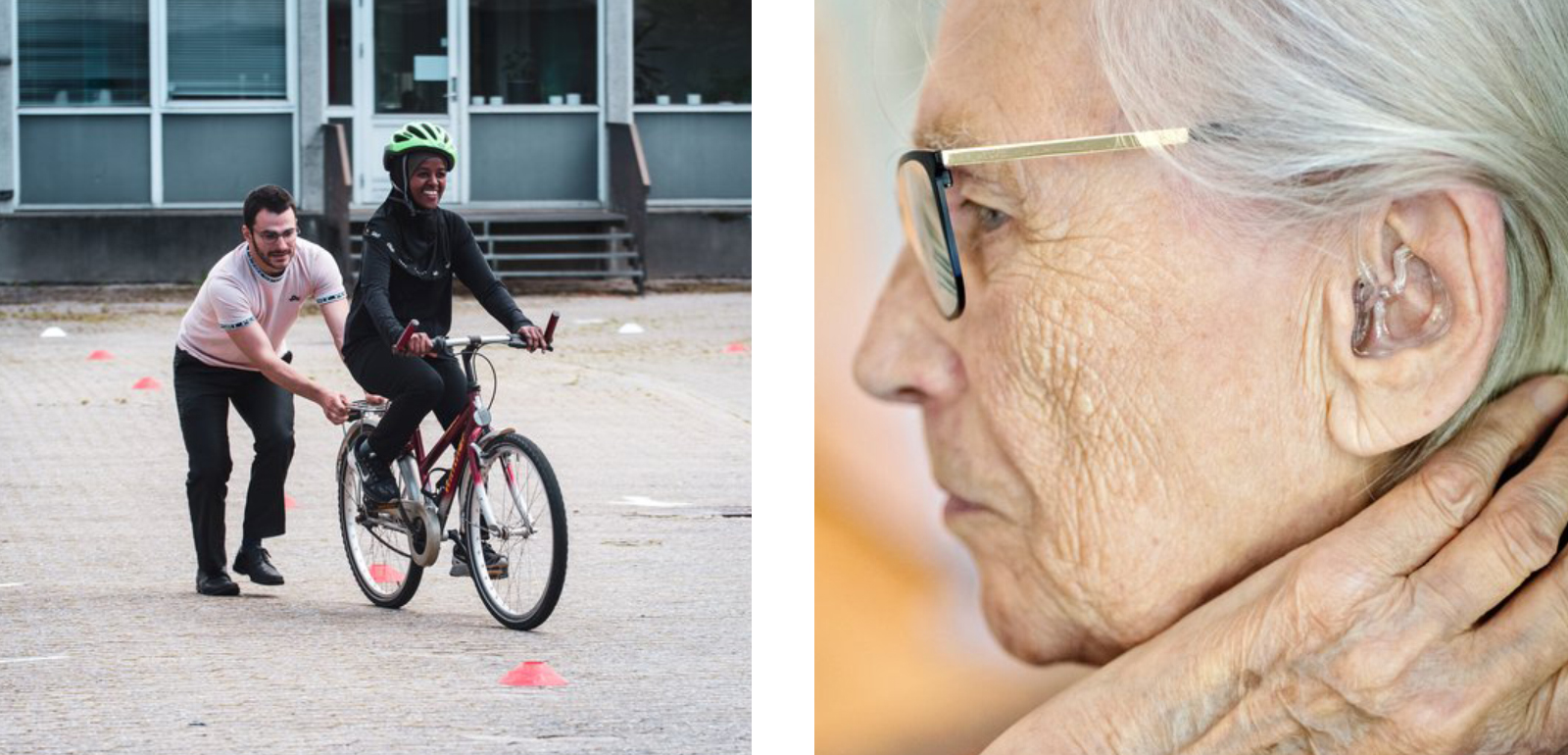
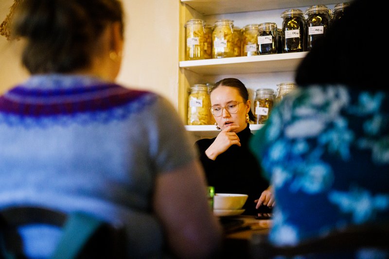
Life in the Nordic region
Images should have a Nordic perspective and reflect a positive attitude toward Nordic society and the rest of the world. They should depict people and nature, urban and rural existence, working life and culture in a genuine, warm and respectful manner. The people of the Nordic region vary in gender, age, religion, ethnicity and sexual orientation. They have different attitudes, interests and levels of educational attainment. It is essential that the images used mirror this diversity.
Photos used to illustrate a problem should never present the issue in a harsh or telltale way. It is important to focus on potential and results already achieved.
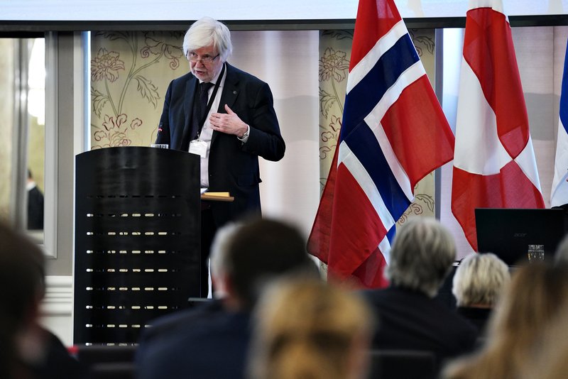
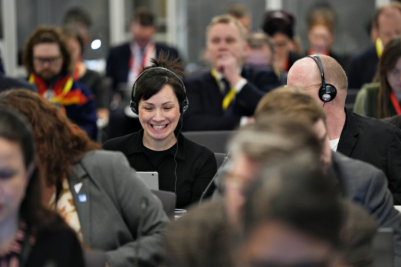
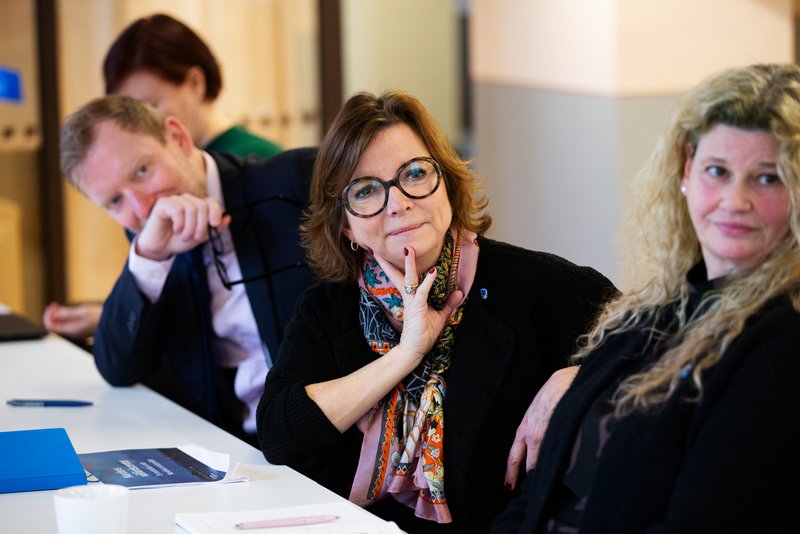
Parliamentary work
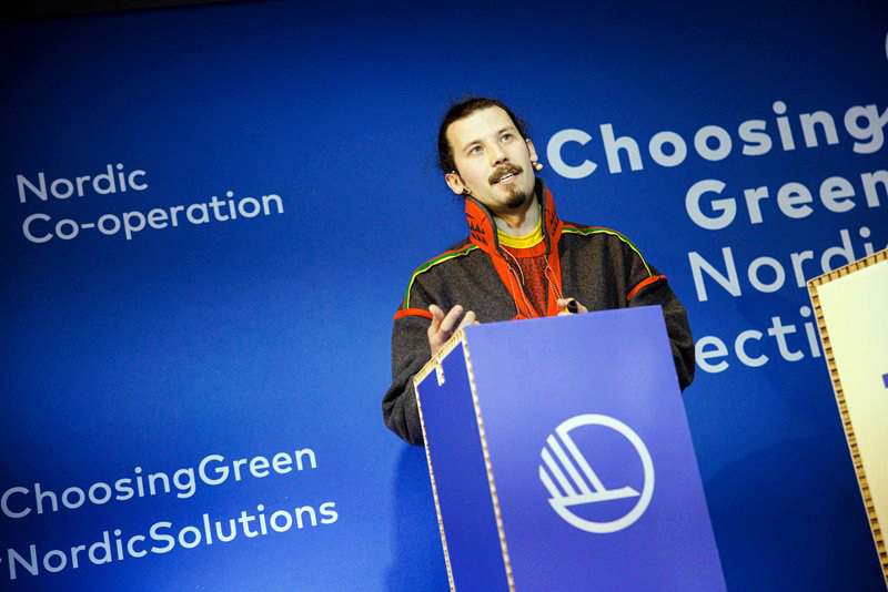
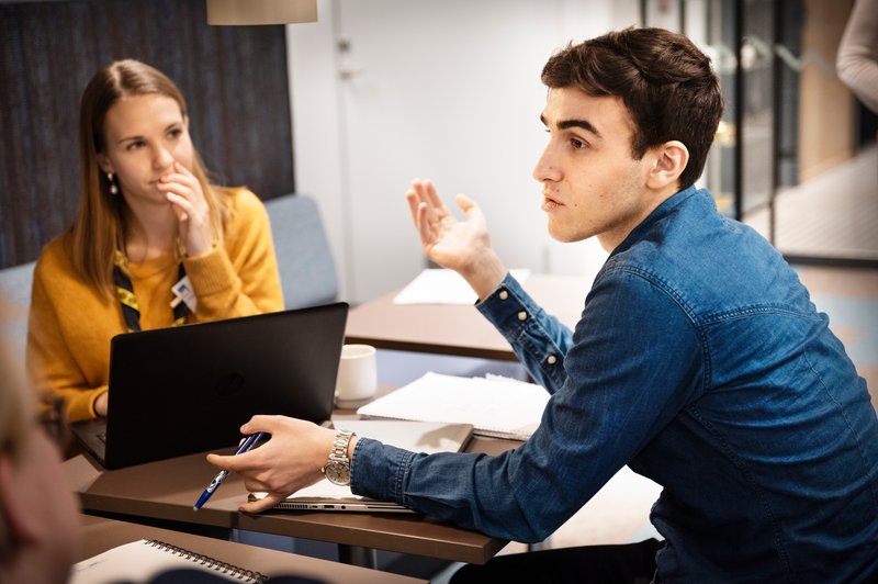
The work of the parliament is illustrated by pictures of politicians negotiating, speaking, gesticulating, being active, listening, at the podium, in the chamber and in discussions with colleagues.
Zooming in is a good way of creating focus because it makes the foreground and background diffuse and slightly blurred, but presents the subject in sharp focus. Portraits may be in colour or black and white. Use the light to lend atmosphere.
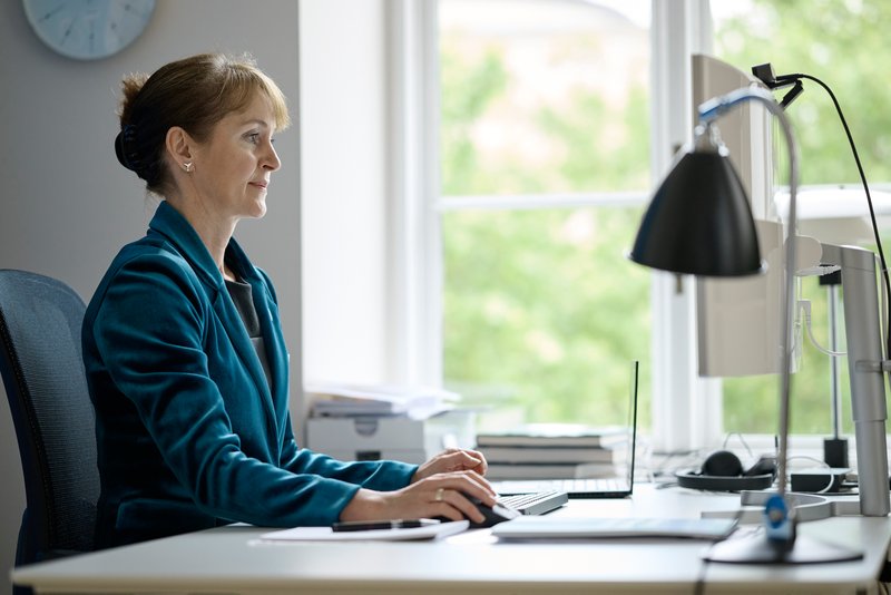
Portraits
Portraits may be posed or natural, with the surroundings forming an integral part of them. For both types of portrait, the image should convey personality and accessibility.
The portraits can be in color or in black and white.
As a photographer you can try to make the most of natural light. Positioning the subject close to a window, and allowing natural light and shadow to define the face, helps produce an interesting portrait. Avoid strong sunlight, which leads to heavy shadow and high contrasts – soft, indirect light is more subtle. Photographing the subject outdoors in a backlit setting will result in a calm and bright background.

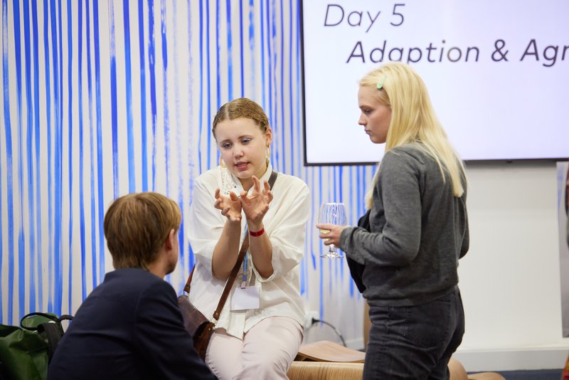


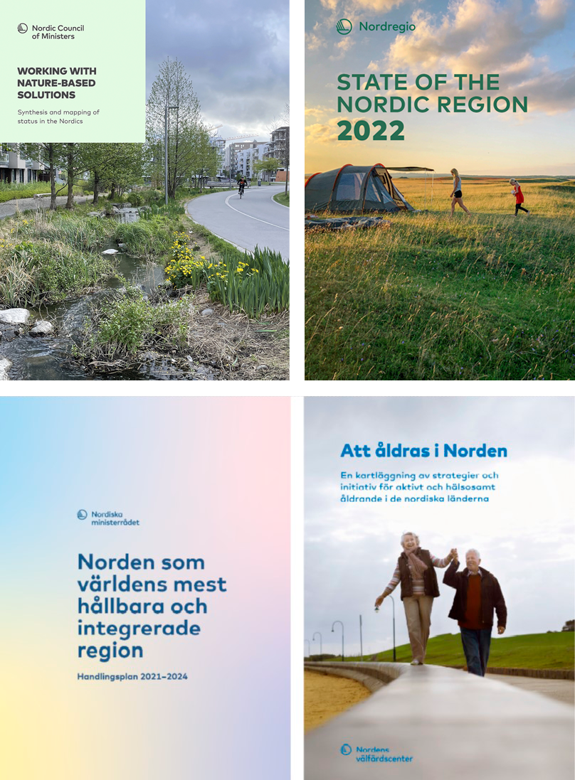
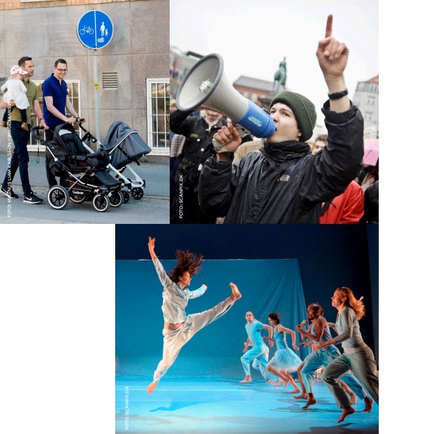
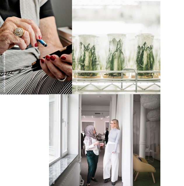
Images are placed edge to edge
Placing pictures edge to egde creates a narrative, visual interaction and dialogue between politics and society. To imbue the composition with an air of variety and movement, it is important to select images that differ in scale, as shown in the examples – one shot in close-up, the next from a distance. See examples below.
You can see more examples under Digital publications.


Things to avoid
Avoid exaggerated staging, heavy editing and artificial filters.
Also, avoid colour casts, flash photography and poor lighting.
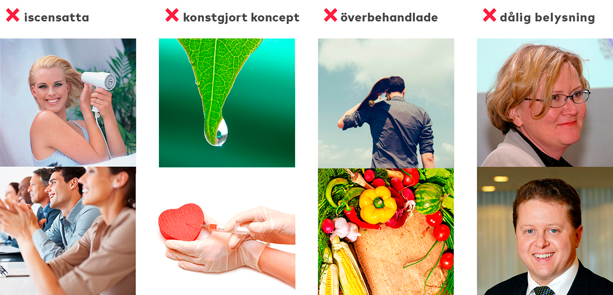

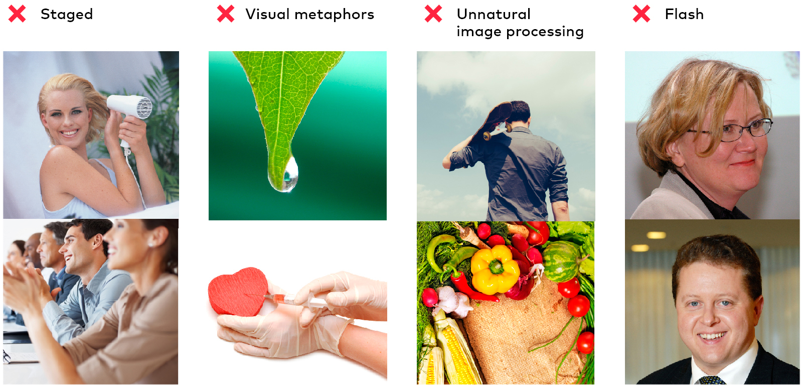
Image database
You can search our image database. The vast majority of images there can be used free of charge, as long as you credit the source.
Here are some other websites with free images:
scanpix.com has links to image banks for Denmark, Norway, Sweden and the Baltic states. You can buy up-to-date editorial pictures individually.