Photo: iStock
4. A digital mapping tool for hydrogen valleys in the Nordics
The digital mapping tool is a web-based platform designed to showcase the findings and data collected throughout the project. The objective was to develop a prototype that serves as the initial step towards creating a more sophisticated and refined platform in the future.
4.1 Scope and method
4.1.1 The user experience (UX)
To create a foundation for the design and ensure that the tool functions effectively, we must first understand the needs and preferences of the end-users. A common process for UX design work is the Double Diamond, which is a structured design approach developed by the British Design Council, consisting of four phases: Understand, Define, Develop and Deliver. It emphasises divergent thinking to explore multiple possibilities in the Understand and Develop phases, and convergent thinking to narrow down and refine ideas in the Define and Deliver phases, ultimately leading to well-crafted solutions.
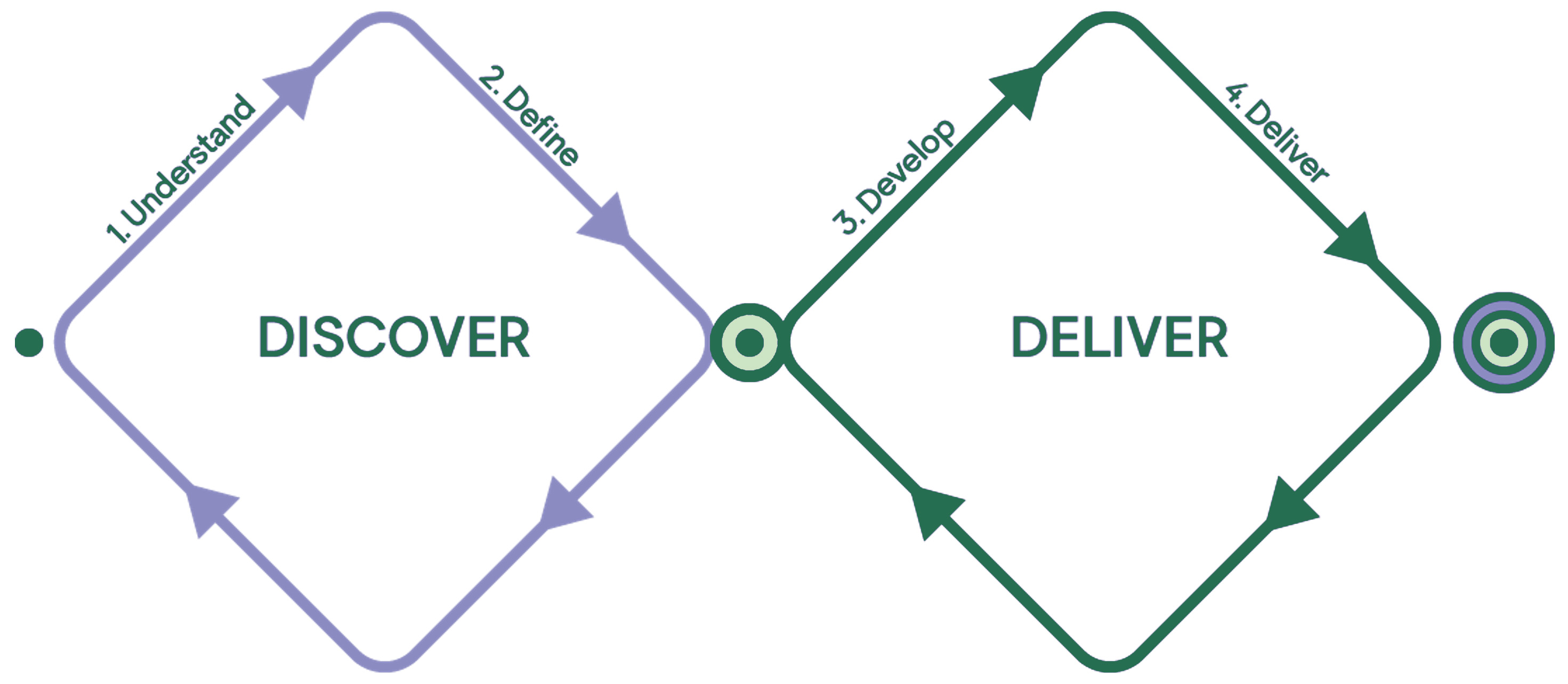
Figure 12. The design process “Double Diamond”.
As a part of the Discover process a benchmarking study was conducted to map existing tools and information sources that communicate hydrogen projects and initiatives on a global or local level.
The following sources were examined.
Online tools
Information and statistics
4.1.2 Design principles
Based on market research and input from a workshop with participants from across the Nordic region, a set of design principles for the tool was developed. These principles were used to provide direction for the design work in the Deliver phase.
The design principles were:
- A Nordic perspective. The tool is distinguished by focusing on hydrogen development within the Nordic region, and the aim is to clearly represent and maintain this perspective throughout the platform, highlighting the unique context and contributions of the Nordics.
- Let the information shine. By distributing information across separate pages, we enhance search engine optimisation and create multiple entry points to the site. This approach not only optimises visibility but also allows users to navigate the content more efficiently.
- Show what we know. It is crucial to have a pragmatic approach to presenting the data generated throughout the project.
4.1.3 Tool structure
The aim was to develop a structured and flexible tool that shows information from the hydrogen valley database in a compelling manner. By distributing information across separate pages, we highlight different perspectives without overwhelming users. This approach allowed us to craft unique content for each view, facilitating easier content sharing and enhancing the user experience. Additionally, this structure improves the site’s search engine optimisation (SEO) because each page has a unique URL, enabling users to access the tool from various entry points, depending on their search criteria.
The tool is organised into the following page types:
- Landing page/Homepage: The main entry point, which provides an overview and guides users deeper into the site.
- Map page: Visual representations of data with geographic contexts.
- List page: Tabular data for easy filtering and data overview.
- Statistics page: Aggregated data and analytics.
- Regional pages: Focused content that pertains to specific regions.
- Information pages: Detailed information on various topics such as data definitions, about the project, privacy policy etc.
4.1.4 Data architecture
The data architecture plays a vital role in organising and presenting information effectively within the application. To fully understand the information available, the data in the hydrogen valley database (Excel) was broken down and divided into two categories:
- Descriptive data: Project name, links, description etc. These data points provide context for the hydrogen valley/hotspot.
- Segmentation data: These data points represent a finite range or set of possible values and are typically used in queries to segment data. Examples of segmentation data include production capacity, year of completion, country etc.
Based on this, data prioritisation for the UI was discussed with project partners and the steering committee.
4.1.5 User interface (UI) design
The focus of UI design activity was on creating a comprehensive and user-friendly interface, informed by insights obtained during the UX research. To verify the concept prior to developing the software, the UI was presented as an interactive prototype.
4.1.6 System setup
This activity focused on exploring the technical frameworks and infrastructure necessary to support the tool. The technical planning involved defining necessary functionality and data storage requirements, as well as evaluating existing technical systems and resources that could impact the new setup.
In general terms, the system includes of the following primary components:
- A web server: Acts as the gateway for handling requests and responses between the user and the server.
- A frontend application: This is the user interface through which end-users interact with the tool.
- A database: Serves as the central repository for storing all the data the tool needs to function efficiently.
- A backend application: This component manages data provisioning for the frontend by handling database connections and data processing.
4.2 The prototype tool
The final concept was designed iteratively by looking at the available data and the defined information structure and finding a visual style coherent with the communication guidelines provided by Nordic Energy Research. Development of the actual tool was accelerated as soon as the concept was finalised. The development process itself was also carried out in iterations, and during this process, adjustments were made to translate the concept into the implemented product. The tool presents the database content via several different visualisation views (or pages), briefly described below.
4.2.1 Landing page
- Provides a brief introduction to the purpose and content of the tool.
- Summarises data points for the entire Nordic region.
- Summarises data for each country within the Nordic region.
- Promotes further exploration by providing links to prioritised sections (map) of the tool.

Figure 13. The landing page (illustration from nordich2valleys.org).
4.2.2 Explore page
- Map view that provides a geospatial overview of each project and type (hotspot or valley).
- Easily view each project by clicking on the markers on the map.
- Data filters for viewing the data from different perspectives.
- Table view for exploring the projects from a data perspective.

Figure 14. The explore page, in map view (illustration from nordich2valleys.org).
4.2.3 Overview page
- Focuses on the Nordics from an aggregated perspective, as well as from the perspective of each country.
For examples from the overview page, see Figures 4-11.
4.2.4 Project page
- Presents the available data for each project in a clear and visually appealing manner. The data presented here mirrors the content that is displayed when clicking on a project marker in the map on the explore page.
Figure 15. Example of the information provided on a project page (illustration from nordich2valleys.org).
4.2.5 Content pages
- Content pages are a flexible format for displaying information. Pages can consist of data definitions, project descriptions, contact information etc.

Figure 16. The content page “About” (illustration from nordich2valleys.org).
4.3 Future tool development
The digital tool, as a publicly available interactive web application, allows users to view and analyse data gathered during the mapping process. It is thus essential for the mapping to indicate any true added value for Nordic stakeholders. However, the tool is currently only a prototype and will require further development to be fully quality assured and become a more comprehensive tool.
The development process moving forward may include the following steps:
- Investigate and implement new ways of aggregating relevant data based on the data collected during the project.
- Test the tool with relevant stakeholders, gather their feedback and make adjustments based on insights.
- Establish procedures and responsibilities for updating and curating data. Train content editors and adjust the backend user interface to facilitate administration.
- Further develop the country-specific perspective, with each country represented by a country-specific page (may also be at the region level).
- Implement aspects of the application that were not implemented in the prototype due to time constraints. Such as country-specific pages, advanced visualisations and an enhanced mobile experience.
In addition, it will be necessary to update and maintain both the database and the tool on a regular basis to stay relevant over time. Development and investment plans are constantly evolving, and without regular updates from stakeholders, the data will quickly become outdated.