Graphical profile
The internal communication is to comply with the graphical profile for the Nordic co-operation and the adopted design manual. However, variation from the external communication in terms of expression is appropriate, to make it easy for all employees to distinguish between external and internal communication.

The graphic profile for internal communication is as follows:
- Colours: Primary blue background and white text. Alternatively, the colours can be reversed so that the background is white and the text is primary blue.
- Typography: Mark Pro is our primary font, although Corbel can also be used as a system font. CAPITAL LETTERS can be used for key words. Important words and phrases, such as quotes, can be marked in bold. Centred text can be used in exceptional cases.
- Graphic elements: A thick line is used as a design element.
- Photos: We use black and white images.
- Illustrations: Icons and illustrations can be used and adapted into animations if needed.
Primary blue is always used here with a white title placed above the box. The Swan logo is used as a signifier. See examples of designs below.
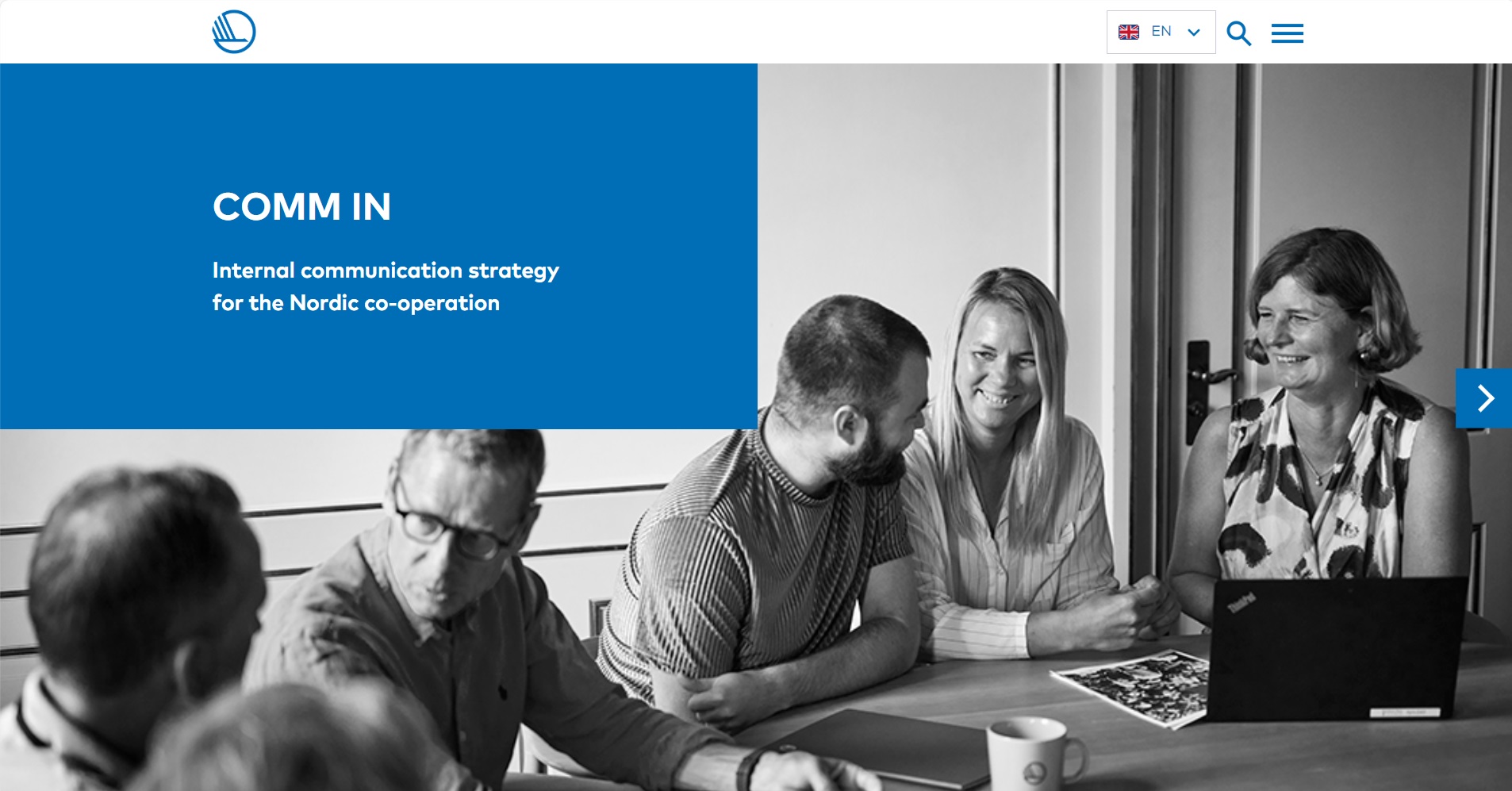
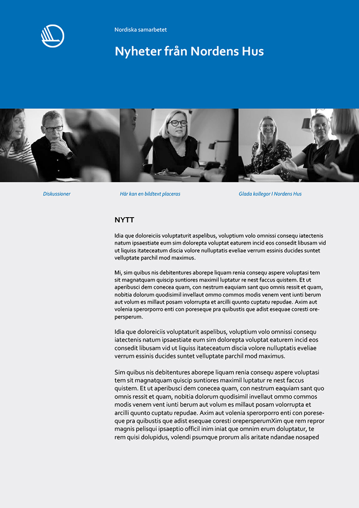
Example of a landing page design for the online version of a publication. A primary blue box with a white title is always used with a black and white photo.
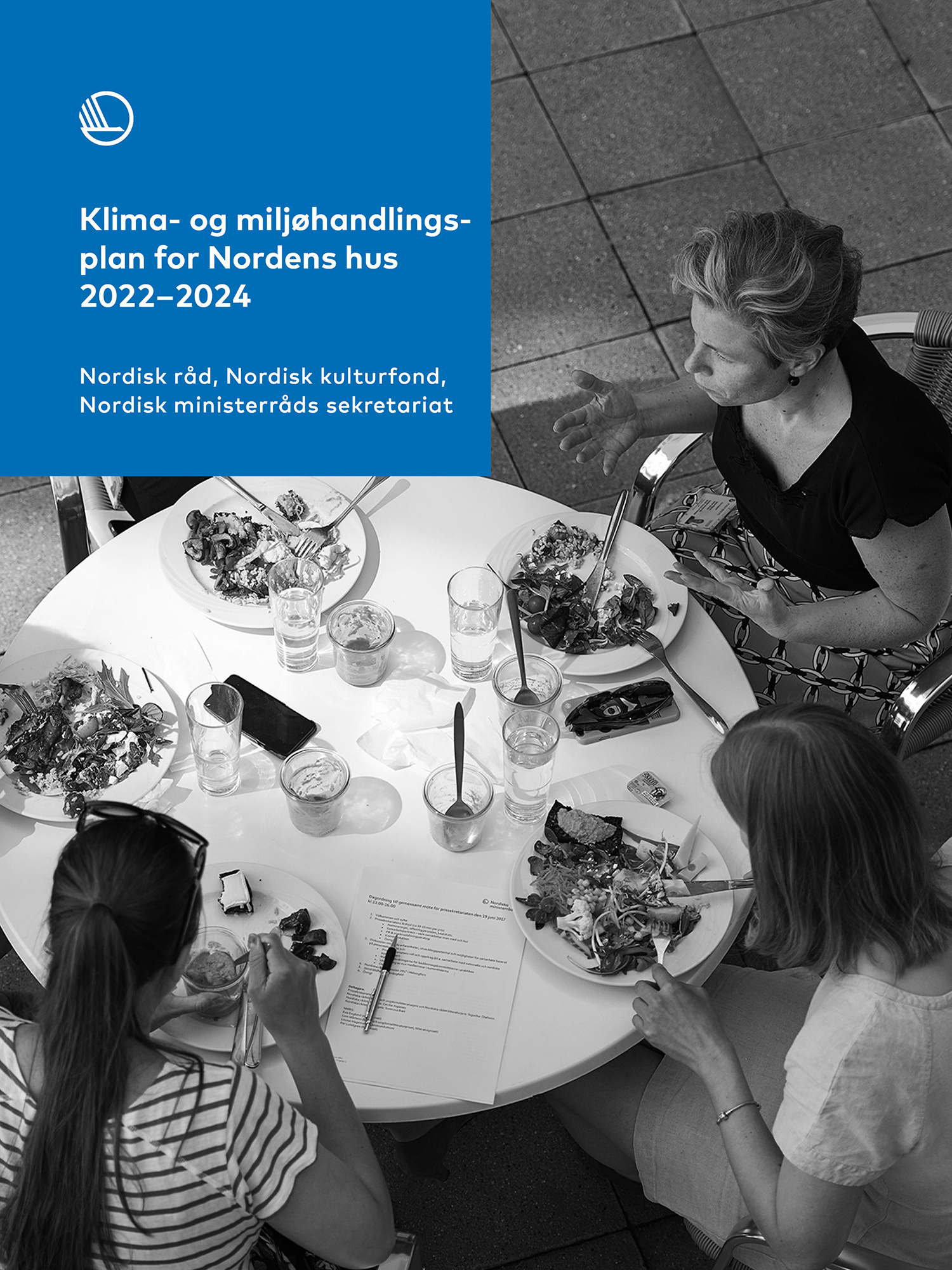
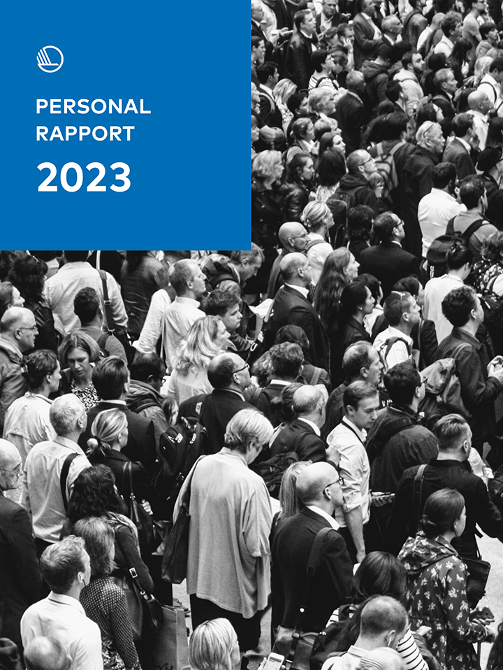
Example of two (fictitious) PDF cover pages, also with the primary blue box design and white text.
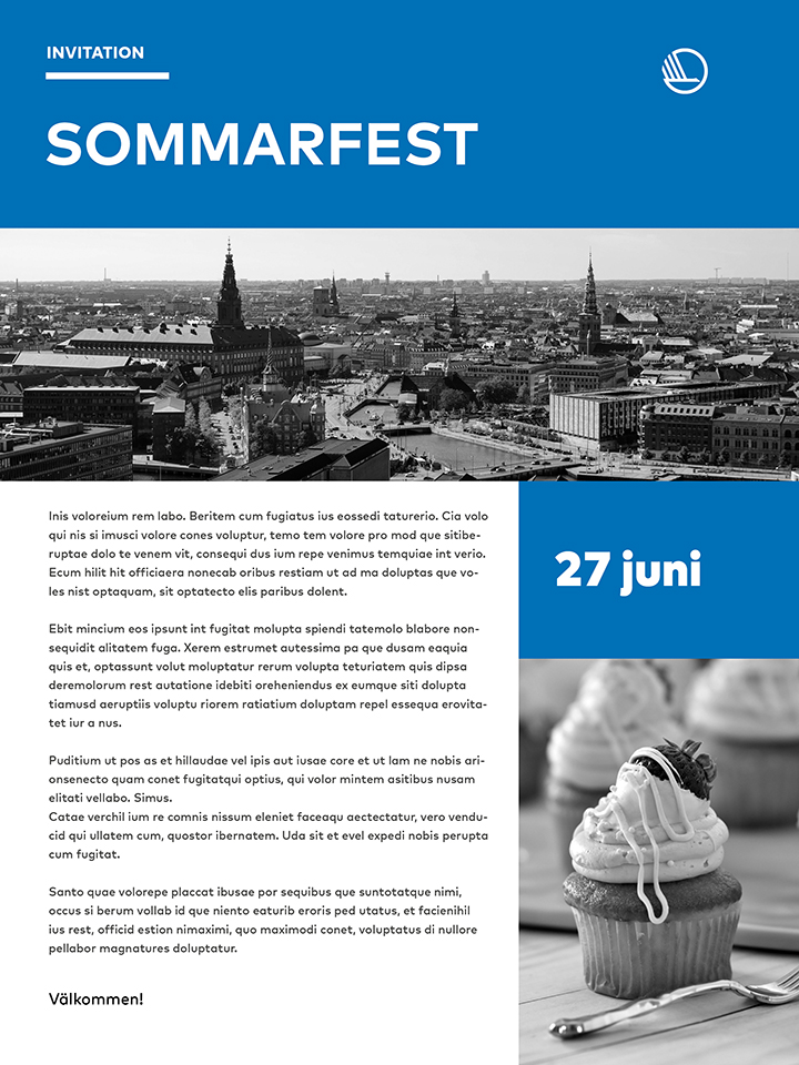
Example of a Word document and an invitation to a summer party. In Word, the system font Corbel is used.

Example style for icons, illustrations, and animations, which should ideally be in blue colours and shades.
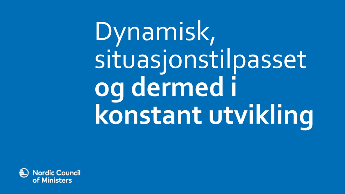
In PowerPoint, the system font Corbel is used. The primary blue background is used with white text.
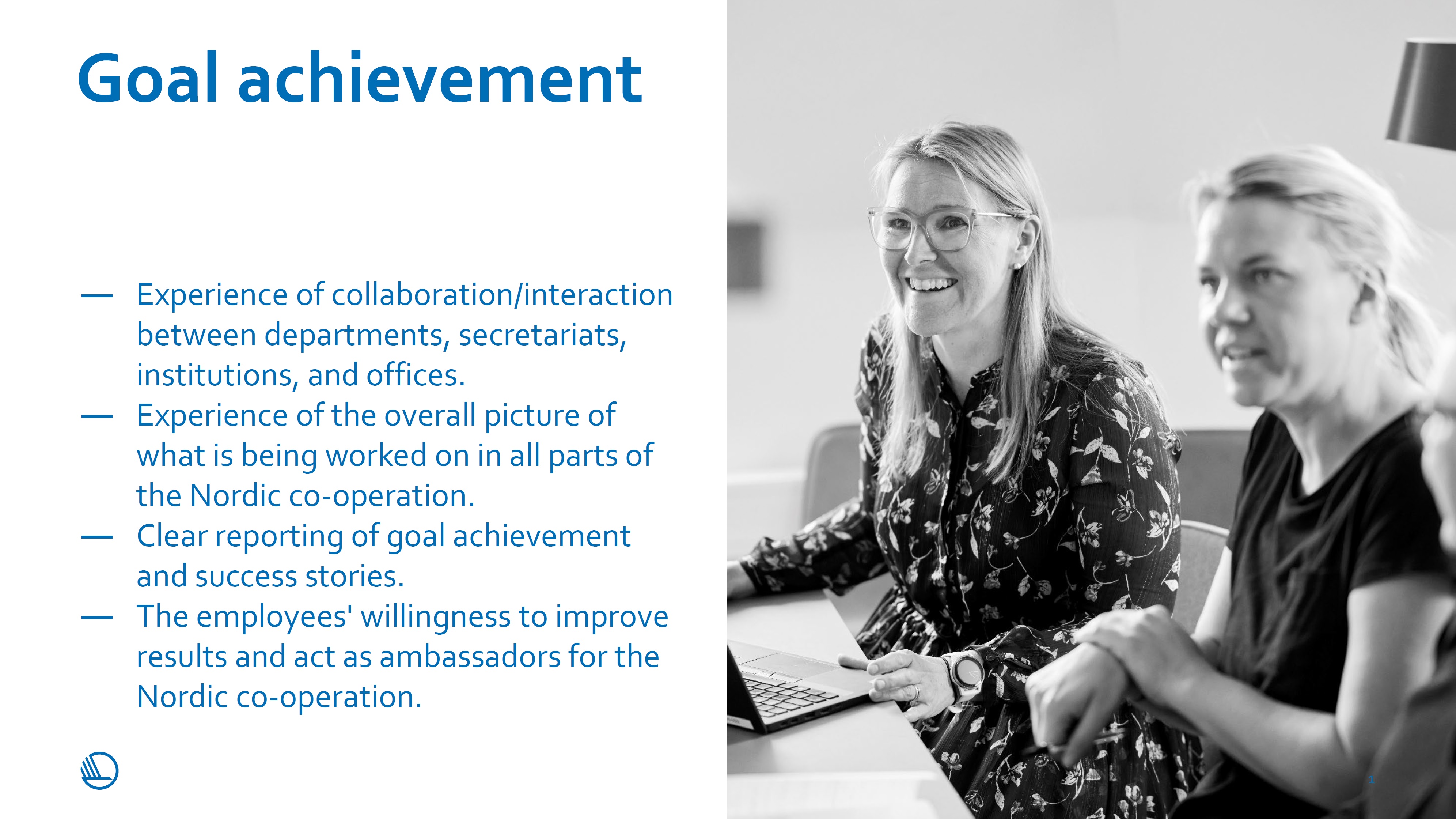
The colours can be reversed so that the background is white and the text is primary blue. Photos must be black and white - Key words can be set off.