PHOTOS: ISTOCK
5. ASSESSMENT OF ENERGY POVERTY IN THE NORDICS
This chapter provides an assessment of energy poverty in the Nordics. The analysis is based on existing survey-based data obtained through the EU Joint Research Center (JRC)
The assessments are based on JRC data analysis over the EU SILC and HBS data (output JRC135908, part of the data catalogue “Just Energy and Transport Data Inventory”). The views expressed in the report are purely those of the authors and may not in any circumstance be regarded as stating an official position of the European Commission.
It should be noted that the surveys are susceptible to uncertainty in sampling. It has not been possible for us to test the statistical significance of the findings.
The chapter is structured in three major sections. Section 5.1 conducts an overall assessment of energy poverty in the Nordics through time, based on selected indicators of energy poverty. Sections 5.3 and 5.4 take stock of how the prevalence of energy poverty varies on a range of background variables. Specifically, section 5.3 is concerned with demographics whereas section 5.4 is concerned with living conditions such as dwelling and tenure types.
5.1 High-level indicators of energy poverty in the Nordic countries
This section assesses the level of energy poverty in the Nordics through time
Due to data availability and comprehensive computational time, it has not been possible to provide complete time series. The selection of years to be presented from the SILC survey is based on critical socio-economic importance as well as the wish to be able to compare with HBS data. Thus, EU-SILC survey data are presented for the years 2015, 2016, 2018, 2020, 2021, and 2022. HBS data are available in 5-year intervals and thus presented for the years 2010, 2015 and 2020. The Nordic (and EU27) average reported in a given year is based on countries with available data in the given year.
- Inability to keep home adequately warm: Percentage of population reporting that they are unable to keep their home adequately warm (SILC)
- Arrears on utility bills: Percentage of population reporting that they have been unable to pay the utility bills in time at least once in the past twelve months (SILC)
- High energy expenditures (2M): Percentage of households whose share of (equivalised) energy expenditure in (equivalised) disposable income is above twice the national median share (HBS)
- 10%: Percentage of households whose share of (equivalized) energy expenditure in (equivalized) disposable income is above 10% (HBS)This is the absolute equivalent to the 2M indicator meaning that while the 2M threshold is defined by the underlying distribution of energy expenditures and income, the 10% threshold is constant.
- Low absolute energy expenditures (M/2): Percentage of households whose absolute (equivalised) energy expenditure in euros is below half the national median (HBS)
Table 2 provides an overview of the identified and discussed pros and cons in chapter 5:
Indicator | Pros | Cons |
Inability to keep home adequately warm (warm) | Provides important insights into the mechanics at play, especially ‘hidden’ energy poverty. | Subject to individual preferences varying with age, gender, and other socioeconomic factors. |
Arrears on utility bills (arrears) | Provides a measure for a very targeted monetary indicator for energy poverty. | Expression of prioritization of paying energy bills over keeping the accommodation warm. |
Twice the national median share (2M indicator) | The relative nature of the indicator creates a dynamic target. | The indicator may misidentify high-income households with relatively high energy expenses and overlook low-income households that under consume due to financial constraints. |
10% indicator | The indicator is expected to reflect the general energy price level of the countries compared to other goods and services. | In some countries, the energy bills are included in the rent and therefore hard to differentiate from other housing costs. |
Half or less than the national median level (M/2 indicator) | Aims to measure the number of households with abnormally low energy expenditures, who potentially are failing to meet their basic needs. | The indicator may also capture households living in highly energy efficient homes, which explains the low level of consumption. |
Table 2. Overview of the pros and cons of the five indicators
As will be seen, the five indicators provide a different picture of energy poverty in the Nordics, both across the Nordic countries and in comparison with the EU27. These results underscore the importance of triangulation and a thorough discussion of the contribution of each indicator. Also evident is the fact that data are missing on some indicators for some of the Nordic countries, reflecting the importance of investigating the potential for using alternative data sources or establishing new data sources to measure energy poverty in the Nordic countries.
5.1.1 Consensual based indicators
One of the most referenced indicators of energy poverty is the self-reported inability to keep home adequately warm (warm) indicator stemming from the SILC survey. While this indicator can be criticized for being subject to individual preferences varying with age, gender, and other socioeconomic factors, it does provide important insights into the mechanics at play, like hidden energy poverty and deprivation, especially when comparing across time.
Figure 10 shows the proportion of individuals who report being unable to keep their houses adequately warm. The figure presents the share for each of the Nordic countries, the average across the Nordic countries, and the EU27 average. The figure suggests that all Nordic countries report fewer issues with keeping their housing adequately warm than the average across the EU27. While the Nordic average does not exceed 3.3% of individuals being unable to keep their home adequately warm, the EU27 average varies between 6.8% and 9.6%. This tendency of variation was a subject of criticism during the workshop because, to some extent, it constitutes uncertainties about the variable’s credibility.
The figure also suggests that the proportion of individuals reporting issues with keeping their housing adequately warm increased from 2021 to 2022 for both Denmark and Sweden, the Nordic average
Note that Norway and Iceland data were unavailable for 2021 and 2022. The Nordic average in these years comprises Denmark, Finland, and Sweden.
Figure 10. Proportion of individuals unable to keep home adequately warm, SILC, 2015-2022* (%)
Note: No available data for IS after 2018, and for NO after 2020. “Nordic average" and "EU27" refer to the average of the Nordic countries and EU Member States with available data in the given year. *Years: 2017 and 2019 are missing in the presented time series.
Source: JRC analysis based on Eurostat data, EU-SILC (2015-2022)
The second self-reported indicator included in this assessment (and suggested by EPOV, see section 4.5.1) is the arrears on utility bills (arrears) indicator. The measure offers a focused and specific approach to addressing energy poverty, which can be advantageous when estimating its prevalence. However, the indicator may also reflect a prioritisation of paying energy bills over maintaining a warm living environment. In addition, the indicator has not been adjusted for general buying-power and levels of inflation underlining the indicator’s nature of self-regulation.
Figure 11 summarises the development in this indicator over time for the Nordic countries and the EU27 average. Struggles to pay the utility bills in time is generally more prevalent in the EU27 average than in the Nordic countries. During the entire time series, however, Finland has the highest share of individuals with arears on utility bills among the Nordic countries, which is on par with the EU27 average. This is in stark contrast to the warm indicator, for which Finland was found to be among the lowest shares. The discrepancy may be due to the Finnish disconnection protection policy ensuring that missed payments do not automatically lead to disconnections from supply. Norway and Sweden have the lowest average levels across the observed years, which may be due to the universal energy service obligation and relatively low energy prices in Norway.
The figure also suggests that all countries with available data in 2021-2022 (except Finland) experience an increase in poverty from 2021 to 2022, pointing once again to the energy crisis. Interestingly, the energy crisis does not seem to have had as big of an impact on the arrears indicator as it does on the warm indicator. There are several potential explanations for this. Firstly, the Nordic countries have strong social security mechanisms in place where households can apply for support when paying their energy bills. Secondly, the relationship between the two indicators could indicate a trade-off effect, where consumers are prioritising paying their bills over keeping their accommodation warm. Thirdly, with energy being a basic good, households might cut down consumption elsewhere in order to meet their basic needs for energy services. Lastly, the modest increase in poverty may also reflect that although increasing energy prices put a strain on household budgets, the price increases might have been manageable. This is considering the various policies, which have been implemented in the Nordics to support households against the financial stress during the energy crisis.
Figure 11. Proportion of individuals with reported arrears on utility bills, SILC, 2015-2022* (%)
Note: The figure shows the proportion of individuals having arrears on utility bills during the past year. No available data for IS after 2018, and for NO after 2020. “Nordic average" and "EU27" refer to the average of the Nordic countries and EU Member States with available data in the given year. *Years: 2017 and 2019 are missing in the presented time series.
Source: JRC analysis based on Eurostat data, EU-SILC (2015-2022)
5.1.2 Expenditure-based indicators
The expenditure-based indicators are usually applied in tandem because they each capture distinct issues related to energy poverty and affordability. The expenditure-based indicators originate from HBS and are presented for the years 2010, 2015, and 2020
HBS data are not available for NO and IS. HBS 2020 data are only available for DK. The Nordic average is based on countries with available data, which in 2010 and 2015 were DK, FI and SE. The Nordic average is not reported for 2020, because DK is the only Nordic country with available data in this year.
Some countries do collect these data on a more frequent basis, e.g. Denmark collects the HBS annually. However, the EU wide collection of HBS data via Eurostat, on which we base this assessment, follows 5-year intervals.
The twice the national median share (2M indicator) provides an insight into the budgetary burden of energy bills relative to households’ disposable income, using the national median as point of reference
Figure 12 shows the proportion of households that have a share of energy expenses relative to income, which is equal to or higher than the 2M indicator. The data indicate that all the Nordic countries (with available data) have a higher prevalence of energy poverty according to the 2M indicator than the EU average. The estimated Nordic average is above 20 percent in both 2010 and 2015, indicating that more than a fifth of the Nordic households included in the analysis are energy poor according to this indicator. The result is especially driven by Sweden, for whom 29% of the households had more than twice the national median share of energy expenditures to income in 2015. Evidently, this high prevalence of energy poverty according to the 2M indicator stands in stark contrast to the warm and arrears indicators from above. The shares in the Nordic countries have increased over time, while the EU average has decreased slightly over time (note, however, that Denmark is the only Nordic country with data for 2020). Such increases may be driven either by increased energy expenses moving households above the 2M threshold or by a decrease in the 2M threshold and as such prove very hard to interpret.
Figure 12. Proportion of households with a share of energy expenditure relative to net household income twice as high or more than the national median (2M indicator), HBS, 2010-2020 (%)
Note: Income and energy expenditures are equivalized according to household size. No available data for IS and NO in all years, and for FI and SE in 2020. “Nordic average" and "EU27" refer to the average of the Nordic countries and EU Member States with available data in the given year. EU figures as the average of countries with available data are inconsistent for 2010 and 2015 because of the inconsistencies in the sampling weights of some countries.
Source: JRC analysis based on Eurostat data, HBS (2010, 2015, 2020)
In order to avoid some of the issues related to the 2M indicator, we provide numbers for the 10% indicator
The 10% indicator is the absolute equivalent of the 2M indicator, Energy poverty indicators: Conceptual issues. Part I: The ten-percent-rule and double median/mean indicators, Schuessler, 2014
This is also evident in the EPOV methodology report published in 2020: EPOV Indicator Dashboard: Methodology Guidebook, Thema and Vondung, 2020
Figure 13 shows that the proportion of households identified by this measure varies considerably across the three included countries. While Finland and Sweden have less than 10% of households spending more than 10% of their budget on energy, Denmark has 14-19% of households spending more than 10%. While the difference between the countries in part may be explained by higher energy prices in Denmark as described in section 4.4, some of the discrepancy may – as argued – be attributed to the fact that energy bills are included in the rent in Finland and, usually but not always, in Sweden as well.
Contrary to the 2M indicator, the results show a decrease in the percentages of the population that may be considered at risk of energy poverty. While some households have decreased their energy expenditure to below 10%, a number of households also moved above the 2M threshold. Due to the decrease in the absolute 10% indicator, it is likely that the increase in the relative 2M indicator above can be explained by a lower 2M threshold rather than increased energy expenditures. Nonetheless, the figure shows that of the three Nordic countries measured, Denmark is the only country where the identified share of households exceeds the EU27 average by a considerable margin (in 2010 and 2020), indicating a level of economic strain similar to the 2M measure above. Lastly, the EU27 share decreases considerably from 2015 to 2020. This reflects a decrease in the economic strain across the EU27 countries with available data in 2020.
Figure 13. Proportion of households with a share of energy expenditure relative to net household income of 10% or more (10% indicator), HBS, 2010-2020 (%)
Note: Income and energy expenditures are equivalized according to household size. No available data for IS and NO in all years, and for FI and SE in 2020. The figures in “Nordic average" and "EU27" refer to the average of the Nordic countries and EU Member States with available data in the given year. EU figures as the average of countries with available data are inconsistent for 2010 and 2015 because of the inconsistencies in the sampling weights of some countries.
Source: JRC analysis based on Eurostat data, HBS (2010, 2015, 2020)
In contrast to the two previous indicators, Figure 14 illustrates the proportion of households with energy expenses in euros that is half or less than the national median level (M/2 indicator). This measure is referred to as hidden energy poverty, because it aims to measure the number of households with abnormally low energy expenditures, who potentially are failing to meet their basic needs. The pitfalls of this indicator are that it may also capture households living in highly energy efficient homes as well as also being referenced to as a changing target, where changes in the energy expenditure distribution translates into a new M/2 threshold.
Considering the shares of households based on this indicator, Finland and Sweden are observed to have an overall higher level of potentially hidden energy poverty than Denmark and the EU27 average. Interestingly, the distribution and development of this indicator resembles quite closely the M2 indicator.
Figure 14. Proportion of households with absolute energy expenditures equal to half or less than the national median (M/2 indicator), HBS, 2010-2020 (%)
Note: Income and energy expenditures are equivalized according to household size. No available data for IS and NO in all years, and for FI and SE in 2020. “Nordic average” and “EU27” refer to the average of the Nordic countries and EU Member States with available data in the given year. EU figures as the average of countries with available data are inconsistent for 2010 and 2015 because of the inconsistencies in the sampling weights of some countries.
Source: JRC analysis based on Eurostat data, HBS (2010, 2015, 2020)
5.1.3 Comparison across consensual- and expenditure-based indicators
The five indicators presented in the previous sections are summarised in Figure 15 in 2015 levels as 2015 is the most recent year where all Nordic EU Member States have available data in HBS. The figure shows a stark contrast between the consensual-based and expenditure-based indicators. In general, the expenditure-based measures indicate substantially higher levels of energy poverty in the Nordics. The same conclusion applies to the EU average. However, the difference is not nearly as large.
Figure 15. Comparison of energy poverty indicators across SILC and HBS, 2015 (%)
Note: The HBS indicators are based on income and energy expenditures equivalized according to household size. No available data for IS and NO in HBS. The figures in “Nordic average" and "EU27" refer to the average of the Nordic countries and EU Member States with available data in the given year. EU figures as the average of countries with available data are inconsistent for 2010 and 2015 because of the inconsistencies in the sampling weights of some countries.
Source: JRC analysis based on Eurostat data, SILC (2015) and HBS (2015)
While providing an assessment of energy poverty on the aggregate level in the Nordics, this section also underlines some of the inherent challenges associated with using these indicators to assess energy poverty in the Nordics as the indicators do not identify a specific group of energy poor citizens.
Most notably, the structure of energy bills poses severe limitations on interpretations from the expenditure-based indicators. Furthermore, the 2M and M/2 indicators are subject to changing targets and do not lend themselves very easily to comparisons across countries. While it may seem that there is a high prevalence of energy poverty in relative terms, it might not be the case when comparing across countries in absolute terms. The expenditure-based indicators are also sensitive towards purchasing power. Other issues may include under-reporting of vulnerability (on consensual-based indicators), survey bias caused by sample sizes as well as the citizens’ space for action, e.g. consume energy when it is cheap, heat up specific areas of the residence while leaving others cold and similar. Irrespective of the root cause, these differences highlight the need for further efforts to triangulate the measurement of energy poverty and perhaps investigate alternative indicators suited for the specific national context.
5.2 Energy poverty and the revised EED
This section takes stock of energy poverty using the indicators suggested in the Energy Efficiency Directive (EED). Given that the EED suggests using a general poverty indicator to indicate energy poverty, the section further investigates the intersection between energy poverty and general poverty. The aim of that discussion is also to provide some insights into the question of whether energy poverty is, in fact, an issue serving its own merit in the Nordic countries.
As discussed above in section 4.3, the Energy Efficiency Directive (Directive (EU) 2023/1791) requires the Member States to use the arithmetic average share of the following four indicators to measure the extent of energy poverty in their National Energy and Climate Plans, if they have not already committed themselves to other indicators:
- Inability to keep the home adequately warm
- Arrears on utility bills
- Population living in a dwelling with a leaking roof, damp walls, floors or foundation, or rot in window frames or floor
- At-risk-of-poverty rate (AROP)
All four indicators are collected in the SILC survey. Figure 16 shows the four indicators for each country in 2018
2018 is the latest year where data on all Nordic countries are available in the SILC survey.
The at risk of poverty (AROP) indicator identifies the share of the population with an equivalized disposable income (after social transfers) below 60% of the national equivalized median income
Figure 16. Comparison of energy poverty and poverty indicators, SILC, 2018 (%)
Note: The leak, damp or rot in the dwelling indicator shows the proportion of individuals living in a dwelling with a leaking roof, damp walls, floors or foundation, or rot in window frames or floor. The at risk of poverty (AROP) indicator identifies the share of the population with an equivalized disposable income (after social transfers) below 60% of the national equivalized median income. The figures in “Nordic average" and "EU27" refer to the average of the Nordic countries and EU Member States with available data in the given year. 2018 is the latest year where data were available for all Nordic countries.
Source: JRC analysis based on Eurostat data, SILC (2018)
Figure 17 shows the development in the AROP indicator over time. Evidently, the share of individuals at risk of poverty is relatively stable in all Nordic countries and the EU27. This contrasts with the development in the energy poverty (warm and arrears) indicators shown above, which tend to fluctuate more and increased significantly in 2022. Although high correlation between poverty and energy poverty is to be expected, the development of the two are not perfectly correlated. Some of this discrepancy may be ascribed to the relative nature of the AROP indicator (where the share is dependent on the national median) versus the ‘absolute’ nature of the warm and arrears indicators.
Figure 17. Proportion of individuals below at risk of poverty threshold (AROP indicator), SILC, 2015-2022* (%)
Note: The at risk of poverty (AROP) indicator identifies the share of the population with an equivalized disposable income (after social transfers) below 60% of the national equivalized median income. No available data for IS after 2018, and for NO after 2020. The figures in “Nordic average" and "EU27" refer to the average of the Nordic countries and EU Member States with available data in the given year. *Years: 2017 and 2019 are missing in the presented time series.
Source: JRC analysis based on Eurostat data, SILC (2015-2022)
Source: JRC analysis based on Eurostat data, SILC (2015-2022)
Although the warm and AROP indicators do not perfectly align, there are correlations. Using 2018 data, these correlations are illustrated in Figure 18, where the share of individuals unable to keep their home adequately warm is calculated for individuals above and below the AROP threshold. Recall that the AROP threshold is 60% of the national equivalized median income. The third panel illustrates the ratio between the two groups. The panel shows that individuals at risk of poverty have 3.3 times the likelihood of being unable to warm their houses compared to individuals not at risk of poverty. Given that access to essential energy services is largely dependent on financial capabilities, this relationship is to be expected. Norway is an outlier in this respect with a ratio as high as 16.8, indicating that people at risk of poverty have almost a seventeen times higher risk of not being able to keep their home adequately warm. This result is mainly driven by the very low share of individuals above the AROP threshold being unable to keep their home adequately warm. Ultimately, the AROP indicator is not necessarily an appropriate indicator for identifying energy poor individuals if being used isolated. Rather, it may be useful for identifying a group of individuals at risk of energy poverty.
Figure 18. Proportion of individuals ‘unable to keep home adequately warm’ by ’at risk of poverty’ indicator, SILC, 2018 (%)
Note: The at risk of poverty (AROP) indicator identifies the share of the population with an equivalized disposable income (after social transfers) below 60% of the national equivalized median income. The figures in “Nordic average" and "EU27" refer to the average of the Nordic countries and EU Member States with available data in the given year. 2018 is the latest year where data were available for all Nordic countries.
Source: JRC analysis based on Eurostat data, SILC (2018)
5.3 Energy poverty and vulnerable groups
This section aims to investigate the prevalence of energy poverty across demographic groups in order to qualify a discussion of whether there are groups that are especially vulnerable towards energy poverty. The parameters considered include income levels, economic activity, health, household types, children in the household, age, and gender.
In October 2023, EPAH published a report on updated indicators divided into four primary topics: Climate, Facilities/Housing, Mobility, and Socioeconomic aspects
While we have argued for a triangulation of indicators in general, this section focuses primarily on the warm indicator. This is due to the low reliability of expenditure-based indicators in the Nordic countries. The warm indicator is prioritised over the arrears indicator in order to limit the scope of the analysis. The warm indicator was chosen because some countries in the Nordics, e.g. Finland, have policies that guard against disconnections due to arrears. In such settings, the arrears would overestimate the level of energy poverty.
In general, income is one of the main explanatory components of energy poverty as described in section 4.1. This merits a thorough look into the dynamics of how energy poverty affects different groups in the income distribution. In this context, it is worth noting that energy poverty may be a subset of vulnerable groups, and if so, it is essential to describe the connections between these groups. In the Nordics, there is some overlap between vulnerable groups in general and those experiencing energy poverty. However, it should be emphasized that energy poverty does not automatically imply vulnerability. This underscores the necessity of clearly distinguishing between the two groups and elucidating how they are interconnected (see chapter 8 for policy recommendation).
Figure 19 shows the proportion of individuals in each income decile who are unable to keep their home adequately warm in 2018
2018 is the latest year where data on all Nordic countries are available in the SILC survey.
Figure 19. Proportion of individuals with reported inability to keep home adequately warm by income deciles, SILC, 2018 (%)
Note: Income deciles are based on equivalized disposable household income. “Nordic average" refers to the average of the Nordic countries with available data in the given year. The EU27 panel is left out to be able to see the nuances in the Nordic countries. *Data are missing for the 5th income decile in IS and the 6th, 8th, and 10th income deciles in NO. 2018 is the latest year where data were available for all Nordic countries.
Source: JRC analysis based on Eurostat data, SILC (2018)
Figure 20 illustrates the proportion of individuals in each income decile who have experienced arrears on utility bills in 2018. Unsurprisingly, the overall pattern is that lower income deciles have a higher risk of experiencing arrears for all Nordic countries and the EU27. The larger the difference in proportions for high and low deciles, the more explanatory power income presumably has in terms of explaining the ‘arrears on utility bills’ indicator. The data indicate that individuals in the lowest income decile in the Nordic countries on average are 2.4 times more likely to have arrears on utility bills compared to the average individual.
Figure 20. Proportion of individuals with reported arrears on utility bills by income deciles, SILC, 2018 (%)
Note: Income deciles are based on equivalized disposable household income. “Nordic average" and "EU27" refer to the average of the Nordic countries and EU Member States with available data in the given year. 2018 is the latest year where data were available for all Nordic countries.
Source: JRC analysis based on Eurostat data, SILC (2018)
Figure 21 indicates the share of households in each income decile with a ratio of energy expenditure relative to net household income twice as high or more than the national median in 2015. The distribution of energy poverty according to the 2M indicator varies a great deal across countries. Income seems to correlate strongly with energy poverty according to this measure in Denmark and the EU27 average, with lower income deciles having a higher share of individuals with energy expenditures above the 2M threshold. In Finland and Sweden, on the other hand, the share of energy poor households is the highest in the 5th income decile. This result underlines the structural difference in energy bills mentioned in section 5.1.1. Because energy bills are included in the rent in these countries, some households may wrongly indicate that they have (close to) zero energy expenditures, which translates into a downwards bias in the median. This caveat underlines the severe problems with using these expenditure-based indicators in Sweden and Finland as they do not appropriately reflect energy poverty.
Figure 21. Proportion of households with share of energy expenditure relative to net household income twice as high or more than the national median (2M indicator) by income deciles, HBS, 2015 (%)
Note: Income and energy expenditures are equivalized according to household size. No available data for IS and NO. “Nordic average" and "EU27" refer to the average of the Nordic countries and EU Member States with available data in the given year. EU figures as the average of countries with available data are inconsistent for 2010 and 2015 owing to the inconsistencies in the sampling weights of some countries.
Source: JRC analysis based on Eurostat data, HBS (2015)
Although income is an important factor, other variables may provide alternative insights into what constitutes and drives energy poverty. Figure 22 illustrates the proportion of individuals with different economic status, who are unable to keep houses adequately warm. The figure shows that unemployed individuals are more exposed to not being able to warm their houses. However, the category ‘other’, which comprises individuals outside of the four other categories, also experiences a consistently higher risk of not being able to warm their houses. A key insight from this is that there is also a significant group of ‘other inactive’ who may not be active on the job market, who are shown to be exposed to potential energy poverty. Hence, any measure of energy poverty must also account for proportions of the population that slip through standard measures of the labour market.
Figure 22. Proportion of individuals unable to keep home adequately warm by economic activity status, SILC, 2018* (%)
Note: Data are based on the population aged 18 and above. Other inactive includes individuals unable to work due to long-standing health problems, individuals fulfilling domestic tasks (housewife/husband), individuals in compulsory military or civilian service and other. *IS data are from 2016 due to missing data on unemployed in 2018. “Nordic average" and "EU27" refer to the average of the Nordic countries and EU Member States with available data in the given year. 2018 is the latest year where data were available for all Nordic countries.
Source: JRC analysis based on Eurostat data, SILC (2018)
One of the consequences of energy poverty is poor health. There already exists comprehensive academic literature investigating the effects of energy poverty on health. Some studies even document how energy poverty increases morbidity and mortality
Figure 23. Proportion of individuals unable to keep home adequately warm by general health status, SILC, 2018 (%)
Note: Data are based on the population aged 18 and above. General health status is defined by self-perceived general health status. ’Good health includes ’Good’ and ’Fairly good’. ’Bad’ includes ’bad’ and ’very bad’. “Nordic average" and "EU27" refer to the average of the Nordic countries and EU Member States with available data in the given year. 2018 is the latest year where data were available for all Nordic countries.
Source: JRC analysis based on Eurostat data, SILC (2018)
Another key variable to investigate is household type. Figure 24 provides a break-down of the inability to keep home adequately warm indicator for different household compositions. The figure shows that single parent households struggle to keep their houses adequately warm to a higher degree than the other household compositions across all countries. Single adult households come in second in all countries except for Sweden. These shares stand in stark contrast to couples with and without children, who have very low shares of individuals unable to keep their home adequately warm. Seemingly the number of adults in a household correlate very strongly with the access to adequate heating.
Figure 24. Proportion of individuals unable to keep home adequately warm by household type, SILC, 2018 (%)
Note: “Nordic average" and "EU27" refer to the average of the Nordic countries and EU Member States with available data in the given year. 2018 is the latest year where data were available for all Nordic countries.
Source: JRC analysis based on Eurostat data, SILC (2018)
Delving further into household types, Figure 25 shows the share of households unable to keep their home adequately warm disaggregated by the number of children in the household in 2018. In Denmark and Sweden, the highest shares of energy poor households are households with one child. In Finland and Iceland, the highest shares are among households with three children. For the EU average, the highest incidence of energy poverty is observed among families with either no children or more than four children. While the pattern across the examined countries is ambiguous, it is challenging to definitively establish the significance of children in relation to energy poverty. Nonetheless, having children living at home constitutes a factor to consider when addressing the consequences of rising energy prices through mitigation measures.
Figure 25. Proportion of households with reported inability to keep home adequately warm by number of children in the household, SILC, 2018 (%)
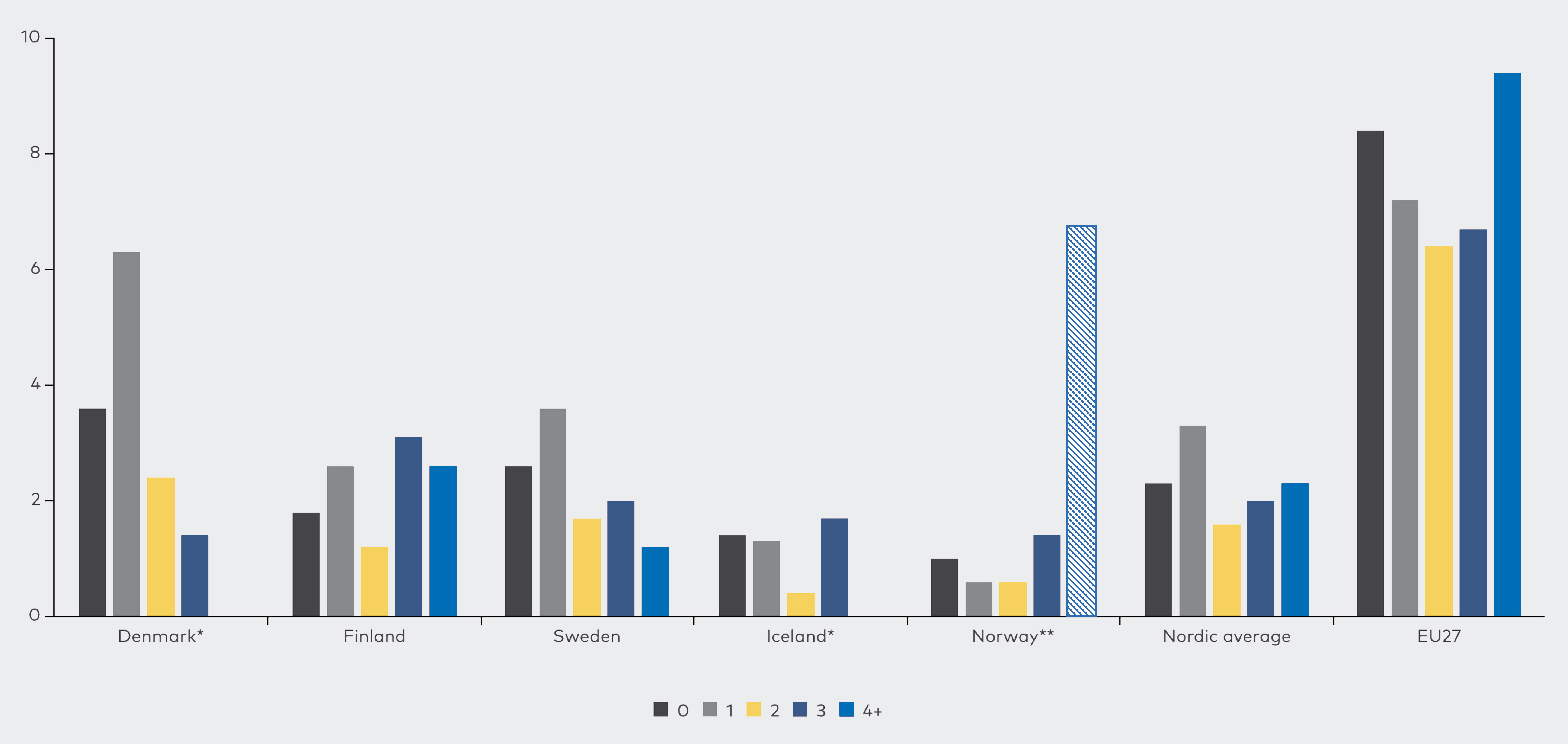
Source: JRC analysis based on Eurostat data, EU-SILC (2018)
Interestingly, when the indicator of inability to keep home adequately warm is cross-tabulated with age groups as in Figure 26, there does not appear to be large differences. All countries show a similar distribution, where younger adults seem to struggle the most, which then tapers off with age. According to these numbers, older individuals do not seem to be especially vulnerable, which may come as a surprise since elderly people have been highlighted as a vulnerable group in literature and in the qualitative data in particular
Figure 26. Proportion of individuals unable to keep home adequately warm by age groups, SILC, 2018 (%)
Note: “Nordic average" and "EU27" refer to the average of the Nordic countries and EU Member States with available data in the given year. 2018 is the latest year where data were available for all Nordic countries.
Source: JRC analysis based on Eurostat data, EU-SILC (2018)
Previous work has examined aspects of energy poverty in relation to gender, specifically in terms of the gender pay gap; the gender pension gap; and women's more limited possibilities to work compared with men due to their disproportionate burden of care for children and other close relatives
Zamfir I., Gender aspects of energy poverty, EPRS, February 2023 (https://www.europarl.europa.eu/thinktank/en/document/EPRS_ATA(2023)739349)
Figure 27. Proportion of individuals unable to keep home adequately warm by gender, 2018 (%)
Note: Data are based on the population aged 18 and above. “Nordic average" and "EU27" refer to the average of the Nordic countries and EU Member States with available data in the given year. 2018 is the latest year where data were available for all Nordic countries.
Source: JRC analysis based on Eurostat data, EU-SILC (2018)
5.4 Energy poverty and living conditions
This section aims to investigate the prevalence of energy poverty associated with living conditions. The parameters considered include dwelling type, tenure status, and the presence of leak, damp or rot.
The relationship between housing stock and ability to keep dwellings warm appears to be an important dynamic. Figure 28 shows the share of individuals unable to keep their home adequately warm within each type of dwelling. The figure indicates that individuals who live in apartment buildings with less than 10 dwellings (and to some extent in apartment buildings with 10 or more dwellings) appear to be at the highest risk of being unable to keep their home warm. This result may reflect several factors. Firstly, an inability of individual owners (or renters) of apartments to renovate in order to make their dwelling more energy efficient. Secondly, there could also be a correlation with income, where lower income or single income individuals for whom it is more difficult to afford adequate heating, may be more likely to reside in apartments as opposed to houses in the Nordic countries. Thirdly, it may also reflect the rental-owner situation, where renters may be over-represented in apartments while also having smaller disposable incomes and thus less likely to be able to afford adequate heating. Fourthly, with respect to the size of the apartment blocks, small blocks with less than 10 dwellings are more at risk than larger blocks in all cases (except for in Sweden). This may reflect that larger apartment blocks are typically more recent and, as a result, better insulated than smaller apartment dwellings. Some of the oldest apartments may have such poor insulation that adequately heating them becomes challenging irrespective of the resident’s income.
Irrespective of the underlying dynamic, it is an important finding that individuals living in houses have a very low risk of being unable to keep their home warm compared to individuals living in apartments. This may reflect that energy efficiency renovations are more available to individuals living in houses, and as such may stress the importance of targeting energy efficiency towards individuals living in apartments.
Figure 28. Proportion of individuals unable to keep home adequately warm by type of dwelling, SILC, 2018 (%)
Note: “Nordic average" and "EU27" refer to the average of the Nordic countries and EU Member States with available data in the given year. Germany is excluded from the EU27 average due to unavailable data on dwelling type in some years. 2018 is the latest year where data were available for all Nordic countries.
Source: JRC analysis based on Eurostat data, EU-SILC (2018)
Figure 29 below shows the indicator for ability to keep home warm in terms of individuals’ tenure status. These results show a far less homogenous picture across the different Nordic countries, reflecting different (social) housing standards and regulations. For example, in Denmark, reduced rent and rent-free tenures are not reported, whilst in Sweden, reduced rate rentals are also not seen
“In a situation where there is no clear distinction between a ‘prevailing rent’ sector and a ‘reduced rent’ sector, all renters would be classified as ‘tenant or subtenant paying rent at prevailing or market rate’.” Methodological guidelines and description of EU-SILC target variables, 2021
Figure 29. Proportion of individuals unable to keep home adequately warm by tenure status, SILC, 2018 (%)
Note: *Data for tenants renting at reduced price are unavailable for DK and SE. Data for rent-free tenants are unavailable for DK and NO. “Nordic average" and "EU27" refer to the average of the Nordic countries and EU Member States with available data in the given year. 2018 is the latest year where data were available for all Nordic countries.
Source: JRC analysis based on Eurostat data, EU-SILC (2018)
Finally, Figure 30 below gives an indication of how the building quality is associated with the ability to keep the dwelling adequately warm. Although it is somewhat expected that damp, leak, or rot would be correlated with the ability to keep the dwelling warm, the figure shows a very strong correlation between the two. The data indicate that the likelihood of being unable to keep the home adequately warm is 4.7 times as high when living in a dwelling with leak, damp or rot.
Figure 30. Proportion of individuals with reported inability to keep home adequately warm grouped by having leak, damp, or rot in the dwelling, SILC, 2018 (%)
Note: “Nordic average" and "EU27" refer to the average of the Nordic countries and EU Member States with available data in the given year. 2018 is the latest year where data were available for all Nordic countries.
Source: JRC analysis based on Eurostat data, EU-SILC (2018)